Salesforce is a robust database system that accommodates a variety of interesting features. For data management and analysis major brands vouch for some features that you can access via Salesforce. Salesforce reports are quite the rage but how to go about them might seem like a task! This article deals with different options for effective reporting and putting the dashboard feature to good use. Read along to understand these features better.
Table of Contents
What is a Report?
A report is defined as a document that contains data in an organized graphical or tabular format. Salesforce enables you to create different types of reports to be able to analyze and understand your data better. You can create Standard reports to cover all the basic requirements or perhaps rely on custom report types to make your analysis. There are Opportunity reports that can help you to access Opportunity records and fields within your report.
With Hevo, you can seamlessly integrate data from multiple sources into any data warehouse, ensuring your organization has a unified view of its data assets.
Why Use Hevo for Data Warehouse Integration?
- No-Code Platform: With Hevo’s user-friendly interface, you can easily set up and manage your data pipeline without any technical expertise.
- Broad Source and Destination Support: Connect to over 150+ sources, including databases, SaaS applications, and more, and load data into your preferred data warehouse.
- Real-Time Data Sync: Keep your data warehouse up-to-date with real-time data flow, ensuring your analytics are always based on the latest information.
Types of Reports in Salesforce
Here are the different types of Salesforce reports you can use:
Summary
Summary Reports are utilized to group rows of data. The “Group Field” plays an integral role in Summary Reports. Grouping is done on the basis of the value of a selected field. Suppose if a property object has a custom field “Status” of picklist type and has two values (Sold, Available). Then, by selecting the status field as a grouping field, a summary report can be generated in two groups, a ‘Sold’ group, and an ‘Available’ group.

Matrix
Matrix Report bears a lot of similarities to the Summary Report. In the Summary Report, the grouping is done on the basis of rows, whereas in Matrix Report there is a need for grouping based on columns and rows. Here is an example of Matrix Report:

Tabular
This is the simplest Salesforce Report which displays records in a tabular format. The following image depicts all the Property records in a row by row tabular format:

Joined Reports
You can use Joined Reports to compare and represent the data of one or more objects in a single report. Here is an example of Joined Report in Salesforce:

Creating a Report in Salesforce
It is quite simple to get started with creating reports for valuable business insights into your data. You can select the type of report depending upon the fields and records you want to highlight when you create the report. Reports display on the records that satisfy the criteria mentioned in the report type. This can help to create an analysis mechanism for specific fields and records amidst the business data. You can, thus, analyze any number of combinations and view them in easy to understand formats that can be shared with others. The Report Builder offers some additional drag-and-drop features which you can use to further add into existing reports or perhaps to create new ones from scratch.
Follow these simple steps to create a report in Salesforce:
- To create a simple tabular report, select the Reports tab under the Suggestion Box icon.
- Click on New Report.
- The report type can be then chosen by expanding the Suggestions box. Choose Edit, “Allow Reports” and then Save these settings to create the report.
- Click on Continue.
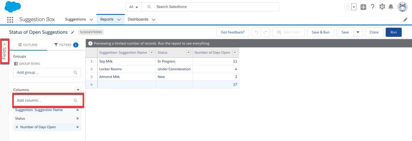
- You can observe the ongoing records and Suggestion Name Field activated in the Report Builder.
- Go to Add Columns and Select Status.
- Enter the “Number of Days Open” in the Column Search.
- Click on “Save”.
- Proceed to name your report.
- Select the appropriate Folder and set to “Public Reports” for public accessibility.
- Click on Save.
- “Save & Run” to finish creating the report.
- You can also choose to create a Summary report for added insights.
- In the Report Results view proceed to Suggestions > Edit >Save As.
- Type “By Status” in the report name.
- Choose the Public Reports Folder. Select Save and Edit.
- Under the Groups Search column, select Status.
- Click on Save. “Save & Run”.
- You can then click the Add Chart button to add a chart to the report.
- Once you finish adding all summary pointers, click Save and your report is good to go!
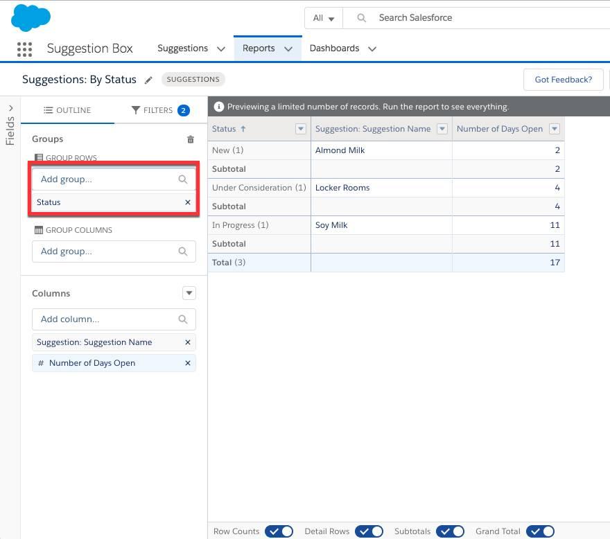
Image source: https://trailhead.salesforce.com/en/content/learn/projects/suggestion_box/suggestion_box_5
Here are the three different components of a Salesforce Report:
Filters
Filters can be used to filter the reports to show only the required data. Say, the requirement is to get a report on sold properties. Then, click on Add Filter and select the ‘Status’ field and choose the value ‘Sold’ as shown below, and click on ‘OK’.

Fields
This refers to all the fields related to the ‘Property’ object. There are a few buttons right to the ‘Fields’ label which are used to group fields. You can also search for a specific field in the quick find box. You can easily drag and drop the fields to the preview page you want to report on.
Preview
Suppose you chose the four fields: Status, Property Name, Price, and Transaction Type, then the preview for the report is shown as below:

What is a Dashboard?
A dashboard in Salesforce can be used to collect different data sources and visuals to present and analyze them as tables, charts and metrics as suited for your specific purpose. These provide a quick snapshot of the main performance metrics and growth indicators for your company or organization.
Such tools can be greatly significant when trying to discover and understand different parameters of growth for your business. A number of database tools allow the easy storage and transfer of data but this data remains truly valuable only when a proper analysis can be carried out to facilitate better understanding of certain parameters essential for growth. Salesforce Reports and Dashboards serve exactly that purpose in being able to highlight trends and patterns from the pre-existing data points.
Creating a Dashboard in Salesforce
A Salesforce Dashboard setup lets you formulate an appeasing collection of the important business data as charts tables and metrics for analysis. Multiple or singular dashboard components can be integrated to create an impactful visual representation of essential data points. Necessary access specifications can also be assigned to these dashboards for monitored viewership. At times businesses might discover the need for an easy representation of frequent changes to indicative data points. You can also render dynamic dashboards which can accommodate the real-time changes updated via the running user.
You can create a Dashboard by following these steps:
- Under the Dashboards tab, select New Dashboard.
- Give a Dashboard Name and set the Private Dashboards folder as the destination.
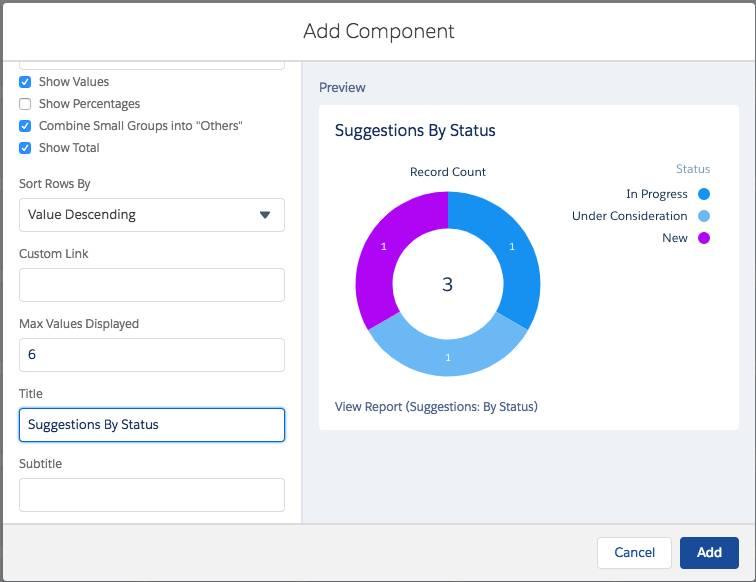
- Add different “+Components” to the dashboard as seen fit.
- Select Suggestions: By Status in the Report Search and click Select.
- Choose a component /chart in the Value dropdown option and the select Record Count.
- Edit the title and Click Add.
- Click on Done.
- Save the settings.
- You have created a dashboard which might look something like this!
Learn More About:
Custom Salesforce Report: 3 Easy Steps
Conclusion
The process mentioned above is long and requires user intervention. If you want to get rid of this hassle, try Hevo today!
The interesting feature of Hevo Data is a real-time update system that runs completely independently. This can be a big plus for generating the most up-to-date reports with the latest information being completely managed and updated automatically on the platform. All without the need to run any script at all! Hevo Data helps you comfortably transfer your data from various sources like Salesforce into Data Warehouse or a destination of your choice for free.
FAQ
What are dashboards in Salesforce?
Dashboards in Salesforce are visual representations of data, aggregating multiple reports to display key performance metrics and trends in real time for better decision-making.
How do you create dashboards in Salesforce?
To create a dashboard in Salesforce, go to the Dashboards tab, click New Dashboard, select a folder, and use the Dashboard Builder to add components like charts, tables, or gauges, linking them to reports.
What is the difference between a report and a dashboard in Salesforce?
A report is a detailed tabular or summary data set, while a dashboard provides a visual overview of multiple reports, allowing for quick insights through charts and graphs.
Share it with your connections.
-
 Share To LinkedIn
-
 Share To Facebook
-
 Share To X
-
 Copy Link