RFM (Recency, Frequency, Monetary) Analysis is a behaviour-based customer segmentation technique that uses past transaction history to segment customers. RFM Analysis in Tableau is an effective Marketing segmentation method that you can use to gain insight into customer behaviour.
This article contains a comprehensive explanation and description of how to setup RFM Analysis in Tableau. You will calculate three indexes to carry out RFM Analysis in Tableau, which are Recency, Frequency, and Monetary value. Using these three metrics, you will learn how to generate important customer insights and improve how you break down your target market audience into smaller, more manageable groups using Tableau.
Table of Contents
Introduction to RFM Analysis
Marketers normally have access to substantial data on their customers– such as browsing history, purchase history, previous campaign response patterns, and demographics– that can be leveraged to identify specific clusters of customers that can be targeted with offers that they are most likely respond to.
This technique is based on the Marketing axiom that 80% of your business comes from 20% of your customers. RFM helps to identify customers who are more likely to respond to promotions by grouping them into various cohorts. For example, people who visit a website regularly but don’t buy much would be a high “Frequency” but low “Monetary” visitors.
RFM Analysis was first used by the direct mail industry more than forty years ago and it remains to be an effective way of optimizing Marketing communications. This analysis is especially common in retail where ideally you’d want to create a view of your customer types without drowning in all the transactional data.
Hevo is the only real-time ELT No-code Data Pipeline platform that cost-effectively automates data pipelines that are flexible to your needs. With integration with 150+ Data Sources (40+ free sources), we help you not only export data from sources & load data to the destinations but also transform & enrich your data, & make it analysis-ready.
Check out some of the cool features of Hevo:
- 100% Complete & Accurate Data Transfer: Hevo’s robust infrastructure ensures reliable data transfer with zero data loss.
- Schema Management: Hevo takes away the tedious task of schema management & automatically detects the schema of incoming data and maps it to the destination schema.
- Live Monitoring: Hevo allows you to monitor the data flow so you can check where your data is at a particular point in time.
You can try Hevo for free by signing up for a 14-day free trial.
Get started for Free with Hevo!Understanding the Importance of RFM Analysis
RFM Analysis effectively allows Marketing teams to target customers with personalized Marketing campaigns based on the different segments curated from their Recency, Frequency, and Monetary scores. RFM metrics are significant indicators of customer’s behaviour as Frequency and Monetary value influence a Customer’s Lifetime Value, and Recency affects the Retention.
RFM Analysis helps Marketing teams to identify:
- The best overall customers.
- The potential valuable customers.
- The Customer Cohort contributing to the Churn Rate.
- The customers that should be retained.
- The Customer Segment that’s most likely to respond to Engagement Campaigns.
Key Benefits of RFM Analysis
When RFM Analysis is applied with Marketing Analytics, it can lead to:
- Increased Customer retention.
- Increased Response Rate.
- Increased Conversion Rate.
- Increased Revenue.
Customer Segmentation with RFM Analysis
When constructing RFM Analysis, the scores are weighted based on:
- Recency: This metric is used to measure the time since the last purchase made by a customer (usually in days). It reveals how recently a customer ordered a product(s) or a customer’s last engagement on a site.
- Frequency: This metric measures the total number of transactions or items purchased by the customer within a specific time frame.
- Monetary: This metric is used to calculate the total spend or average money spent by the customer in dollars (e.g. $5,000).
To perform RFM Analysis, you normally group customers into four groups based on the distribution of Recency, Frequency, and Monetary values. Four groups spread across three variables creates 64 (4x4x4) distinct customer segments. To compare them, you divide each metric into quintiles. If you are above the 80th percentile, your score is 5; if you are in the 60th to 80th percentile, your score is a 4, and so on.
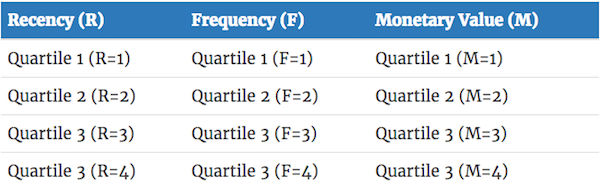
For example, let’s take a look at a customer who:
- Is within the group that purchased most recently (R=1).
- Is within the group that purchased the most quantity (F=1).
- Is within the group that spent the most (M=1).
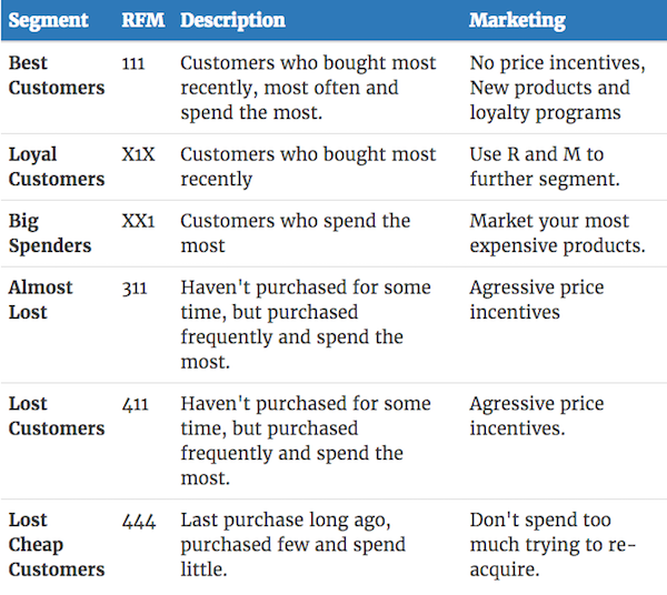
This customer belongs to the RFM segment 1–1–1 (Best Customers), (R=1, F=1, M=1).
Below is a table with the key RFM segments:
Quintiles needed for the analysis can be calculated using Tableau’s percentile rank function which is the same as the PERCENTRANK.INC function in Excel.
For Recency, you can use the following formula:
RANK_PERCENTILE(MIN(DATEDIFF('day', [Order Date], TODAY())), 'asc')For Frequency, you can use the Number of Records since each purchase is a record in the Superstore dataset or count OrderIDs.
RANK_PERCENTILE(SUM([Number of Records]), 'asc')For Monetary, you can use Sales Records:
RANK_PERCENTILE(SUM([Sales])Now, you can convert them to quintiles. You can see the calculation for Recency here but the same formula applies for Frequency and Monetary.
IF [PercentileRankRecency] > 0.20 THEN 1
ELSEIF [PercentileRankRecency] > 0.20 AND [PercentileRankRecency] <= 0.40 THEN 2
ELSEIF [PercentileRankRecency] > 0.40 AND [PercentileRankRecency] <= 0.60 THEN 3
ELSEIF [PercentileRankRecency] > 0.60 AND [PercentileRankRecency] <= 0.80 THEN 4
ELSE "5" END
Finally, combine the results into a single score to get the RFM metric:
[Recency] * 100 + [Frequency] * 10 + [Monetary]In the next section, the article delves deeper into setting up RFM Analysis in Tableau.
Understanding RFM Analysis in Tableau
To accomplish this project, Tableau‘s Superstore sample dataset is utilized. The Superstore dataset has 9994 transitional records and 21 attributes. The main attributes that define the RFM metrics are illustrated in the table below:
| Calculated Attributes | Definition |
| Recency | Difference Between the Highest Order Date in the Data and Lowest Order Date for Each Customer. |
| Frequency | Distinct Count of Customer by Order ID. |
| Monetary | Sum of Sales for each Customer. |
| R-Score | Recency Percentile. |
| F-Score | Frequency Percentile. |
| M-Score | Monetary Percentile. |
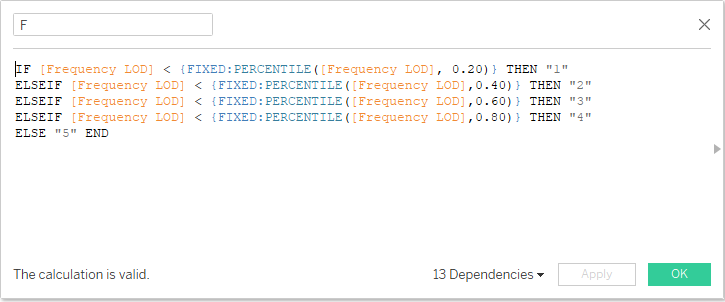
The R-F-M scores are derived by calculating the percentile of customer’s Recency, Frequency, and Monetary values using the formula that was discussed above. This post will only cover how to calculate the F-Score as a part of the RFM Analysis in Tableau.
To calculate F-score, 20% of the top frequent customers will be assigned a score of 5 and 20% of the bottom frequent customers will be assigned a score of 1. The same logic also applies to Recency and Monetary value.
After calculating the R-F-M scores, the next step is to combine the RFM values.

Next, you can group the RFM scores into different segments in Tableau. With this, you complete the process of setting up RFM Analysis in Tableau.

RFM Customer Segmentation
RFM segmentation enables Marketers to zero-down on specific groups of customers with Marketing communications that are most relevant for their particular behaviour. This leads to higher rates of response, conversions, increased loyalty, and Customer Lifetime Value (CLV).
This article talks about segmenting the RFM groups into 11 customer segments as follows:
- Champions: Purchased recently, are frequent buyers and higher spenders.
- Loyal: These customers spend significant amounts of money and also respond to promotions.
- Potential Loyalists: They purchased recently, spent a significant amount of money, and are repeat buyers.
- Promising: This customer segment is recent shoppers, but hasn’t spent much.
- New Customers: These customers bought most recently but not often.
- Need Attention: This group has above average Recency, Frequency, and Monetary values. They may not have made a purchase recently.
- About to Sleep: This segment of customers has below-average Recency, Frequency, and Monetary values. You are likely to lose them if not reactivated.
- At-Risk: These customers spent a lot of money, purchased often, but it has been a long time since they made a purchase. They need to be brought back.
- Cannot Lose Them: This group of customers is important because they made the biggest purchases but they have not returned for a while.
- Hibernating: This group of customers is low spenders, they purchased a low number of orders and it has been a while since they made a purchase.
- Lost: This group has the lowest Recency, Frequency, and Monetary scores.
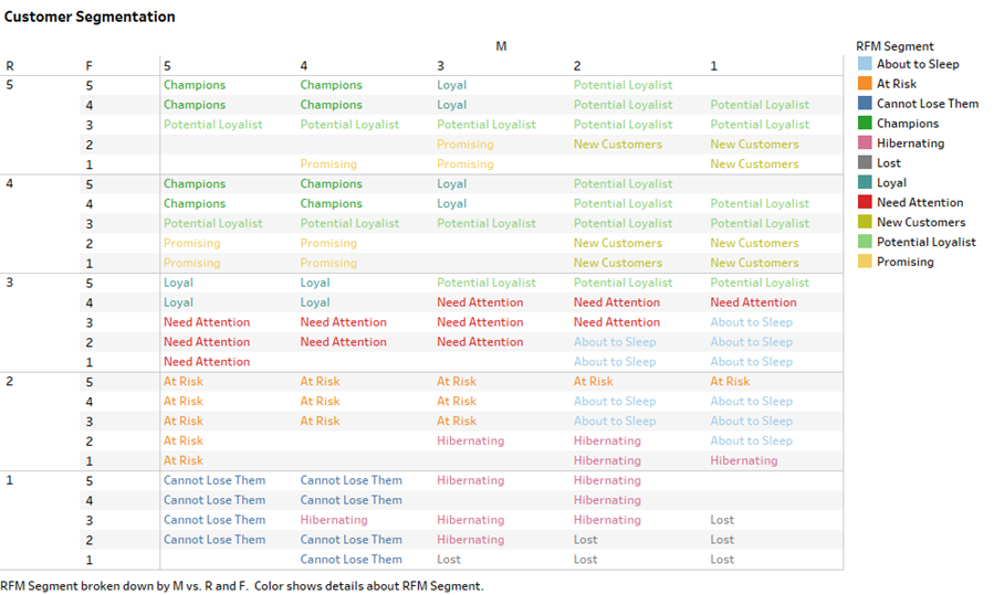
Customers are grouped into segments based on their Recency, Frequency, and Monetary scores.
Data Exploration for RFM Analysis in Tableau
Using the sample Superstore dataset in Tableau, you can explore some business questions and generate interesting insights from your very first RFM Analysis in Tableau.
- Unique Customers in Each RFM Segment
- Total Sales Made across Each RFM Segment
- “At-Risk” Vs “Loyal” Customers
- Segment Performance Based on Customer’s Frequency and Recency
- Customers Purchasing Items Within a Specific Period
Unique Customers in Each RFM Segment
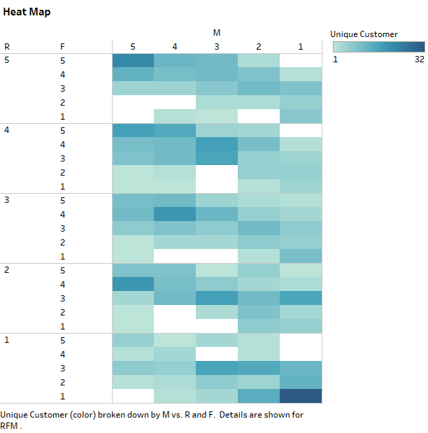
- This heat map shows the unique tally of customers in each RFM segment.
- Customers in the 555 and 111 segments have the highest count at 22 and 32 respectively.
- From the heat map, you can see that 555 is grouped as “Champions” and 111 as “Lost”.
Total Sales Made across Each RFM Segment

- From this chart, it is evident that Champions have the highest Monetary value.
- It is interesting to see that the customers that are “At-Risk” are the second-highest in terms of sales.
“At-Risk” Vs “Loyal” Customers
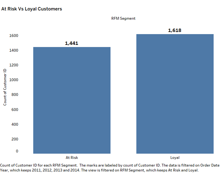
- Further drilling shows that the total number of “Loyal” customers were higher than “At-Risk “customer across the years.
- However, in 2011 and 2012 the number of “At-Risk” customers was higher than “Loyal” customers.
- In 2013 and 2014, the count of “Loyal” customers increased while the count of “At-Risk” customers declined.
Segment Performance Based on Customer’s Frequency and Recency
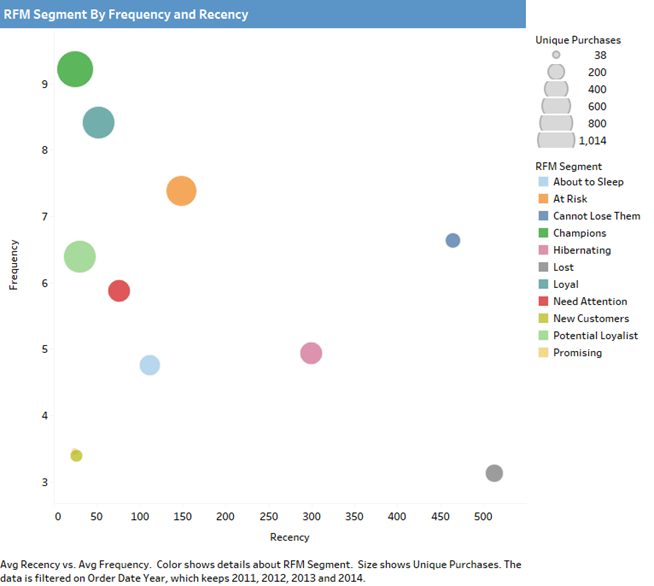
- Customers who are “Champions” made purchases 9 times on average and also made recent purchases within 24 days.
- Customers who are segmented as “Lost” purchased items 3 times on average. Their recent purchases were almost 2 years ago (513 days).
Customers Purchasing Items Within a Specific Period
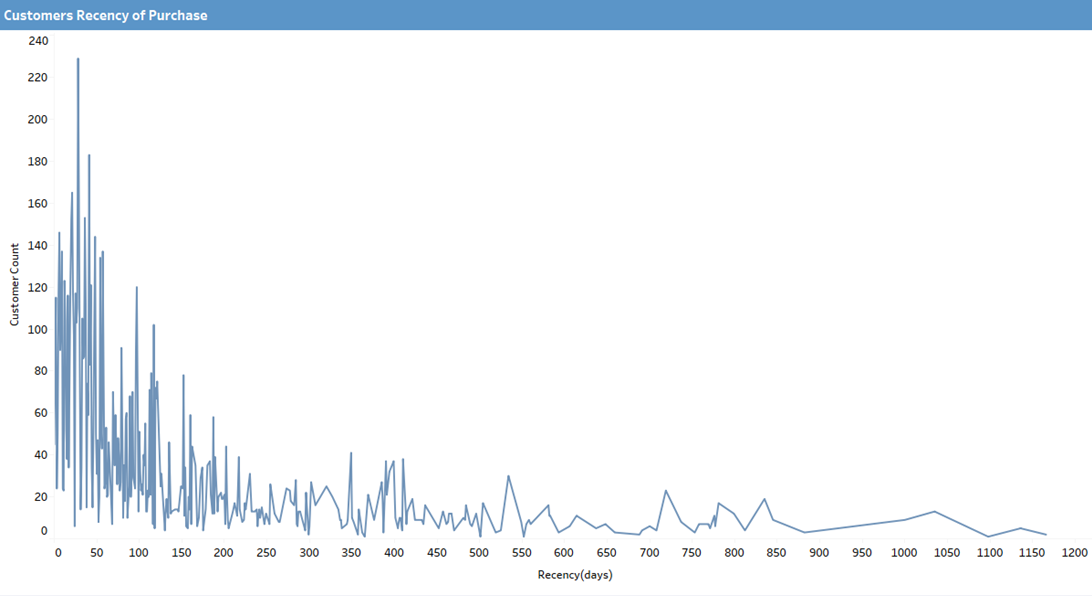
- The line chart shows that 229 out of 793 Superstore customers made a purchase(s) in the last 28 days.
Example of RFM Analysis Tableau Using Online Retail Transaction Dataset
Step 1: Acquiring the necessary data
We will require the customers’ purchase history data in order to execute RFM tableau analysis.

Step 2: Setting up a Tableau connection for the dataset
The data connection page is what opens when you initially launch Tableau. In this part, we’ll establish a connection to the necessary dataset file.

Tableau connects to the necessary dataset and displays the Data source page. Here, we can connect to additional datasets to carry out data modeling utilizing joins and relationships, and we can also choose between the Live connection and Extract option.
Step 3: RFM Measure Calculation
Using the “Create Calculation Field” option, we will construct three new measures—”RFM-R,” “RFM-F,” and “RFM-M”—in order to do Tableau RFM Analysis.
RFM-R
DATEDIFF('day',{ FIXED [Customer ID]:MAX([Invoice Date])},{MAX([Invoice Date])})
RFM-F
({ FIXED [Customer ID]:COUNTD([Invoice ID])})
RFM-M
{FIXED [Customer ID]: SUM([Sales Amount])}

Step 4: RFM Score Calculation
We will add three new variables, “R-Score,” “F-Score,” and “M-Score,” after receiving the RFM measurements. After determining each of the three individual scores, we will finally compute the aggregate RFM-Score. We will use these ratings as the foundation for client segmentation and definition.
<strong>R-Score</strong>
IF [RFM-R] <= {FIXED:PERCENTILE([RFM-R],0.25)}
THEN 1
ELSEIF [RFM-R] > {FIXED:PERCENTILE([RFM-R],0.25)} AND [RFM-R] <= {FIXED:PERCENTILE([RFM-R],0.5)}
THEN 2
ELSEIF [RFM-R] > {FIXED:PERCENTILE([RFM-R],0.5)} AND [RFM-R] <= {FIXED:PERCENTILE([RFM-R],0.75)}
THEN 3
ELSE 4
END
<strong>F-Score</strong>
IF [RFM-F] <= {FIXED:PERCENTILE([RFM-F],0.25)}
THEN 4
ELSEIF [RFM-F] > {FIXED:PERCENTILE([RFM-F],0.25)} AND [RFM-F] <= {FIXED:PERCENTILE([RFM-F],0.5)}
THEN 3
ELSEIF [RFM-F] > {FIXED:PERCENTILE([RFM-F],0.5)} AND [RFM-F] <= {FIXED:PERCENTILE([RFM-F],0.75)}
THEN 2
ELSE 1
END
<strong>M-Score</strong>
IF [RFM-M] <= {FIXED:PERCENTILE([RFM-M],0.25)}
THEN 4
ELSEIF [RFM-M] > {FIXED:PERCENTILE([RFM-M],0.25)} AND [RFM-M] <= {FIXED:PERCENTILE([RFM-M],0.5)}
THEN 3
ELSEIF [RFM-M] > {FIXED:PERCENTILE([RFM-M],0.5)} AND [RFM-M] <= {FIXED:PERCENTILE([RFM-M],0.75)}
THEN 2
ELSE 1
END
<strong>RFM-Score</strong>
INT(STR([R-Score])+STR([F-Score])+STR([M-Score]))Step 5: RFM Segment Creation
“RFM-Segments” will be the new calculation field that we create.
RFM-Segments
IF [RFM-Score] == 111
THEN 'Best Customers'
ELSEIF [R-Score] == 1 AND [F-Score] == 2 AND [M-Score] <=2
THEN 'Potential To Become Best Customer'
ELSEIF [F-Score] == 1
THEN 'Loyal Customer'
ELSEIF [M-Score] == 1
THEN 'Big Spenders'
ELSEIF [RFM-Score] == 311
THEN 'Almost Lost'
ELSEIF [RFM-Score] == 411
THEN 'Lost Customers'
ELSEIF [RFM-Score] == 444
THEN 'Lost Cheap Customers'
ELSEIF [R-Score] = 2
THEN 'Look Out Buyers'
ELSEIF [R-Score] >= 2 AND [F-Score] >= 2
THEN 'Occasional Buyers'
END
Step 6: Reporting and Visualisation
Now that all of the attribute measures and customer groups have been established, we can proceed to analyze them with the use of various RFM Dashboards.
Learn More About:
How To Perform RFM Score Analysis Targeting Niche Customer
Conclusion
From this post, it is evident that RFM Analysis in Tableau is probably one of the easiest ways to segment customers given that businesses usually have the customer purchase information readily available to them. You can drastically improve your Marketing performance when running Marketing campaigns to boost revenues using RFM Analysis in Tableau. These strategies can help you find out who the best customer is for that specific campaign or which customer segment is most likely to respond to the offer.
In this article, you get a glimpse of the basics of RFM Analysis, its importance, and its benefits. Finally, the article touches upon setting up RFM Analysis in Tableau and the data exploration that is carried out on the sample dataset available in Tableau to elicit the findings of RFM Analysis in Tableau.
Extracting complex data from a diverse set of data sources can be a challenging task and this is where Hevo saves the day! Hevo offers a faster way to move data from Databases or SaaS applications into your Data Warehouse to be visualized in a BI tool. Hevo is fully automated and hence does not require you to code. You can try Hevo for free by signing up for a 14-day free trial. You can also have a look at the unbeatable pricing that will help you choose the right plan for your business needs!
FAQ on RFM Analysis in Tableau
How to do RFM in Tableau?
To perform RFM analysis in Tableau, you would typically follow these steps:
– Connect to Data
– Calculate RFM Scores
– Segmentation
– Visualization
– Analysis and Insights
What is RFM in analysis?
RFM analysis evaluates customers based on three key dimensions:
– Recency (R): How recently a customer has made a purchase. Customers who have purchased more recently are generally more likely to respond to promotions or engage with the company.
– Frequency (F): How often a customer makes purchases. Customers who buy more frequently are often more engaged and loyal.
– Monetary Value (M): How much money a customer spends on purchases. Customers who spend more money are typically more valuable to the business.
How do you calculate RFM analysis?
To calculate RFM scores for customers, follow these steps:
– Recency
Determine the most recent purchase date (Last Purchase Date).
Calculate the number of days since each customer’s last purchase (Recency).
– Frequency (F)
Count the total number of purchases (Frequency) made by each customer within a defined time period.
– Monetary Value (M)
Sum up the total monetary value (Monetary) of purchases made by each customer within the same time period.
Share it with your connections.
-
 Share To LinkedIn
-
 Share To Facebook
-
 Share To X
-
 Copy Link