Google Data Studio is really like a canvas on which you can create your art with data. It provides you with all the tools you will need to generate an interactive, enticing, and persuasive painting of your data. It looks slightly simple when you first open it but do not be deceived. Google Data Studio Report is amazingly versatile in its ability to present raw data in so many forms.
Its versatility results in it being a multi-purpose reporting tool. You just need to have the data and you can find a way to generate world-class reports for free. In this tutorial, let us build a Google Data Studio Report together from scratch.
By the way, if you have never used Google Data Studio before, first read this blog and quickly get back here. I can wait!
Ok, you are back. Let us make a simple Google Data Studio report for Google Analytics. Later you will see that what works for making a Google Analytics report also works for making a report for the performance of your YouTube channel, your e-commerce website, or really anything under the sun.
Table of Contents
What is Google Data Studio?
It’s a free online tool that allows you to easily visualize data. You have a variety of data sources to choose from, including Google Sheets and Microsoft Excel files. Google Data Studio’s artificial intelligence (AI) automatically combines data from multiple sources, analyses it, and allows you to create interactive charts, dashboards, and reports.
All you have to do now is choose which charts or tables you want to include in your report and apply some colorful themes to them. To become familiar with the tool, you don’t need to go through extensive training sessions. You can create regular project reports, team performance reports, project budget forecasts, and more by simply dragging and dropping charts into the canvas.
With Hevo, you can seamlessly integrate data from multiple sources into any data warehouse, ensuring your organization has a unified view of its data assets.
Why Use Hevo for Data Warehouse Integration?
- Broad Source and Destination Support: Connect to over 150+ sources, including databases, SaaS applications, and more, and load data into your preferred data warehouse.
- Real-Time Data Sync: Keep your data warehouse up-to-date with real-time data flow, ensuring your analytics are always based on the latest information.
- No-Code Platform: With Hevo’s user-friendly interface, you can easily set up and manage your data pipeline without any technical expertise.
Key Features of Google Data Studio
- A Nifty Dashboard: The dashboard and user interface of Data Studio are similar to those of Google Drive. As a result, you’re well-versed in the tool’s user interface. The following are the most important elements with which you’ll interact frequently:
- You can use the top-right Search Data Studio box to look for reports, templates, and data sources.
- You can change the visibility of Reports, Data Sources, and Explorer in the Recent section.
- You can create a new Report, Data source, or Explorer from the left-hand menu. In this area, you’ll also find shared items and the Templates gallery.
- You can customize several fields of the User settings by clicking the gear icon in the top right corner.
- Multiple Data Collection Sources: Data Studio eliminates the need to manage multiple versions of Google Sheets or Microsoft Excel files related to your work. Using 490+ data connectors, the tool can analyze raw data from over 800 data sets. As a result, data from third-party sources such as Funnel, TapClicks, Amazon Seller Central, Asana, Jira Cloud, and others can now be imported. You can also give the tool permission to access and analyze data from Google tools such as Campaign Manager 360, Google Analytics, MySQL, and Google Sheets. When you use Data Studio, you don’t have to be concerned about data integrity or security. It uses advanced encryption technology to protect your data both in transit and within the tool.
- Performance Driven In-Memory BI Engine: Assume you’re presenting a client with a project performance report. Even though you have premium and modern data visualization tools, the presentation isn’t going well because the data keeps loading. Furthermore, when working with multiple data sources, the lag may be even worse. Thanks to the Google Cloud BigQuery team’s BI Engine, Data Studio has sub-second performance. It’s in-memory data access and analysis service that can work with your BigQuery data warehouse on-premise. As a result, you can display real-time data from hundreds of sources in a single dashboard that updates and loads in real-time.
- Interactive Data Visualization: Advanced programming features like chart interaction controls, drill-downs, and cross-chart interactions make the Data Studio report’s view mode extremely responsive. As a result, a viewer can customize almost anything in your reports, from filters to metrics, to gain new insights. Data Studio Explorer allows the viewer to delve deeper into your report by breaking down your graphs and tables into small chunks of information. When viewing the databases of a report, viewers do not need to be SQL database experts. Visual queries are available for viewers to use to explore databases.
- Real-Time Collaboration: You and your collaborators can work on the same Data Studio report in real-time, just like with other Google productivity tools. You can invite people to work with you, manage their access levels, and get a public link for social media from the Share menu at the top of the report. If you share your Data Studio workspace with another person, their Google profile will appear in the menu bar if they join. Other notable features on Data Studio that make collaborative work easier are:
- Allow collaborators to make changes to a reusable data source and incorporate it into their own reports.
- Embed a Data Studio report in a variety of formats, such as newsletters, emails, and blogs.
- Make it impossible for others to print, download, or copy your Data Studio reports.
- Ease of Use: Its web UI is simple to navigate, and Google Workspace users are already familiar with it. Complete drag-and-drop actions are available in the report editing workspace. For each object you use in your reports, you can access custom property panels. You don’t need to know much about graphs and tables if you use Data Studio’s ready-to-use templates. There are eight different types of report categories to choose from in the Templates library.
- Scheduling a Report: It’s crucial to share the data visualization report on a regular basis or according to the client’s preferences. When you’re juggling multiple tasks and looking after your team, it’s easy to forget to send your client project reports. You can plan ahead with Data Studio’s Schedule email delivery feature. You can prepare a report for your client and set a delivery date for it. When the report is due, Data Studio will automatically notify your client. You can also change the Repeat settings to tell the tool if the client requires reports at specific intervals.
- Various Charts and Graphs: You can use Data Studio to create 14 different types of charts for your reports. Whether you need Bar, Pie, or Line charts, you can get the majority of them with just one click. The in-memory BI Engine analyses the data type and organizes it according to the charts or tables you choose. You can add Community visualizations to your report in addition to charts to give it a professional and creative look. You have unrestricted access to various visualizations such as Gantt charts, Radar charts, gauges, Start Ratings, and so on. Though if you are having a data and would like to make graphs that are graphically attractive then you can also use tools like visme.
How to Use Google Data Studio to Improve Your Data?
To use Google Data Studio, you must first log in, which you can do here. To use the platform, you’ll need a Google account. We’ll show you how to create a report, add data, and generate your first report in the sections below.
- Choose a Google Data Studio Report Template:
You can either start from scratch or use one of the templates to create a report. Starting with a template that you can customize to fit your needs is a good idea. You can try your hand at a blank report once you’ve gotten a better understanding of the platform.
To see more, go to Template Gallery. There are dozens of templates to choose from:
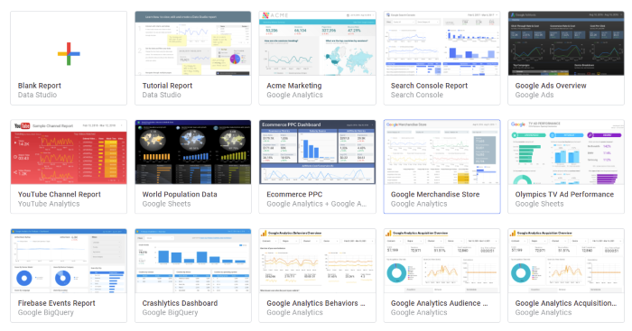
You can make and submit your own templates, but for now, let’s go with something simple. Then select Use Template from the Search Console Report menu.
Set your email preferences and enter your basic information, such as your country and company. To get a better understanding of the platform, I recommend turning on tips and recommendations.
- Add Data Sources to Google Data Studio:
It’s time to create your customized search console report now that you have a template. To use the template, click Copy Report.
You can change the report’s name, share it, add charts, and more from here.
The first step is to click Add Data to add your data to the report.
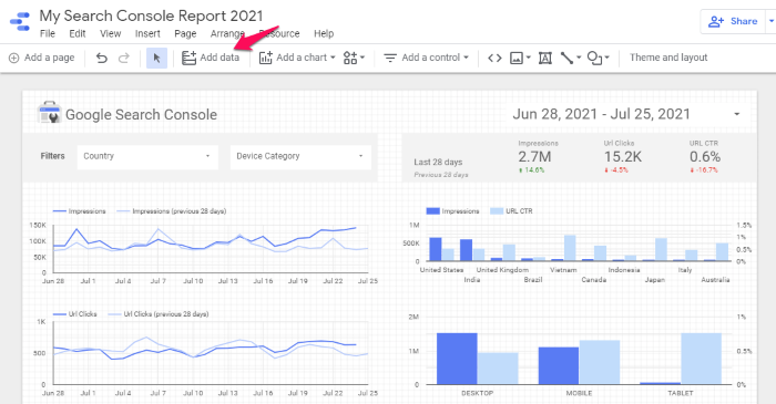
Choose from which sources you want your data to come. If you’re still getting a feel for the platform, I recommend starting with Google Analytics. It’s probably familiar to you, and it’s simple to set up.
You can, however, incorporate data from a variety of other sources, including (but not limited to):
- Google Sheets
- BigQuery
- Campaign Manager 360
- Google Ads
- Google Survey
- PostgreSQL
- YouTube Analytics
- AdRoll
- Facebook Ads
- Ahrefs
- CallRail
- Campaign Monitor
Click Add after selecting the account, property, and website data you want to include.
- Customize the Report Visualization:
Now that you have your data, it’s time to personalize this template. Nearly everything can be changed, which can be overwhelming, so let’s start small, with the date range.
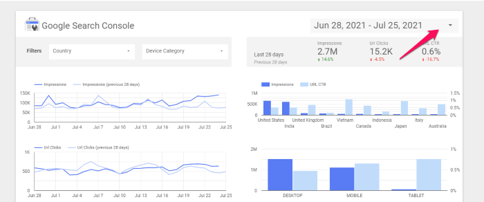
In the upper-right corner of the report, click the carrot next to the date:
Then choose the date range for which you want to see the data:
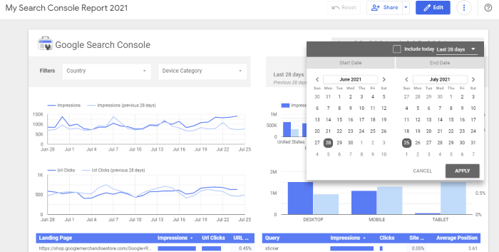
When you click Apply, the report’s charts and graphs will be updated to reflect the new data.
The current data is simply sorted in this step. You can sort by date, country, landing page, and a variety of other factors.
What if you want to add a new chart to your collection? In the navigation bar, click Add a Chart.
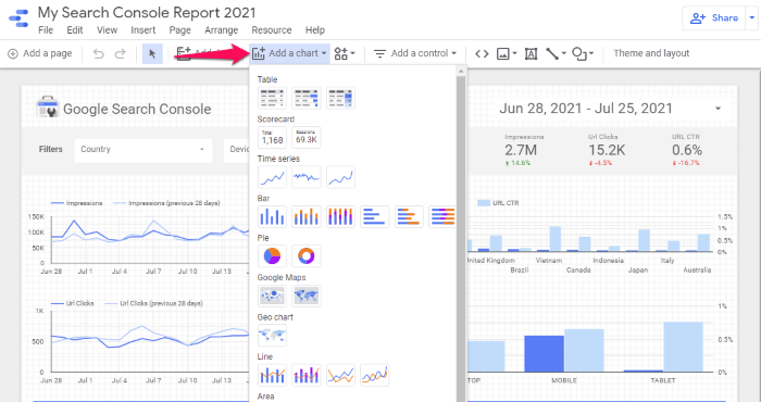
After that, choose the chart type you want to use. A bar graph is what I’ll use, but you can also use a table, scorecard, time series, Google Maps, line bars, scatter plots, pivot tables, and so on.
To add the chart, your cursor will change to a “plus” sign. Click where you want the chart to appear in your report. (Don’t worry, you’ll be able to relocate it later.)
Then, in the right sidebar, select Dimension (called the Properties panel.) This instructs Data Studio on what the graph should be about.
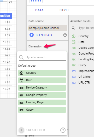
Additional dimensions, such as landing page and country, can be added.
You can also sort the data ascending or descending, change the default date range, add metrics sliders, and enable drill-downs.
Click the Style tab in the Properties panel to change the appearance of your chart.
You can change the color, add bars, rotate the graph, and draw a reference line here.
Feel free to experiment with different charts, change the style, and create the report you need to showcase your data.
- Share Your Google Data Studio Report:
It’s time to share your report with your team, boss, or clients after you’ve finished it. This is how you do it.
In the top right corner of your report, click Share.
Feel free to experiment with different charts, change the style, and create the report you need to showcase your data.
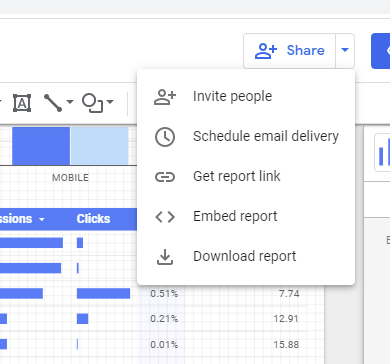
You can invite others to view the report, schedule an email delivery (which is particularly useful for client work), embed the report, get a link, or simply download it.
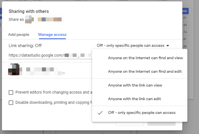
Even better, you can control who sees the report when you invite people, so you have complete control over who sees it.
You can, for example, grant view-only access, allow editing, and disable downloading, among other things.
What is Google Data Studio Report?
Google Data Studio Report is a free web-based visualization tool developed by Google to help people easily create sharable reports in a matter of a few clicks. It allows users to create customizable dashboards to measure the performance of their business, Marketing, Sales, or other work.
Google Data Studio Reports enables users to create flexible reports by adding their data sources for seamless data flow. Get real-time updates on charts to allow users to identify the hidden insights from data. Google Data Studio Reports comes with pre-built KPIs, visualization and reporting tools, and data segmentation features that help users quickly understand data and trends.
What are the Benefits of Creating Reports Using Google Data Studio?
Google Data Studio Reports come very handy when creating flexible dashboards and need regular small changes. Many individuals and Marketers prefer Google Data Studio Reports because it offers many features. A few benefits of Google Data Studio Reports are listed below:
- Integration with data sources: Google Data Studio Reports supports integration with many Google products and services and 100+ other apps for seamless data flow into dashboards.
- Create Sharable Reports: Google Data Studio Reports allow you to create reports and share them with your team members, managers, and individuals without downloading any files. It supports sharing through E-Mails, links, and scheduled sharing.
- Drilling-Down Reports: Google Data Studio Reports help users effortlessly drill down into data to get insights. It offers various tools that help quickly do the process.
- Setting Goals and KPIs: It allows users to set their goals and measure performance compared with goals. It comes with many key performance indicators (KPIs) that help users to understand important metrics.
What are the Best Practices to Create Google Data Studio Report?
Google Data Studio Reports is easy to make using drag and drop features. But one should always follow some best practices to create Google data Studio reports for maximum efficiency. Here are some of the best practices listed below:
- Setting up goals and KPIs: It’s always suggested to choose the right metrics and key performance indicators that will best reflect the progress of your business or task. Setting up weekly and monthly goals allow companies to compare their performance with some benchmark and motivate them to achieve it.
- Selecting Date Ranges in Reports: It allows companies to customize the view of Google Data Studio Report for any date or timeframe individuals want to visualize data deeply. It makes the reports more flexible to use towards personal preference.
- Configuring Google Data Studio Reports Accessibility: While creating any Google Data Studio Report, one should always know the end-users of the report. Team members or individuals should provide access to reports and dashboards to rightful people.
- Applying Predictive Analytics: Google Data Studio offers Predictive Analytics features that allow users to predict trends and forecast a few results based on their data.
- Distribute Related Charts: Adding more and more widgets on one page increases the complexity of reports. Google Data Studio Reports can be added to another page that allows users to segregate widgets on the same page based on the relation with other widgets.
What are the Methods to Create a Google Data Studio Report?
You can make practically any report on Google Data Studio. But to illustrate the process, let us create a Google Data Studio report for Google Analytics.
Once you add your Google Analytics data using the ‘Add Data’ option on the toolbar, you can start with, using the ‘Shapes’ on the toolbar. The point of adding shapes to the report is to give a visual boundary for the charts or texts you may add to these shapes.
Google Data Studio has two shapes – Rectangle and Circle.
Step 1. Add a rectangle to the canvas. It will look like this.
Step 2. You can now add a text box to it and enter the info you want. In my case, I want it to be the heading of what follows. My rectangle looks like this.
Step 3. You can, of course, add texts and charts without using the shapes too- like the heading in the image below
Step 4. I am going to add three circles below the rectangle. The method is similar. All you need is the ‘Add Shape’ tool.
Step 5. Inside these shapes, I will add the charts I want. There is a big list of charts in the ‘Add charts’ option in the toolbar. I am going to pick the Scorecard.
Step 6. Place the scorecard inside one of the circles. It should look like this.
Step 7. Click on your scorecard and look to the Data and Style columns you have next to your canvas. You can decide which metric the scorecard should show. I went with the metric- ‘Sessions’. You can pick any metric that can be seen in the drop-down menu in ‘Metrics’.
Step 8. Under the style column, you get to modify the shapes, colors, backgrounds, borders, and other appearance-related parameters of the chart to suit your style.
Step 9. Finally, this is how the canvas looks after I add different metrics using the scorecard.
Step 10. Here I have created similar rectangular boxes and added a ‘Time Series’ chart. Nothing changes except for the fact that you select the time series chart in the ‘Add Chart’ option.
Step 12. Like you did with the scorecard chart, you can change the appearance of this chart too using the ‘Style’ column.
Step 13. Similarly, you can play with the ‘Data’ column too to select your metric, etc. You can also use the ‘Comparison Data Range’ option to visually check how things have changed with your metric over your defined period of time.
Step 14. If you have gotten the feel for it, you can go ahead and add different types of charts on your canvas. Some of the coolest charts are the Geo chart (my favorite), the Donut chart, the Scatter plot, etc.
Check out the Donut chart too. Looks yummy!
Does the Donut chart seem a little too cluttered to be delicious-looking? You can always change how any chart looks using the ‘Style’ column. So go to the ‘Style’ column and reduce the number of slices.
Finally, after making such modifications, this is how the report looks.
Google Data Studio has all the tools you need to make a comprehensive and visually appealing report. You know the fundamentals now and you can explore further on your own to do much more. Remember that there are no rules here and if you are not as aesthetically impaired as I am, you can do a much better job at creating a very attractive canvas.
What are the Other Google Data Studio Reports?
Check out this report made for the performance of a YouTube channel. The metrics you measure may be different, but the tools you use are pretty much the same. What you choose to present in the report is up to you and your requirements.
This is another report made for Search Console. You can add texts describing the charts you present too.
How to Add Pages to a Google Data Studio Report?
The reports don’t have to be on one page. You can always add pages and also control what pages viewers can see.
How to Share a Google Data Studio Report?
Sharing your Google Data Studio report is easy! You can invite people or groups of people to view your reports, schedule email delivery, create a link, or download it as a PDF.
Conclusion
You have seen that report building is insanely easy with Google Data Studio. It connects seamlessly with all the other Google services and it is easy to access. As long as you have a clear idea of what you want to present, you can practically create a very pretty report in a matter of minutes and head to your meeting. You can add images, and external links, and leverage tools like Date Range and Data Control to make your reports more interactive and functional. You can create a link or download it as a PDF to share it more conveniently. Google Data Studio is also free to use! Basically, it is awesome!
Share with us how you make reports in the comment section. Also, tell us what you think about Google Data Studio. We would love to hear from you!
FAQ
How to create a report on Looker Studio?
Log into Looker Studio and click “Create Report.”
Connect to your data source, customize charts and visuals, and arrange them in the report layout.
Share or export your report using the share button.
How to create a Google report?
Use Looker Studio or Google Analytics to select and visualize metrics like traffic, conversions, or user behavior.
Customize the layout, apply filters, and export the report as a PDF or shareable link.
How do you create a data report?
Identify your objectives and gather data from relevant sources.
Use tools like Excel, Tableau, or Looker Studio to visualize data with graphs, tables, and key metrics.
Format your report for clarity and share it with stakeholders.


