According to a report, over 97 percent of the fortune 500 companies use Power BI as their business intelligence tool to make data-driven decisions.
With Power BI, users can easily create interactive reports and scalable dashboards by just dragging and dropping necessary fields of any given dataset. Users can share dashboards created using Power BI across various departments of the organization and also make them available to public visibility.
Consequently, anyone can view, collaborate, and customize Power BI dashboards based on their access or permission levels. Since Power BI dashboards comprise more than one visualization in a single worksheet, users often struggle to get relevant insights for making appropriate business decisions.
To eliminate such complexities, users can add filters to the Power BI dashboards or reports to segment information based on the selected criteria. In other words, when you use Power BI filters on dashboard, you can filter any specific fields or values within the dataset for viewing only the information related to the selected fields in the dashboard.
In this article, you will learn about Power BI, the types of filters in Power BI, and how to add Power BI filters on dashboards.
Table of Contents
What is Power BI?

Developed by Microsoft in 2011, Power BI is one of the most prominent business intelligence and data visualization tools that allow you to create interactive charts and dashboards. In other words, Power BI is a business analytics tool that enables streamlined report publication as well as third-party integration, allowing users to embed with external applications for analyzing and visualizing data. Power BI suite provides you with various software, connectors, and services, including Power BI desktop, SaaS-based Power BI service, and mobile Power BI apps that are designed to be compatible with a wide range of operating systems.
Free up your time by offloading routine data requests to Hevo Answers. Get instant insights, automate ad-hoc queries, and focus on high-impact analytics.
🔹 Natural Language Queries – Ask in plain English, no SQL needed
🔹 Instant AI-Powered Insights – Get accurate answers in seconds
🔹 Seamless Data Integration – Connect to Salesforce, Shopify, Google Ads & more
🔹 Enhanced Productivity – Reduce reporting workload, focus on strategy
Types of Power BI filters
Power BI provides you with various filters that allow you to perform different types of filtering operations. Some of the mainly used filters are listed below.
1. Visual-Level Filters: Visual-level filters are automatically added to the filter pane when you build a new visualization in Power BI. This filter in the pane can be edited, deleted, hidden, locked, renamed, or sorted by users with edit permission.
2. Page-Level Filters: This filter is used to segment information from a specific page present within a report. With this filter, you can also apply certain filter conditions on a selected page to display information that is only relevant to the given condition. Users with report editing permission can edit, delete, clear, hide, lock, rename, or sort this filter in the filter pane.
3. Report-Level Filters: With report-level filters, you can apply filter conditions to the entire Power BI report for filtering information present across every visual and page of a report. In contrast to page-level and visual-level filters, report-level filters are universal or global filters that impact every data present in the report, regardless of which page or visual you are looking at.
How to Add Power BI Filters on Dashboards
Before adding Power BI filters on dashboards, you should readily have pre-built visualization charts or reports. For this tutorial, we will use “Overall Product Sales” data that comprises five individual datasets: Order dataset, Sales dataset, Customer dataset, Region dataset, and Product dataset. In the further steps, we will be using the visualizations created by these datasets for adding different types of Power BI filters on dashboards.
- Initially, we have to open the pre-built visualization in the Power BI workspace. In this case, we opened a treemap chart created using Power BI for adding filters. To learn how to create a treemap chart using Power BI, you can refer to the official documentation.

- The Treemap chart displays total sales based on each product’s sub-category, such as Bookcases, Phones, Appliances, and Tables. In the above image, you can notice that the treemap mainly has two categories based on the dataset, such as “Sub-Category” and “Sales.” While Sub-Category is a part of the overall products, Sales is the total monetary return in dollars based on the overall sales that occurred in each sub-category of products sold.
- Then, you can find the “Filters” section on the right side of the Power BI workspace. You can also see three types of filters: visual level filters, Page-level filters, and Report level filters. We will explore and learn more about each of Power BI filters on dashboards in the further steps.
- On the Visual level filters section, we can select or customize the fields we want to include in our visualizations. In this case, the treemap uses only those two fields since we selected only two fields, such as Sales and Sub-Category.
- When the field is a measure (numeric value), the Power BI filters on dashboards will show a number filtering criterion using which we can segment the specific field based on some numerical conditions.
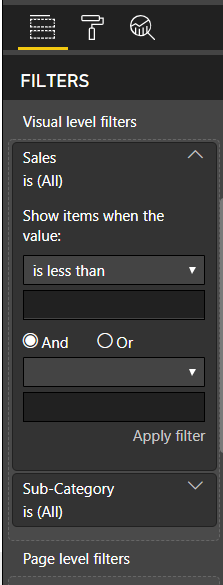
- As shown in the above image, the filter asks you to select the appropriate option from the “Show items when the value:” menu for filtering the field based on whether it is less than or greater than the given number or condition. We can filter the numeric field by specifying an appropriate numerical value and selecting the filtering criteria from the drop-down menu.
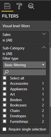
- When the field is a dimension (quantitative value or text), filtering will be straightforward since we do not have to set any numeric condition or criteria. A list of all the available textual values of a particular field is displayed in the filters section, where we can apply appropriate filters by checking the checkboxes, as shown in the above image. After selecting the preferred quantitative or textual fields, click the Apply filter button.
- In the next step, we will see how to add filters to a page created using Power BI.

- Now, drag a specific field from the “Fields” pane on the right side and drop it into the “Page-level filter” segment based on which field you want to sort the information on a report page.
- To filter the total sales information only for the year 2018, we have to select the checkboxes that correspond to 2018 in the Filters section. After customizing date parameters in the Filters section, the visualization will change automatically to display information only for the year 2018.
- After successfully adding filters to the Power BI page, we can try including Power BI filters on dashboards.

- Now, open a pre-built report or Power BI filters on dashboards in the Power BI workspace. Then, drag a specific field from the Fields pane on the right side and drop it into the “Report level filter” segment based on which field you want to sort the information on the visualization report.
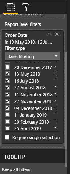
- In the next step, add filters to your report by selecting the appropriate checkboxes in the “Report level filters” section. For filtering the total sales information only for the year 2018, we have to select the checkboxes related to 2018 in the Filters section, as shown above.

- Based on the selected dates in the “Report level filters” section, the report filters and displays the information. Since we selected data for the year 2018, our report will only show the sales information with respect to the year 2018, as shown in the above image.


- You can also add Power BI filters on dashboards by making users easily hover over any visuals and filter any particular field or parameter without altering the overall visualization. Furthermore, we can add new filters to existing reports or new reports that will be created in the future using Power BI.
- Using the filter pane present in the worksheet, we can either add Power BI filters on dashboards to a page or a full report. We can also perform customizations like formatting the filter pane to match the report’s theme, locking or hiding filters, providing filter access to certain users, and much more.
- For adding Power BI filters on dashboards to pane or to all the new reports created using Power BI, we have to configure the filter settings in the Power BI Desktop.
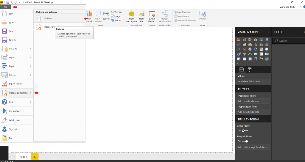
- Go to the File tab in the Power BI Desktop and select Options and Settings. Then, click on Options, as shown in the above image.
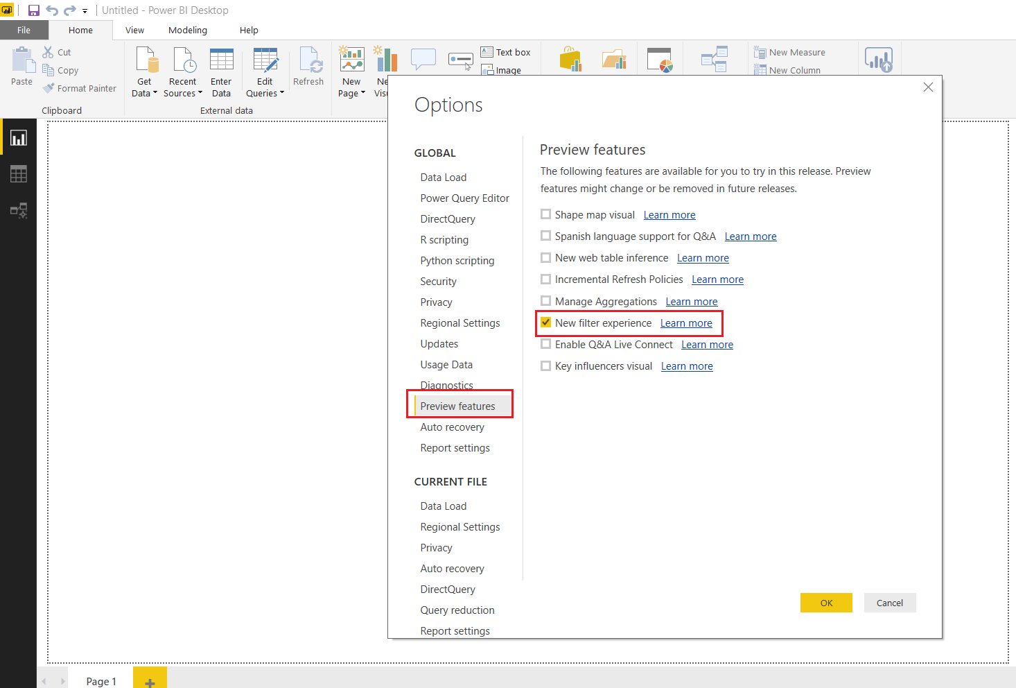
- Now, the “Options” dialogue box is opened. Select the “Preview features” from the left side pane of the “Options” dialogue box.
- We can find various options under the Preview features menu. Select the “New filter experience” checkbox and click the “OK” button.
- Now, we configured the filter settings to add filter panes to all new reports created using Power BI filters on dashboards. Then, for adding filter panes to the existing reports, go to the File tab in the Power BI Desktop and select Options and Settings.
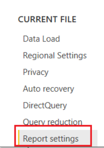
- Select “Report settings” from the left side pane of the “Options” dialogue box, as shown in the above image.
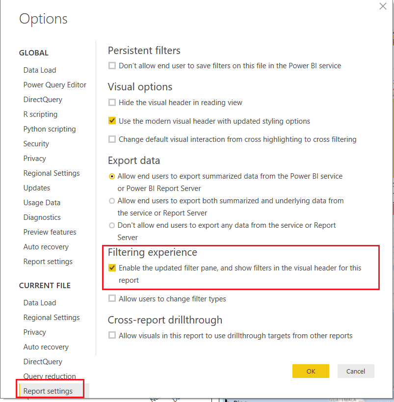
- Now, in the “Visual options” section, select “Use the modern visual header with updated styling options checkbox.” Then, in the “Filtering experience” section, select the first checkbox, as shown in the image given above.
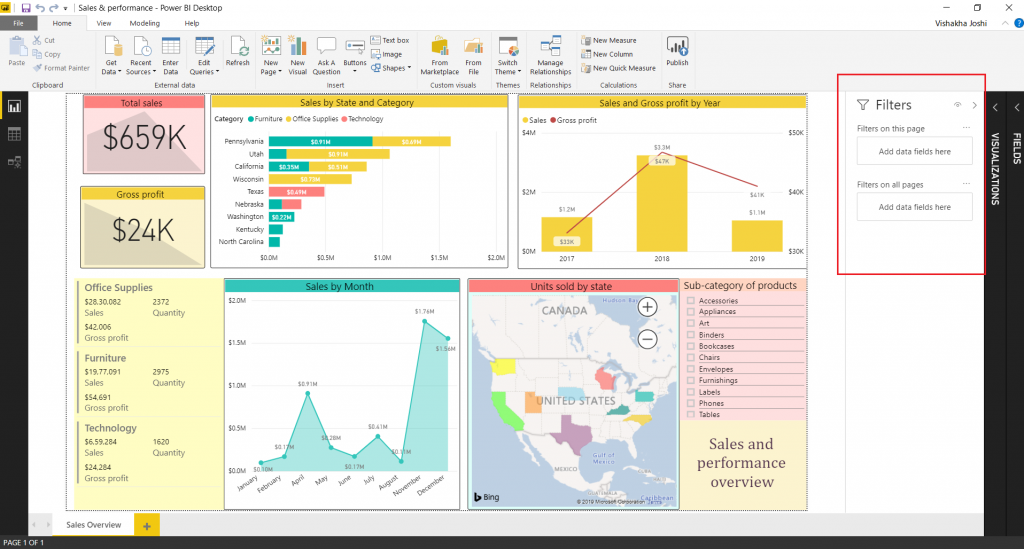
- After configuring the filter settings, a new filter pane is added to the right side of the Power BI report, as shown in the above image. To filter information of the report or dashboard, we need to just drag and drop the appropriate fields to the filter pane.
Conclusion
In this article, you learned about Power BI, types of filters in Power BI, and how to add Power BI filters on dashboards. This article mainly used three types of filters: visual-level filters, page-level filters, and report-level filters. However, Power BI also has some advanced filters like drill-down filters, cross-drill filters, and URL filters, which you can further explore to utilize in your visualizations.
Extracting complex data from a diverse set of data sources to carry out an insightful analysis can be a challenging task and this is where Hevo saves the day! Hevo Data, a No-code Data Pipeline can seamlessly transfer data from a vast sea of 150+ sources to a Data Warehouse, BI Tool like Power BI, or a Destination of your choice. It is a reliable, completely automated, and secure service that doesn’t require you to write any code!
Sign up for a 14-day free trial and simplify your Data Integration process. Do check out the pricing details to understand which plan fulfills all your business needs.
Do share your experience of learning and implementing the Power BI filters on dashboard in the comments section below.
FAQ on Power BI Filters on Dashboard
Can you put a filter on a Power BI dashboard?
Yes, you can apply filters to a Power BI dashboard to control what data is displayed across visualizations. Filters can be applied at Page Level, Visual Level and Report Level.
Why use filters in dashboard?
Using filters in a dashboard helps focus on specific data subsets relevant to analysis, facilitates interactive exploration, and enhances performance by optimizing data display based on user needs and roles.
What are the three types of filters in Power BI?
The three types of filters in Power BI are visual-level filters, Page Level Filters, and Report Level Filters.
How do I add a filter bar in Power BI?
To add a filter in Power BI you can use the “Filters” pane in Power BI Desktop to drag fields onto the canvas, then customize the appearance and behavior of slicers using the formatting options.
Share it with your connections.
-
 Share To LinkedIn
-
 Share To Facebook
-
 Share To X
-
 Copy Link