Data Analytics and Business Intelligence tools that assist organizations in making effective data-driven decisions are constantly evolving like never before. Power BI is one such BI (Business Intelligence) tool that helps organizations conduct an informative analysis of their business and customer data in order to gain actionable insights. Power BI offers a ton of Data Analytics and Visualization features that enable users to create informative Dashboards or Reports and use them to make data-driven decisions. You can easily combine data from various sources and turn it into valuable insights. Power BI Heatmap is one of the most popular visualizations used by data professionals to depict distributed networks, advertisement impact, and so on.
Upon a complete walkthrough of this article, you will gain a decent understanding of Power BI Heatmaps and how they can be leveraged for Data Visualization. You will also learn about the steps required to create Power BI Heatmaps in a seamless manner. Read along!
Table of Contents
What is Power BI?
Power BI is a business analytics tool developed by Microsoft that enables users to visualize data, share insights, and create interactive reports and dashboards. It integrates seamlessly with various data sources, offering robust data modeling, real-time analytics, and collaboration features, making it ideal for data-driven decision-making.
What is a Heatmap?
A heatmap is a data visualization tool that uses colors to represent the magnitude of values in a dataset. It provides an intuitive way to analyze patterns, trends, and relationships within data by highlighting high and low-intensity areas. Commonly used in fields like website analytics, geographic data, and business reporting, heatmaps make complex data easier to understand at a glance.
Are you looking for ways to connect your data sources? Hevo has helped customers across 45+ countries migrate data seamlessly. Hevo streamlines the process of migrating data by offering:
- Seamlessly data transfer between 150+ other sources.
- Risk management and security framework for cloud-based systems with SOC2 Compliance.
- Always up-to-date data with real-time data sync.
Don’t just take our word for it—try Hevo and experience why industry leaders like Whatfix say,” We’re extremely happy to have Hevo on our side.”
Get Started with Hevo for FreeUnderstanding Power BI Heatmaps for Data Visualization
As the name implies, a Heatmap is a type of visualization that is used to project the density of data on a map for any given point. A Power BI Heatmap is a type of visualization that demonstrates the density of data on a map. It is a graphical representation of data in which individual values in a matrix are represented as colors.
Since most businesses deal with structured data, a Heatmap is a powerful tool for cross-examining multivariate data by placing variables in rows and columns where you can Color-Highlight important data containing cells within the table. This is accomplished by highlighting behavioral data with a Warm-to-Cool Color Spectrum. Categorical data is color-coded, but numerical data requires a color scale that blends from one color to the next to show the difference between high and low values.
Power BI Heatmaps are useful for displaying variation across multiple variables, revealing patterns, indicating whether variables are analogous to one another, and determining whether there are any relationships between them. Power BI Heatmaps also provides comprehensive information about an entity or a data point based on certain variables in the dataset.
Applications of Heatmaps in Organizations
Some of the ways in which an organization can leverage Heatmaps in Power BI Dashboards are as follows:
- Heatmaps can be used by businesses to find new locations for distribution or service centers. Companies can map the locations from which they can provide efficient services to the maximum number of customers by analyzing customer density using color patches.
- You can easily identify the locations to run your marketing campaigns and reach out to relevant customers by mapping the data sets gathered from various websites. You can, for example, use demographic data to determine where the majority of your target customers live and when they are most likely to see your campaigns.
- Demographic Heatmaps can also be used to identify areas where a business can expand and open a new franchise to maximize profit. Using radius analysis, one can create customer clusters within the expected area surrounding their new franchise.
- Heatmaps are also relevant to the Sports Industry. At times, in a cricket match, you might have seen a Heatmap demonstrating favorite zones of a batter to play a shot and similarly showing what are the lines where bowlers are getting maximum wickets.
How to Create a Power BI Heatmap?
Different methods to create a Power BI Heatmap
- Custom visual: Use custom map visuals from the Microsoft AppSource marketplace to make geographical heatmaps.
- Conditional formatting: You can apply conditional formatting to tables/matrices to change cell colors based on values to create a heatmap.
For the purpose of this tutorial, let us create a Power BI Heatmap using the custom visual method, representing the population of European Countries. You can access the dataset from here and we’ll suggest you to copy this data to an Excel Sheet.
Step 1: Load the Data
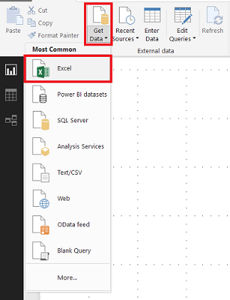
- Open Power BI and click on the Get Data option.
- Now, select the desired format for the input file. For this tutorial, we are going to use Excel for loading the data.
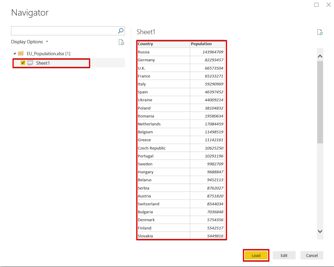
- Select the desired Excel File for loading the data.


Step 2: Import Custom Visualizations
Since Power BI does not offer an in-built Heatmap component, you’ll need to use custom visualizations to create the Power BI Heatmap. Follow the steps given below to do so:
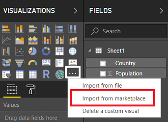
- Navigate to the Visualizations Panel and click on the three dots.
- Now, select the Import from Marketplace option.
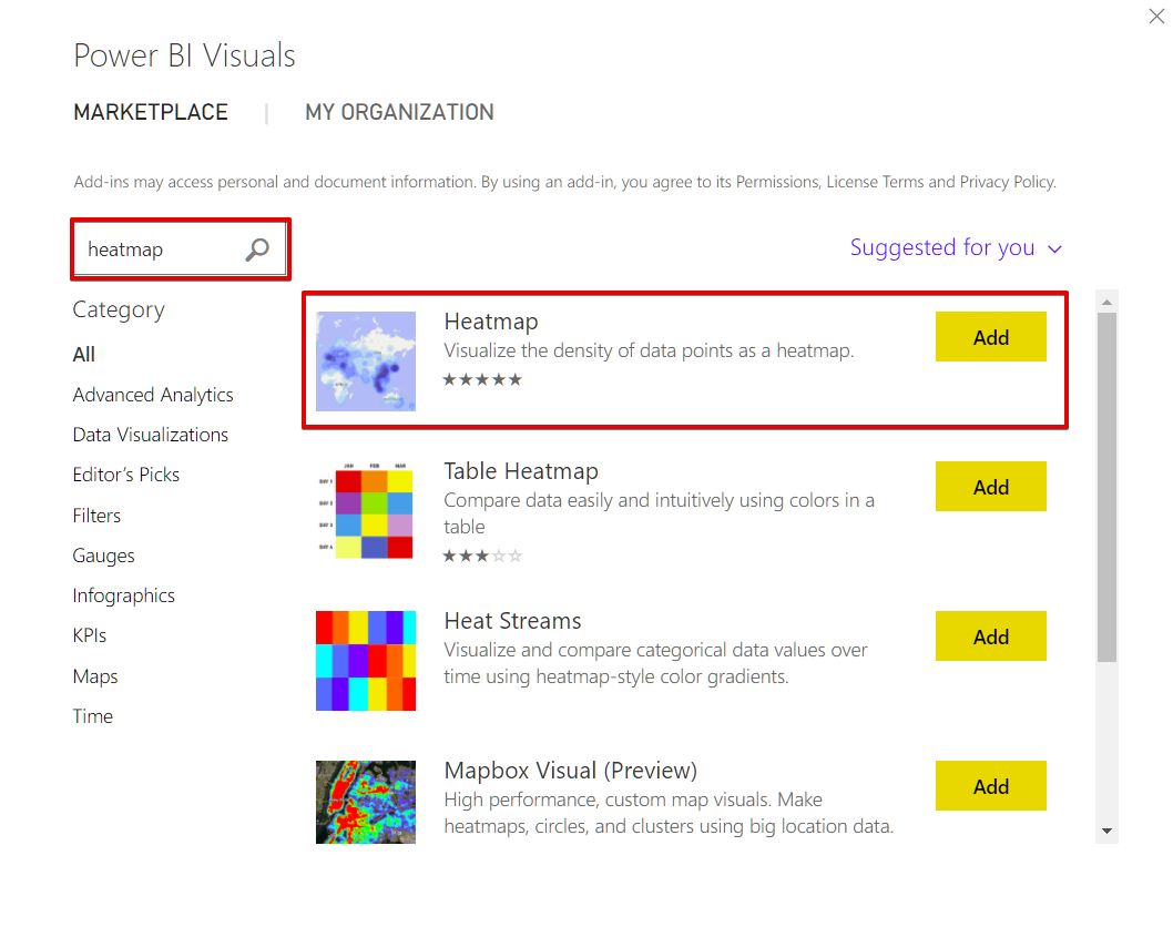
- Search for Heatmap and add it.
- Now, drag the custom visual Heatmap component into the Power BI Design Panel.
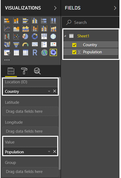
- Drag and drop the Country field to the Location field (ID).
- Drag and drop the Population field to Value.
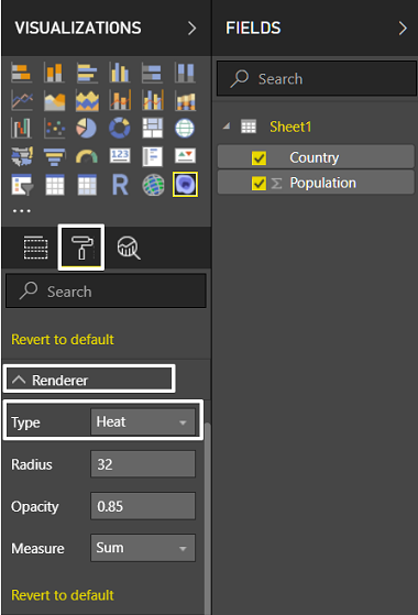
- Change the Renderer Format type to Heat, you can find it under the Format Properties of Heatmap.
- As a result, our population heatmap of European countries will look the following:
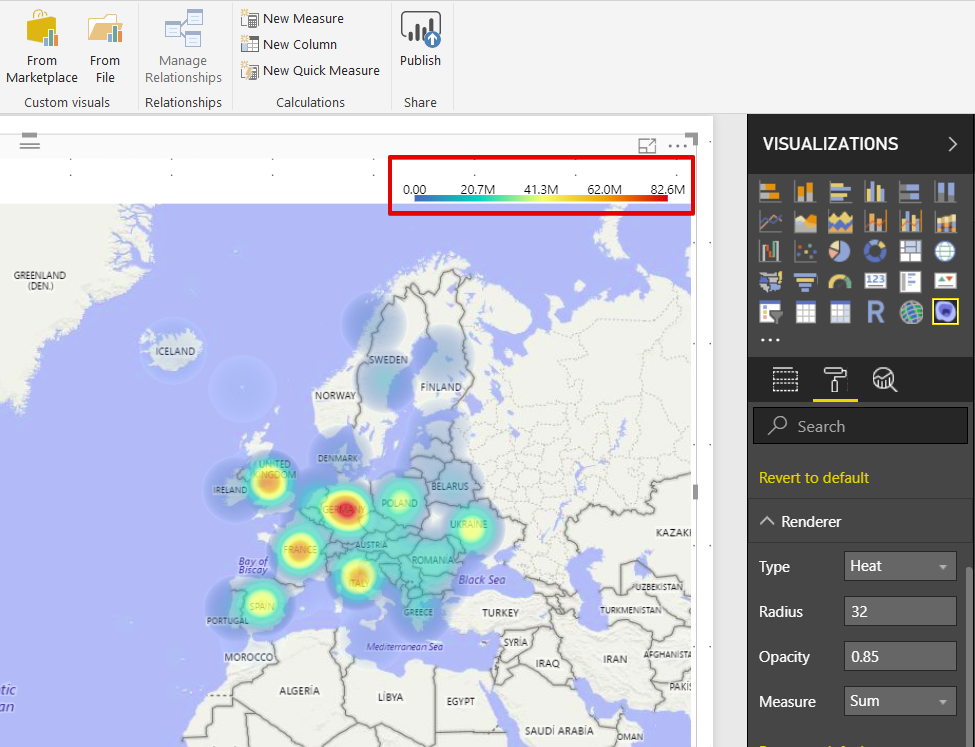
One interesting thing to notice about this Power BI Heatmap is that the legend, which represents the value ranges, is located at the top of the heatmap.
Things to remember while using Power BI Heatmaps
There are some key pointers you should keep in mind while creating Heatmaps in Power BI. Some of them are as follows:
- Power BI Heatmaps are customized visualizations that can only be accessed via Power BI Marketplace.
- Power BI Marketplace has a variety of visualization charts that are rarely used. The visualization section is the only place where you’ll find common charts.
- While creating a Heatmap, always choose a color that represents heat or density.
- Heatmap only deals with numbers.
Conclusion
Power BI heatmaps are a versatile tool for visualizing data patterns and uncovering hidden trends. They allow you to quickly identify areas of interest, such as high-performing metrics or regions that need attention, making them invaluable for data-driven decision-making. By leveraging heatmaps in Power BI, businesses can gain actionable insights and improve strategic planning.
To maximize the value of your Power BI visualizations, having accurate, real-time data is crucial. Hevo, a no-code data pipeline platform, helps you effortlessly integrate data from various sources into Power BI. With Hevo, you can ensure your heatmaps and other analytics stay up-to-date, reliable, and insightful. Ready to enhance your Power BI heatmaps with seamless data integration? Start your free trial with Hevo today!
FAQs
1. What is data mapping in Power BI?
Data mapping in Power BI involves linking data fields from your data sources to the corresponding fields in your Power BI reports and visualizations.
2. What is a heatmap data visualization?
A heatmap is a visual representation of visitor activity data that uses a warm-to-cool color scheme to create hot and cold regions.
3. Can you create a roadmap in Power BI?
Yes, you can create a roadmap in Power BI using custom visuals or by leveraging Gantt charts.

