Data Visualization plays a vital role in today’s revolutionized industry scenarios. It holds various composite and combined indicators and displays them in a single space called Dashboards that provide comprehensive insights from data at-a-glance. There are a wide variety of Data Visualization tools available that can be leveraged by businesses to create easy-to-understand and interactive Dashboards.
This article will provide you with an understanding of how you can build a Tableau KPI Dashboard by stitching together various Key Performance Indicators (KPIs) from numerous worksheets.
Table of Contents
Introduction to Tableau
Tableau is a widely used Business Intelligence tool in the current market. Its popularity is due to its capability of handling Big Data and is relatively simple to deploy, learn and use. Tableau generates insights from the raw data and creates a visual masterpiece for businesses to make data-driven decisions.
Visualizations in Tableau are generated as Worksheets, Dashboards, and Stories. Users can create custom Dashboards that provide actionable insights and help drive the business forward. When configured with the proper underlying hardware and operating systems, all products by Tableau always operate in virtualized environments. Tableau can be used to explore data with limitless visualizations.
Trusted by 2000+ customers across 40+ countries, Hevo elevates your data migration game with its no-code platform. Ensure seamless data migration using features like:
- Seamlessly pull data from over 150+ other sources with ease.
- Utilize drag-and-drop and custom Python script features to transform your data.
- Efficiently migrate data to a data warehouse, ensuring it’s ready for insightful analysis in Tableau.
Experience the simplicity of data integration with Hevo and see how Hevo helped fuel Airmeet’s drive for accurate analytics and unified data.
Get Started with Hevo for FreeUnderstanding the Key Features of Tableau
The key features of Tableau are as follows:
- Tableau Dashboard: Tableau houses an intuitive Dashboard with self-explaining wizards, allowing both technical and non-technical users to create and understand complex visualization easily. All Dimensions and Measures can be analyzed by creating Tableau KPI Dashboards which include numerous charts, graphs, and other forms of visualizations that can be created using a simple drag-and-drop functionality.
- Collaborative Sharing: Tableau allows users to share Dashboards with their peers for collaborative work or review. Users can also share Dashboards on the cloud, which makes them accessible from any part of the world.
- Data Sources in Tableau: Tableau has more than 200+ connectors that give users the ability to connect to a plethora of external data sources like RDBMS, Cloud, Spreadsheet, etc., securely. Tableau also provides several monitoring features such as Data Connectivity, Auto-Refresh, etc.
- Advanced Visualizations (Chart Types): Tableau has a vast collection of simple visualization such as Charts, Tables, Graphs, Maps, etc. along with complex visualizations such as Area Chart, Bar Chart, Box-and-whisker Plots, Bubble Cloud, Bullet Graph, Cartogram, Dot Distribution Map, Heat Map, etc.
- In-Memory and Live Data: Tableau ensures seamless connectivity with data extracted from numerous external data sources in the form of In-memory or live data sources. This gives users the ability to analyze data from various data sources without any restrictions.
- Robust Security: Tableau implements special measures to ensure user and data security. It houses a security system based on permission and authentication mechanisms for user access and data connections.
- Predictive Analytics: Tableau houses several data modeling capabilities, including forecasting and trending. Users can easily add a trend line or forecast data for any chart, and view details describing the fit easily.
Introduction to KPI
KPI stands for Key Performance Indicator and is very useful to assess business performance. KPI offers a glance at various performance metrics such as Sales, Revenues, Trends, etc., and helps businesses make data-driven decisions.
Tableau provides excellent interactive services to create appealing visuals, which plays an essential role in effective communication. Tableau KPI Dashboards can be used to visualize various metrics in the form of Charts and Graphs that seek users’ attention. KPIs are usually color-coded with arrows indicating upward or downward trends.
Prerequisites
- Tableau Desktop or Tableau Services subscription
- Basic understanding of Data Analysis and Visualization.
- Access to Tableau’s in-store sample data called Sample – Superstore.xls
How can I Visualize KPIs Using Tableau?
In this section, you will get an understanding of how you can develop worksheets containing various Key Performance Indicators (KPIs) and later combine them to create a Tableau KPI Dashboard that will provide you with an overall picture at-a-glance. The following steps can be implemented to create a Tableau KPI Dashboard.
Step 1: Create a view that includes the field you want to assess
Let’s consider an example where we will create the ‘sales’ field.
- Connect to the Sample – Superstore data source.
- From the Data pane, drag Sub-Category to Rows and Region to Columns.
- From the Data pane, drag Sales to Text on the Marks card.
Step 2: Create a calculated field that establishes the threshold that demarcates success from failure.
1. In the Analysis menu, select Create Calculated Field to open the calculation editor. Name the calculation KPI and type or paste the following in the formula area.
IF SUM ([Sales]) > 25000 THEN "Above Benchmark" ELSE "Below Benchmark" END2. Click ‘OK’.


Step 3: Update the view to use KPI-specific shape marks
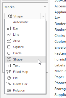
1. On the Marks card, select Shape from the drop-down list of views:

2. Drag the KPI field from the Measures area of the Data pane to Shape on the Marks card.
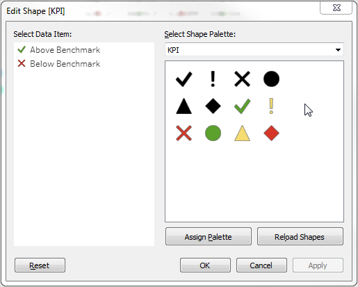
3. Click Shape on the Marks card to open the Edit Shape dialog box.For more about shapes, see Shape in Change the Type of Mark in the View.
4. From the Select Shape Palette drop down list, choose KPI.Now you are ready to associate specific values for the KPI field with specific shapes.
5. Click Above Benchmark under Select Data Item and then click the green check mark in the palette.
6. Click Below Benchmark under Select Data Item and then click the red X in the palette.The Edit Shape dialog box should now look like this:

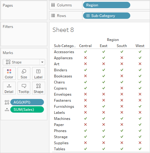
7. Click OK to close the Edit Shape dialog box.The shapes in the view show the correct indicators. Now you just need to hide the sales numbers.
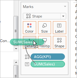
8. Drag SUM(Sales) on the Marks card to Detail.

You now have a completed view that show how individual products (sub-categories) are performing across all four regions

Conclusion
This article you with an in-depth understanding of how you can create Tableau KPI Dashboards and easily keep track of the performance of your business.
Choosing a Business Intelligence and Data Analysis tool for your business can be a tough decision primarily because almost all departments in a business such as Finance, Marketing, etc. now make use of multiple platforms to run their day-to-day operations and there is no single tool that can integrate with all these sources easily. Hence, businesses can consider using automated Data Integration platforms like Hevo.
Hevo helps you directly transfer data from a source of your choice to a Data Warehouse, Business Intelligence tools such as Tableau, etc., or desired destination in a fully automated and secure manner without having to write the code allowing you to create Tableau KPI Dashboards seamlessly. It will make your life easier and make data migration hassle-free. It is User-Friendly, Reliable, and Secure.
Give Hevo a try by signing up for the 14-day free trial today and also check about the pricing to find a suitable plan that fits your business needs.
Frequently Asked Questions
1. What is the KPI dashboard in Tableau?
A KPI dashboard in Tableau visually tracks key performance indicators (KPIs) to measure performance against targets. It displays metrics like revenue, growth, or customer satisfaction, enabling quick decision-making.
2. How do I show KPI on my dashboard?
-Create calculated fields for KPI logic (e.g., targets).
-Use visual indicators like shapes, colors, or gauges to display results.
-Add these to your dashboard using charts and formatting.
3. How to make an indicator in Tableau?
Use calculated fields with logic (e.g., IF statements) to define thresholds. Add the field to a sheet and represent it using shapes, text, or colors. Place this in the dashboard as an indicator.


