A Pie Chart is a type of interactive Data Visualization. The chart, which is represented in a circular pattern, is useful when determining the shares or contributions of various categories. The shares are effectively percentage contributions in Total. The Angle of the sector that represents the category corresponds to the share size for that category.
Pie Charts are simple to create in Tableau. Tableau, in reality, has a self-explanatory method for creating Pie Charts. Pie Charts work well in Dashboards and, when paired with other types of Charts, can provide good Data Insights. This article will help you understand the various Tableau Pie Charts.
Table of Contents
What is Tableau?

Tableau is a popular Business Intelligence and Data Analytics tool that was designed to help organizational decision-makers visualize, analyze, and understand complex business data so that they can make data-driven decisions. It may be used to create a wide range of interactive displays as well as retrieve relevant data.
Tableau was founded in 2003 as part of a computer science project at Stanford with the goal of improving the flow of any data study by using simple visualizations to make data more accessible and apparent to humans.
Key Features of Tableau
- It connects to any Cloud-based platform, such as Salesforce and Google Analytics, as well as SQL-based databases (MySQL, PostgreSQL, MariaDB, MongoDB, etc).
- Tableau has a drag-and-drop interface that is easy to use.
- It connects with data stored on-premises as well as data stored in the cloud.
- For studying and identifying Data Trends, Tableau provides a number of visualization options.
- Tableau allows you to create Interactive Dashboards and share them with both internal and external stakeholders.
- Tableau makes combining data from several sources a breeze.
- Tableau allows you to ask natural language inquiries about your data.
For further information on Tableau, check out the official website.
Why is Data Visualization Important?
Let’s have a look at an example. Assume you make a Line Chart using a Data Visualization of the company’s profits from 2010 through 2020. It’s possible to imagine the line continuing to rise indefinitely, with a drop-in only in 2018. So, except for a loss in 2018, you can see in a flash that the corporation has had uninterrupted earnings in all of the years. Getting this information quickly from a data table would be difficult. This is just one example of how Data Visualization may be beneficial. Let’s look at some more reasons why Data Visualization is important.
- Data Visualization Discovers the Trends in Data
- Data Visualization Provides a Perspective on the Data
- Data Visualization Puts the Data into the Correct Context
- Data Visualization Saves Time
- Data Visualization Tells a Data Story
What is a Pie Chart in Tableau?
A Pie Chart is useful for organizing and displaying data as a percentage of the total. This type of representation, as the name suggests, employs a circle to represent the whole and slices of that circle, or “pies,” to represent the various categories that make up the whole. This type of graph allows the viewer to compare the relationships between several Dimensions (for example, categories, goods, individuals, countries, and so on) within a given context. The graphic divides the Numerical Data (measure) into percentages of the overall sum in most cases. Each slice represents a percentage of the whole value and should be measured as such.
1) Simple Pie Charts
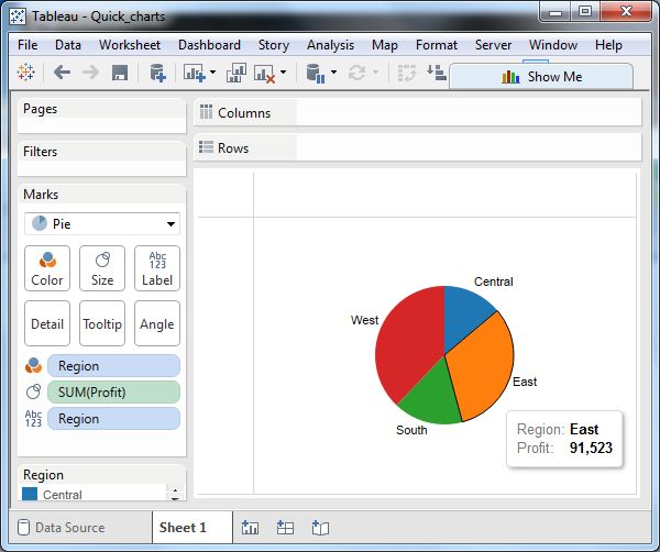
To make a Simple Pie Chart, pick one Dimension and one Measure. Take, for instance, the Region Dimension and the Profit Measure. In the colors and label markings, remove the Region Dimension. In the size mark, drop the Profit Measure. Select Pie as the chart type. The following graph displays/depicts the four zones in various colors.
2) Drill-down Pie Charts
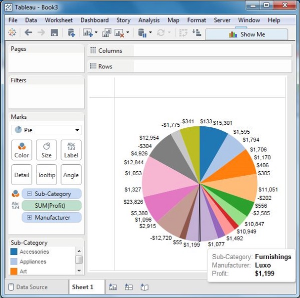
You can choose a Dimension with a hierarchy, and the chart changes to reflect the level of the Dimension chosen as you go deeper into the hierarchy. You’ll use the dimension Sub-Category as an example, which contains two more levels: Manufacturer and Product Name. Take your Profit and put it in the Labels box. The values for each slice are displayed in the Pie Chart below.
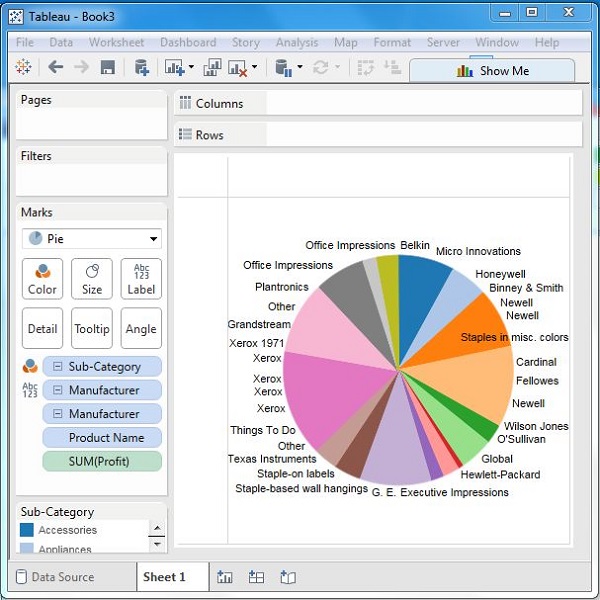
Going one more level into the hierarchy, you get the manufacturer as the Label and the above Pie Chart changes to the below one.
What type of Analysis is Supported by Pie Charts?
To depict the link between separate components and the whole, pie charts should be employed. They’re most effective with Dimensions with a small number of categories. A Pie Chart can make a story inside the data pop out if you need to stress that one portion of the entire is overrepresented or underrepresented. When comparing exact Statistics, Pie Charts aren’t very useful.
How do you read a Pie Chart?
You must evaluate the Area, Arc Length, and Angle of each slice when reading a Pie Chart. Since comparing slices can be difficult, meaningful organizing is essential. To make it easier for the user to read, the slices in a Pie Chart should be grouped in a Logical Order, usually from largest to smallest. To correctly assimilate the facts, begin with the largest component and work your way down to the smallest. The colors of the slices should correspond to the blocks in the legend, reducing the need for viewers to review the legend.
In most cases, the entire Pie Chart (or the sum of the quantitative values or slices) is not displayed. It’s usually listed near the chart in the text, in a table detailing individual Data Metrics, or as a separate ban in another Dashboard.
Three-Dimensional Pie Charts are confusing and difficult to interpret. Since the Size, Arc Length, and Angle of each slice are used to understand a pie chart, a Three-Dimensional representation of this chart type will tilt the pie and skew your visual view of its slices. Due to the visual imbalance that might occur between slices, using a Three-Dimensional Pie Chart can make proper category comparisons practically impossible.
When does a Pie Chart come in handy?
A Pie Chart can help display each value of a category within the overall if you have a Dimension with only a few categories to compare. The graph should be understood as a comparison of each group to the others, establishing a category. The “whole” could be anything as long as the category can be divided into Distinct Slices that can be distinguished.
Understanding the Steps Involved in Setting Up Tableau Pie Charts
Step 1: Load the Dataset
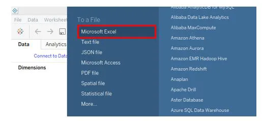
Click “New Data Source” to import the dataset into Tableau. Alternatively, you can select “Connect to Data” from the drop-down menu.
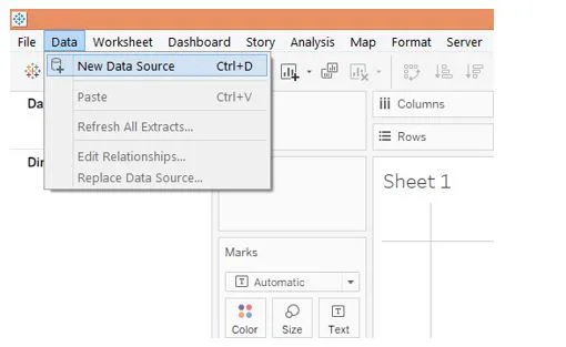
Select the appropriate data source type from the pop-up window. Since the Data Source type in this situation is MS Excel, as indicated in the screenshot below, you need to select Microsoft Excel.
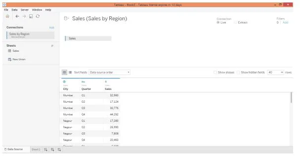
The dataset will appear in the “Data Source” tab once it has been loaded, as illustrated in the accompanying screenshot. It’s usually a good idea to look over the dataset and make sure that all of the entries and variables have been imported successfully without affecting the forms. This is crucial before moving on to the Analysis.
Step 2: Construct a Bar Chart
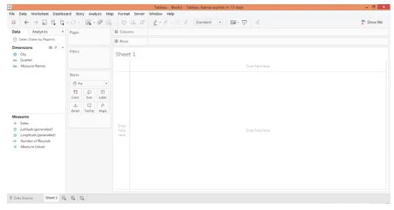
The Dimensions City and Quarter, as well as the measure Sales, are loaded into the appropriate sections on the Sheet tab, as shown below.
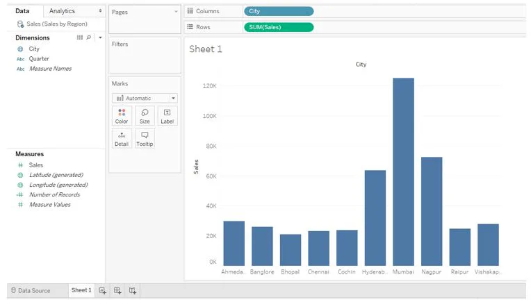
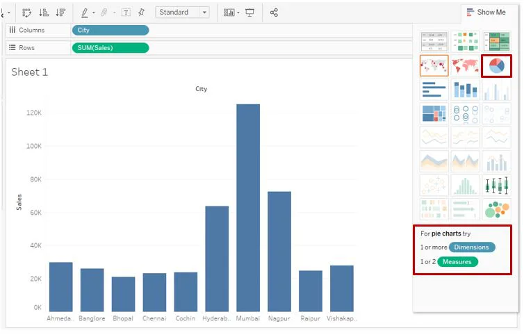
To begin, drag the City dimension into the Columns zone and the Sales dimension into the Rows region. This results in a simple vertical Bar Chart, as illustrated in the screenshot below.
Step 3: Convert a Bar Chart into a Pie Chart
The following step is to change the Bar Chart to a Tableau Pie Chart. To do so, go to Show Me and, under Options, click on the Tableau Pie Chart icon in the Show-Me, as seen in the screenshot below.
When the mouse hovers over the Tableau Pie Chart symbol, conditions regarding the number of Dimensions and Measures get displayed on the lower side. This instructs the user, particularly new users, on how to use the Chart effectively.
Step 4: Increase the Size of the Pie Chart
The Pie Chart seen in the screenshot below is the result of the above stages. You can see that the Pie Chart appears to be little, and you need to double-check whether the sectors indicate percentage contributions or not. You’ll make the necessary changes by following the steps outlined above. Dimension City has been put over Color on the Marks card, as can be seen. Sales Dimension has been applied twice, the first on Angle and the second on Size. When creating a Pie Chart, it’s critical to understand how measures are applied to the items in the Marks card, as this has an impact on the Chart.
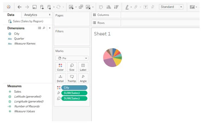
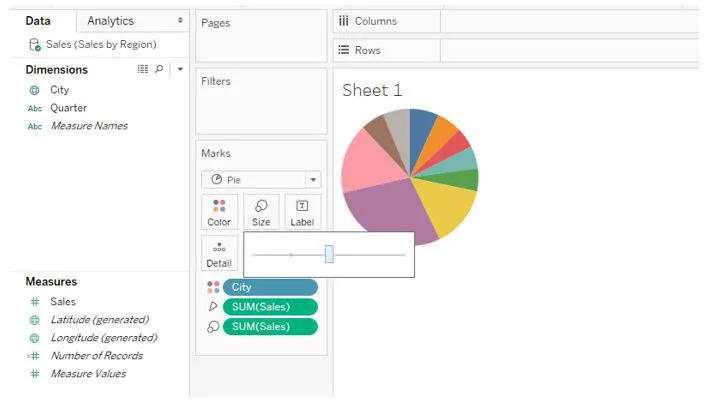
Using the slider in the Marks card’s Size option, you can change the circle’s size. Note that using the maximum size may cause the Chart’s shape to be disrupted, therefore the slider should be used carefully.
Step 5: Drag and Place Dimensions to Label Card
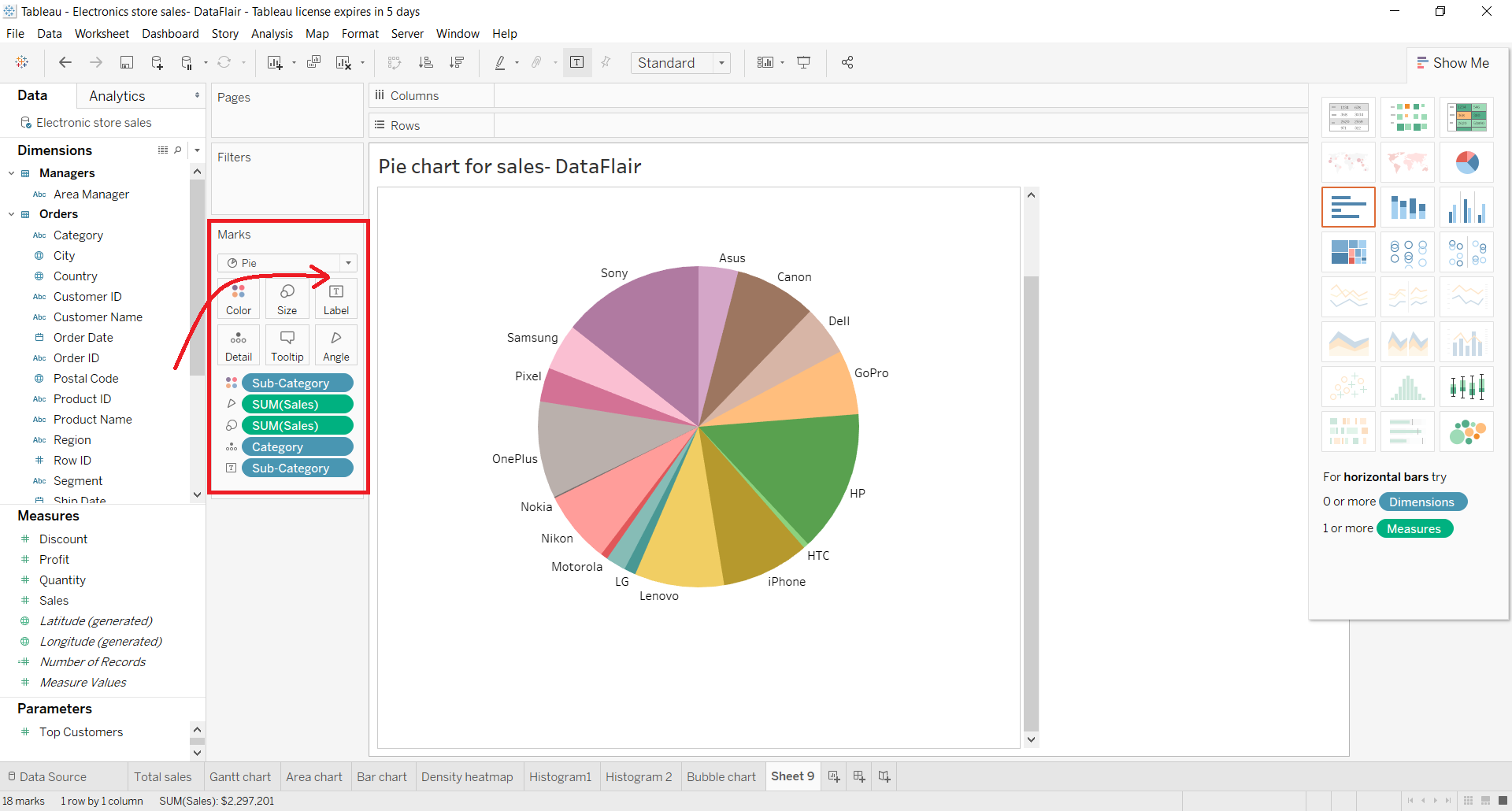
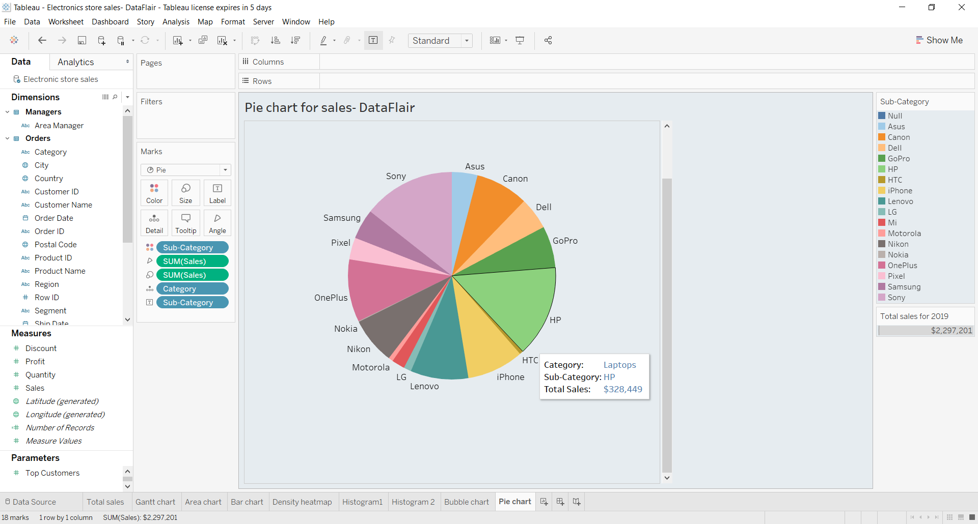
The Marks section will now contain all of the selected Fields. To add labels to the Tableau Pie Chart, drag and drop fields from the Dimensions or Measures section to the Label card. You added a field called Sub-Category to the Tableau Pie Chart, as shown in the screenshot below. This populates each pie segment with the names of all the brands or subcategory items. For the Pie Chart, you may add details and colors in the same way.
Step 6: Apply Formatting to the Pie Chart
Tableau also provides a plethora of Tableau Pie Chart formatting possibilities. The Format option allows you to customize the appearance of a Pie Chart. Right-click on the Pie Chart and select the Format option.
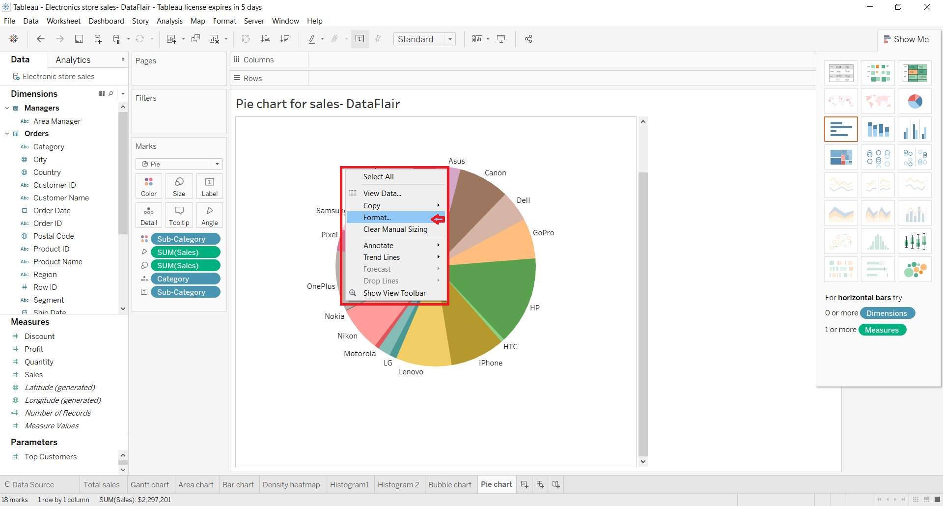
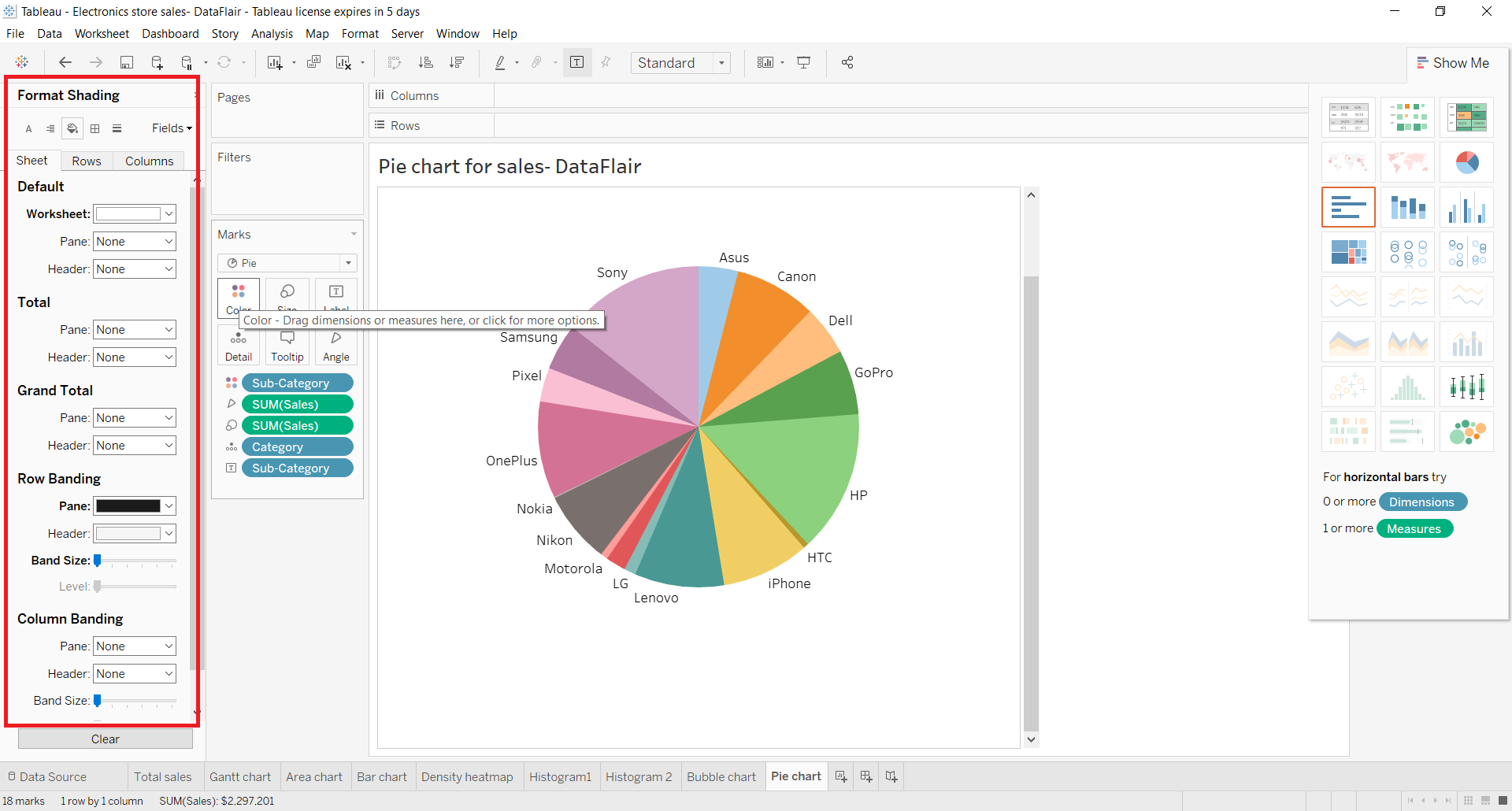
A Format window will open on the left, with several options for designing the Pie Chart, including Text Editing, Borders, Backgrounds, Shading, and so on. Make any modifications you like and you’ll have a Tableau Pie Chart of your choice.
Step 7: Check the Final Pie Chart
The Tableau Pie Chart depicting the overall Sales of each subcategory or electrical brand is now complete. You can see details specific to each colored section of the pie by hovering your cursor over it.
Best Practices for Tableau Pie Charts
- Each Pie Slice should be accurately labeled, with the relevant Number or Percentage linked to it. To make comparisons of slices easier for the User, the slices should be arranged by size, either from largest to smallest or smallest to largest.
- Use Legends and External References sparingly because they make it more difficult to remember the dimensions.
- When possible, labels should be affixed to the slices themselves.
- If the chart includes more than 5 slices, you should consider using a new chart style; but, if you want to keep going, make sure to include a legend, list, or table to provide the viewer with more information.
- NEVER complicate the visual display. A Three-Dimensional Pie Chart is far more difficult to interpret. Adding extra Graphics or Logos to the chart can make it appear cluttered.
When should you not use Tableau Pie Charts?
It is not advisable to use Pie Charts when:
- There are too many categories in your Dimension.
- Within the given Dimension, similar percentages/numbers exist between Distinct Values.
- The data does not represent a “whole” or the percentages do not add up to 100%.
- In your measure value, there exist Negative Values or Complex Fractions.
Ineffective examples of Pie Charts
Example 1
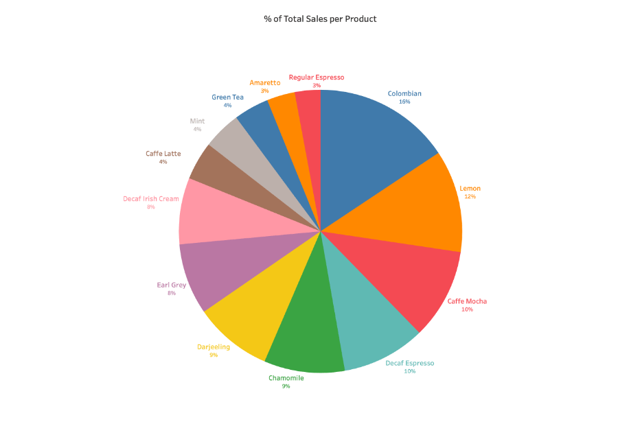
Someone made a highly complicated Pie Chart in an attempt to represent the many different types of coffee and tea served at the market.
- The graph is cluttered by too many slices.
- The values in the slices are comparable. The labels do not match the slices.
- There are two instances of the same color.
Example 2
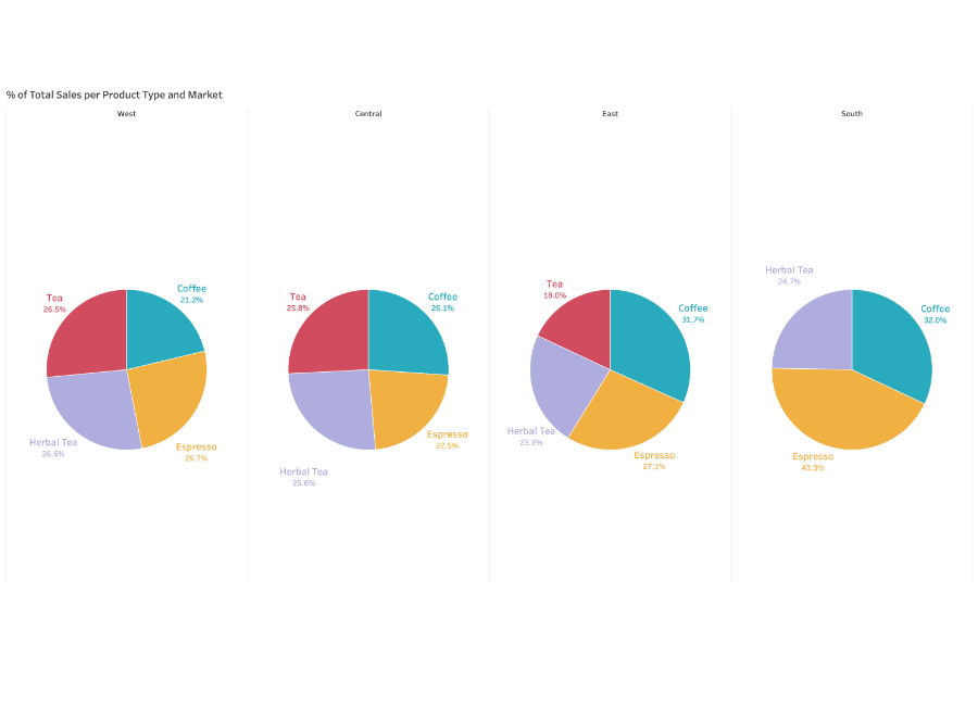
Someone made a highly complicated pie chart in an attempt to represent the many different types of coffee and tea served at the market.
For comparison, two or more Pie Charts should not be placed next to each other. Different percentages for different types of products sold are shown in different markets.
- The link between markets isn’t obvious.
- Three slices are shown on one Pie Chart, while four are shown on the others.
Key Pie Chart Alternatives
Since the Pie Chart has so many flaws, it’s important to have a backup strategy. There are many alternatives to Pie Chart, each of them having its unique qualities and being appropriate for a variety of situations.
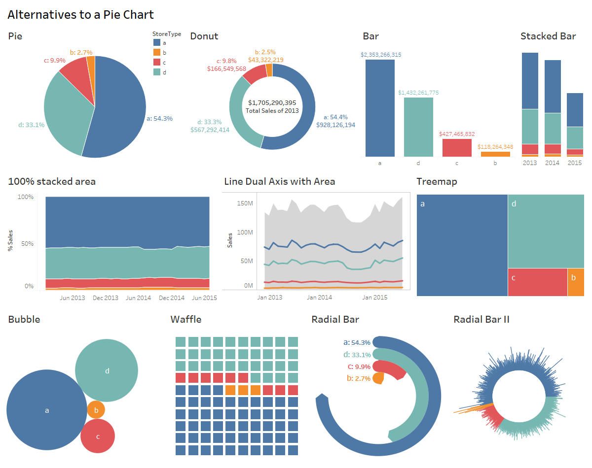
- A Donut Chart is a better version of a pie chart. We can use the hole to show other information, such as total sales.
- You can use a Bar Chart if you want a more accurate comparison. When the two are near, it can imply multiple relationships or a size relationship.
- A Stacked Bar Chart can also be used to depict the relationship between parts and wholes. It also adds another dimension to your life.
- Line and Area Charts are ideal choices for displaying percentage correlations in time series data. A Dual Axis Line Chart with Area could be used. Individual trends are compared over time using lines, while overall sales are displayed in the area.
- The 100% Stacked Area Chart offers greater relative comparisons over time and saves space.
- A Treemap is a suitable alternative to a pie chart since it allows for easier and more exact comparisons. Treemap also makes the most of the available area.
- A Bubble Chart is a means of comparing data without using axes. Bubble size comparisons are more accurate than slice comparisons.
- Since Areas and Angles aren’t effective visual comparison features, Waffle Chart relies on counting, which is both accurate and intuitive. It also utilizes a lot of space.
- In comparison, the Radial Bar Chart preserves the circle visual feature while becoming more visually pleasing and accurate.
- Two levels of comparison are provided by the Radial Bar Chart II. It can also compare StoreType-based sales at the store level. It’s a cool chart, except for the precision.
Other options are the Bump Chart and the Dumbbell Chart. You can choose from five unique Pie Chart alternatives.
These Pie Chart options will speed up your time to insight while simultaneously improving the Accuracy, Precision, and Actionability of your Analysis.
Learn More About:
Conclusion
As organizations expand their businesses, managing large volumes of data becomes crucial for achieving the desired efficiency. Tableau Pie Chart powers stakeholders and management to collaborate their workflow and build a quality Report, meeting the requirements with ease. In case you want to export data from a source of your choice such as Tableau into your desired Database/destination then Hevo Data is the right choice for you!
Share your experience of learning about the Tableau Pie Chart! Let us know in the comments section below!


