


Visualizing data allows users to have a perfect combination of aesthetic features like dimensions, colors, and labels to create visual masterpieces that reveal surprising business insights. It’s an inevitable aspect of Business Analytics since data is being collected and analyzed from various sources to make informed decisions.
Data visualization software like Tableau allows Data Analysts and Business Professionals to help their businesses understand data for business growth. Tableau is one of the most popular BI and Data Visualization Tools for visualizations/data discovery where you can create a bar chart, line graph, or doughnut chart in Tableau. It’s swift to deploy, easy to learn, and very intuitive to use and collaborate.
In this article, you’ll learn about the Tableau Business Intelligence Application and the steps to create a doughnut chart in Tableau. The doughnut chart in Tableau is an improved version of a pie chart where it is easy to visualize and compare individual dimensions.
Table of Contents
Prerequisites for Setting Up Doughnut Charts in Tableau
To set up and create your own doughnut chart in Tableau, it’s helpful to have a solid understanding of the different types of charts and their working.
If you would like to know more about the various charts and visualizations available in Tableau, you can visit the following link- How to Create and Use Tableau Dual Axis Charts Effectively?.
In case you are new to Tableau, we have some useful links to get started:
- What is Tableau? – A Comprehensive Guide
- How to Install Tableau Desktop & Online? | The Best Guide 2022
- What is Tableau Dashboard and How to Build it?
What is Tableau?
Tableau is a powerful and rapidly evolving Data Visualization program. It aids in the conversion of raw data into an easily understandable format. Tableau assists in the generation of data that specialists at all levels of an organization can understand. Custom dashboards are simple to create even for those with little technical skills.
Tableau allows for quick Data Analysis and the creation of graphics in the form of dashboards and workbooks.
For smooth data integration, Hevo ensures seamless migration and transformation, making your data ready for Tableau’s advanced analytics. Try Hevo and equip your team to:
- Instantly load and sync your transformed data into your desired destination.
- Integrate data from 150+ sources(60+ free sources).
- Simplify data mapping with an intuitive, user-friendly interface.
Don’t just take our word for it—try Hevo and experience why industry leaders like Whatfix say,” We’re extremely happy to have Hevo on our side.”
Get Started with Hevo for FreeKey Features of Tableau
- Advanced Visualization: Tableau allows you to create a wide range of visualizations, from simple Pie Charts and Bar Graphs to more complicated Histograms and Gantt Charts.
- Usability: It’s easy to use and doesn’t require any technical or programming knowledge. When it comes to constructing a dashboard, it responds quickly. Tableau may be downloaded to mobile devices and desktop computers, making it easy to access and analyze data. Multilingual data representation and real-time data exploration are supported.
- Connection and Sharing: It comes with many advanced features, such as cooperation and data distribution.
- Security: Multiple data sources are linked together in a highly secure manner. Importing and exporting massive amounts of data is simple.
Tableau Desktop
Tableau Desktop has a rich feature set and allows you to create and customize reports. From creating the charts and reports to blending them to form a dashboard, you can create all necessary elements in Tableau Desktop.
For Live Data Analysis, you get connectivity to Data Warehouse and other types of data sources. You can locally or publicly share the workbooks and the dashboards.
Tableau Desktop is classified into Personal and Professional based on the connectivity to the data sources and publishing option:
- Tableau Desktop Personal: Has the development features like Tableau Desktop, but this version keeps your workbook private and offers limited access. You can’t publish the workbooks online.
- Tableau Desktop Professional: Pretty much similar to Tableau Desktop, but the difference is that your work can be published on Tableau Server or Online. You also get full access to all types of the datatype in the Professional version. This version is suitable for users who want to publish their work.
Tableau Public
This version is specially built for cost-effective users. In the Public product, workbooks created cannot be saved locally; you should save them to Tableau’s public cloud. However, the public cloud is accessible to everyone, and there is no privacy to the files saved. Tableau Public version is suitable for individuals who want to learn Tableau.
Tableau Server
You can use it to share visualizations and workbooks created in Tableau Desktop. You will have to first publish your work on Tableau Desktop to share it on Tableau Server, and then it will only be accessible to licensed users.
Tableau Online
It’s an online sharing tool with similar functionalities to the Tableau Server. However, the data is hosted in the cloud servers maintained by the Tableau group.
Tableau Reader
This free tool allows users to view workbooks and visualizations. With Tableau Reader, you can filter the data but not edit or modify it.
What is a Doughnut Chart in Tableau?

As the name makes you think, the doughnut chart in Tableau has a doughnut-shaped figure. They are the same as pie charts with a hole in the middle. They are also called donut charts and are often viewed as modified pie charts that eliminate the need to compare the area or size of the slice. The doughnut chart in Tableau shifts the focus from area to the length of the arc, which is easy to measure.
Doughnut charts are like piled bar charts, curled around themselves so that both ends meet and form a circle. People prefer the donut chart over the pie chart because of space efficiency and data intensity ratio. You can use the hole in the middle of this chart to convey additional information, like labels of the arc and the total number of data.
Benefits of Using Doughnut Chart in Tableau
- The doughnut chart in Tableau is a reader-friendly chart that can be easily understood even by non-professionals.
- The readings are easy to understand with text boxes and label insertion.
- Users can display multiple data sets with a doughnut chart.
- Users can place additional information about the total value or data labels in the hole of the doughnut chart.
- The percentage values are automatically calculated when the doughnut chart in Tableau is drawn.
- Unlike pie charts, you can use doughnut charts to compare data sets where you can highlight data points by manipulating the pieces of the chart.


Drawbacks of Using Doughnut Chart in Tableau
- The doughnut chart in Tableau is difficult to understand when there are too many slices or data categories.
- Tableau will not identify the negative data unless it’s marked. It is advised to avoid using a doughnut chart when you have negative values in your data.
- It’s great for data comparison but not for data analysis since it’s hard to grasp all data points from one doughnut.
- You cannot determine the exact value by looking at the doughnut chart.
Doughnut Chart vs Pie Chart: What’s the Difference?
When deciding between a donut chart or pie chart for your presentation, ensure the data you’re using is for comparison analysis since both charts are usually limited to comparing the differences between categories.
Although doughnut charts have originated from pie charts, they still share some differences:
- Types: There are six main types of pie charts and only two doughnut charts, simple and exploded.
- Usage: Doughnut chart compares each value contribution to the total. The pie chart does the same except for the hole in the center.
- Comparison: A doughnut chart allows you to compare two series, but you need two different pie charts for comparing series.
- White Space: Pie charts do not have white space in the middle that can be used to show totals, lifting comparisons and trend arrows.
How to Create a Doughnut Chart in Tableau?
To create a doughnut chart in Tableau, you can use the “superstore data set” that is automatically downloaded when installing Tableau Desktop and Public. It’s available under the ‘My documents’ folder in the Tableau repository. The doughnut chart you create with this dataset will show category-wise sales for a superstore.
To create your doughnut in Tableau, follow these steps:
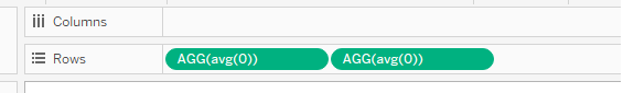
Step 1: Set the Base
Enter the following in rows field.
AVG(0) AVG(0)
You will get the following results:
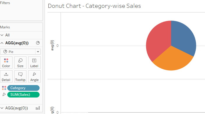
Step 2: Put your First Feature
Under the Marks card in Tableau, select the pie chart in the drop-down menu. Drag and drop Category dimension to the colors card and Sales dimension to the angle card. When you increase the size of the marks card, you will see the following:
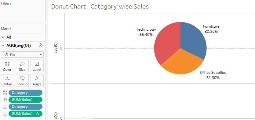
Step 3: Improve visualization
- Drag and drop both Category and Sales to Label cards.
- Under the Labels option, right-click on Sales > Quick Table Calculation > Percent of Total. With this step, you can see the total share of each category compared to the total sales value.
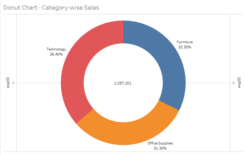
Step 4: Set the Aggregate
Now, click on the second AGG(avg(0)) under the Marks card in Tableau.
- From the dropdown menu, select the Circle Chart.
- Go to Color Card > select White. This will help us to create a hole in a doughnut chart.
Step 5: Combine the Two Measures
To put everything together, select the Dual Axis chart feature in Tableau. Increase the size of the pie chart from the Marks Card section, and your doughnut chart in Tableau is ready.
Conclusion
Creating a Doughnut Chart in Tableau is a simple yet effective way to represent data visually, combining aesthetics with functionality. With just five straightforward steps, you can build a chart that highlights key metrics and comparisons in an engaging format. Doughnut charts are especially useful for showcasing proportions, making them a valuable addition to your data visualization toolkit.
For seamless data preparation and integration to enhance your Tableau visualizations, rely on tools like Hevo to ensure your data is always accurate and analysis-ready.
Ready to elevate your visualizations? Explore smarter data solutions today!
Frequently Asked Questions
1. What is a donut chart in tableau?
A donut chart is a variation of a pie chart with a hollow center, used to display proportions of a whole.
2. What are doughnut charts used for?
They are used to visualize part-to-whole relationships while keeping the center for additional data or text.
3. How to create a donut chart?
Combine a pie chart with a dual-axis chart, using a calculated field for a central hole effect. Overlay text in the center.
Share it with your connections.
-
 Share To LinkedIn
-
 Share To Facebook
-
 Share To X
-
 Copy Link


