


Numerous studies and research on human psychology and perception show that we process visual information far more quickly than written text or facts. As a result, organizations are keener on employing Visualization Tools to better understand scenarios as varied as Customer Sentiment, Real-Time Sales, Market Behavior, and more. By using Visualization Dashboards and representations like Heat Map Google Sheets, you can get deeper context on important Numbers, Trends, Metrics, and Key Performance Indicators (KPIs).
In this article, you will learn how to build visually effective Heat Map Google Sheets that will help you better understand your company’s performance and speed up your decision-making process.
Table of Contents
Introduction to Google Sheets

- Google Sheets is a free web-based Spreadsheet software created by Google as part of their Google Drive Office Suite, which competes with Microsoft Office. The Google Office Suite (Workspace) consists of Gmail, Meet, Drive, Chat, Docs, Slide, Sheets, Forms, and Keep as core office apps.
- It also contains apps like Jamboard, Cloud Search, Voice, Groups, Classroom, Vault, and many others.
- Google Sheets is used for any activity involving the recording and analysis of data i.e. from Digital Marketing to Financial Modeling and from Record Management to Statistical Analysis. You can use Sheets to build dashboards, write formulas, and even develop applications.
- Google Sheets can support XLS, XLSX, XLSM, TXT, ODS, and CSV file formats, making it simple to read and convert into Microsoft Office files directly from Google Drive.
- Google Sheets are also used as databases for handling small amounts of data.
- By integrating features like pivot tables, VLOOKUP, etc you can create dynamic dashboards.
Take advantage of Google Sheet’s robust feature set by seamlessly connecting it with various destinations using Hevo. Hevo’s no-code platform empowers teams to:
- Integrate data from 150+ sources(60+ free sources).
- Simplify data mapping and transformations using features like drag-and-drop.
- Easily migrate different data types like CSV, JSON, etc., with the auto-mapping feature.
Join 2000+ happy customers like Whatfix and Thoughtspot, who’ve streamlined their data operations. See why Hevo is the #1 choice for data visualization.
Get Started with Hevo for FreeUnderstanding Heat Maps for Data Visualization
One of the emerging Data Visualization Techniques that are being used widely today is Heat Map Visualization. With Heat Map Visualizations, you can visually see the distribution of data points in a Geographic Region or in a Tabular Matrix, where the individual values contained are represented as colors. Read about creating heat maps in google analytics 4 to simplify your data visualization.
Since businesses typically deal with structured data, a Heat Map is a powerful tool for cross-examining multivariate data by placing variables in rows and columns where you can Color-Highlight Important Data containing cells within the table. This is achieved by using a Warm-to-Cool Color Spectrum to highlight Behavioural Data. Color-coding is used for Categorical Data, but Numerical Data requires a colour scale that blends from one colour to the next to show the difference between high and low values.

Prerequisites
- Working Knowledge of Spreadsheets.
- A Google Account.
Steps to Create a New Spreadsheet on Google Sheets
The process is pretty simple for you to get started on Google Sheets. To create a new Spreadsheet in Google Sheets, follow the steps below:
- Step 1: On the Google Drive Dashboard, Click on New.
- Step 2: Then click on Google Spreadsheet. A Spreadsheet will appear in a new browser tab, you can start working on this Blank Spreadsheet. Alternatively, you can hover the mouse cursor on ‘Google Spreadsheet,’ and on the right drop-down list, select either a Blank Spreadsheet or choose one from a Template.
- Step 3: To name your Spreadsheet, locate and select Untitled Spreadsheet at the top left of the page. Type a name for your Spreadsheet, then hit Enter.
Note: You can also click on the Google Suite Icon on the Homepage of Chrome Browser, scroll down and select the Sheets icon.


Steps to Build Heat Map Google Sheets
With Google Sheets’ new addition of conditional formatting (a few years ago), you can transform any data set into colourful Heat Map Google Sheets in just a few simple steps. Not only is this useful for spotting trends and patterns, but it also eliminates the need for a separate Chart or Graph.
We will discuss the following two steps to create your own Heat Map Google Sheets:
Step 1: Getting Started with Heat Map Google Sheets
For creating Heat Map Google Sheets, follow the simple steps below:
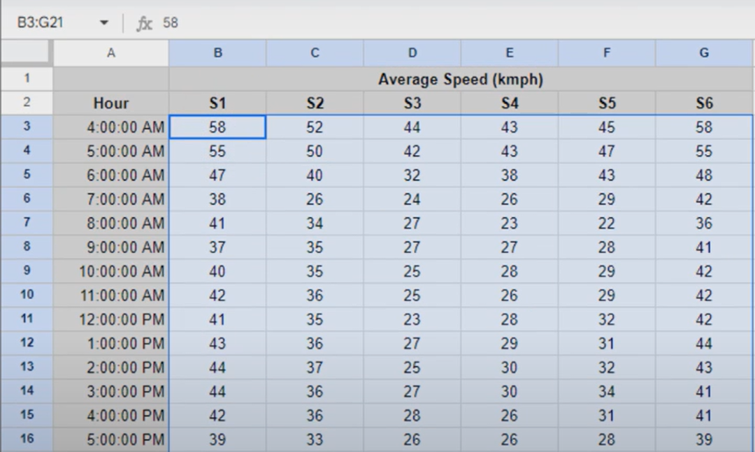
- Select the data in the Google Spreadsheet.
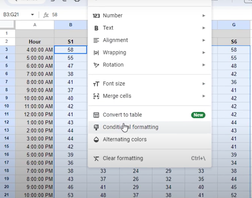
- Select Format and then click on Conditional Formatting. This will open a Conditional Format Rules Panel.
- In the Color Scale panel, select Preview under Format Rules and choose a colour spectrum.
- Select the colours for your Minpoint, Midpoint, and Max point.
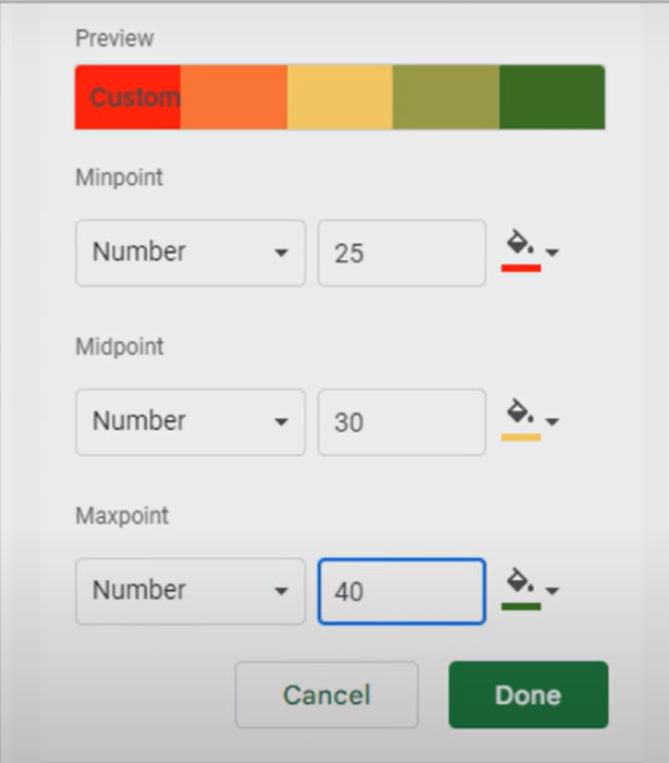
- Adjust your Midpoint to a Percentile.
Step 2: Highlighting Specific Values
Sometimes you may want to introduce a condition for the given data, for example, in a Datasheet containing information about employees and their respective salaries, you may want to highlight the cells containing a Salary amount of more than $3000 per annum. In that case, follow the steps shown below:
- Highlight all the data.
- Go to the Conditional Format Rule Window, Click on Add New Rule.
- Under Single Color Pane, Select the rule “Greater than” from the drop-down list.
- Enter the value 3000. You can also choose to display the output in Bold, Italic, or Underlined.
- Click Done. The resultant Heat Map Google Sheets will show the cells having a Salary value of $3000 and above for the corresponding employees.

Limitations of Building Heat Maps in Google Sheets
Heat Map Google Sheets gives you an opportunity to display your Data in a visually appealing way as well as provides better Business Insights. Though, while using Heat Map Google Sheets you may encounter the following challenges:
- Because Heat Maps rely significantly on colour, they must be made in an accessible manner. Whenever possible, the colour scheme chosen in the Heat Map should fulfil Color Contrast and Density Criteria so that all users or receivers of the Heat Map may benefit from the colour indicator.
- Special attention must be paid if the viewers are colourblind. In case, inaccessible colours are used, you may risk losing the layer of colour as a means of conveying your point, and the image becomes difficult to comprehend.
- Also, it is hard to deduce the numerical value corresponding to a particular hue with adequate precision when employing a table look-up approach to answer specific inquiries.
- Further, the resulting information in Heat Map Google Sheets is frequently not grouped in such a way that patterns may be discerned. Therefore, it is sometimes difficult or impossible to discern anything about general overarching patterns without clustering.
Conclusion
Since Heat Map Google Sheets are both easy to comprehend and attractive to look at, they can appeal to a wider range of consumers, including both creative and logical thinkers. In addition, the adaptability of Heat Map Google Sheets allows them to be employed in a number of circumstances rather than being confined to a single time instance.
Though, as organizations grow, the number of data sources increases; generating tremendous volumes of Data. Regularly Handling, Compiling, and Integrating all of that data manually is a time-consuming task and requires resources that could rather be utilized on important Business activities. As discussed earlier, visualizing all this data just with Heat Map Google Sheets might not be the best way to move ahead. An elegant solution to the above problems can be provided by a Cloud-Based ETL Tool like Hevo Data.
Want to take Hevo for a spin? Sign Up for a 14-day free trial and experience the feature-rich Hevo suite first hand. You can also have a look at our unbeatable pricing that will help you choose the right plan for your business needs!
FAQ
Can you do a heat map in Google Sheets?
Yes, you can create a heat map in Google Sheets using conditional formatting.
Does Google have a heat map tool?
Google Maps offers a heat map layer for visualizing geographic data.
How do I create a Google heat map?
Use Google Maps to import location data and apply the heat map layer to visualize intensity or distribution.
Share it with your connections.
-
 Share To LinkedIn
-
 Share To Facebook
-
 Share To X
-
 Copy Link


