


 KEY TAKEAWAY
Dynamic dashboards in Google Sheets help teams track KPIs and metrics across multiple data sources, making data-driven decisions faster and more efficient.
In 2025, developers and analysts can leverage features like Pivot Tables, Charts, Slicers, and Data Validation to create interactive and insightful dashboards.
Steps to Build a Dynamic Dashboard in Google Sheets:
- Load/Collect Data: Gather data from Google Forms, external databases, or analytics tools to power your dashboard.
- Create a Table/Chart with Raw Data: Use Pivot Tables, Charts, or Geo Charts to visualize key metrics dynamically.
- Format for Readability: Customize fonts, colors, and layout to make your dashboard attractive and easy to interpret.
- Validate Your Data: Apply data validation rules to ensure accurate and consistent entries.
- Consolidate All Charts in a Single Sheet: Combine tables and charts into one protected sheet for centralized analysis.
- Publish Your Dynamic Dashboard: Share your dashboard with your team or clients with appropriate access permissions.
Searching for a critical key performance indicator (KPI) or metric for a report can be difficult in a sea of raw data, primarily when your data is spread across multiple spreadsheets and tabs. Efficient Project Management requires planning and creating dynamic dashboards that can help you make this job easy.
A dashboard helps you track insights and get a bird’s-eye view of data so that you can make data-driven decisions. Having a dashboard gives you a perspective on your tasks and also allows you to track the progress of your projects and campaigns.
One such platform that offers tools and functionalities for creating dynamic dashboards is Google Sheets. Dynamic dashboards in Google Sheets automatically update the included data as soon as any real-time changes occur. This blog will present you with information on what dynamic dashboards are and how you can build a dynamic dashboard in Google Sheets. Let’s get started!
Table of Contents
6 Steps to Build a Dynamic Dashboard In Google Sheets
The steps to build a dynamic dashboard in Google Sheets are as follows:
- Step 1: Load/Collect Data
- Step 2: Create a Table/Chart with Raw Data
- Step 3: Format for Readability
- Step 4: Validate your Data
- Step 5: Consolidate All Charts in a Single Sheet
- Step 6: Publish Your Dynamic Dashboard
Step 1: Load/Collect Data
The first step to creating a dynamic dashboard in Google Sheets is to set up a database for your dashboard. You can either create a Google Form to collect data or load data from an external database or your analytics tool. Data collected from Forms can be converted to Google Sheets and used to power a dashboard as well!

Unlock the full potential of your Google Sheets data with Hevo’s powerful integration platform. Hevo can replicate your Google Sheets data for your destination using Google Sheets API. Here’s how Hevo can enhance your data workflows:
- Direct Integration: Connect Google Sheets as a data source with Hevo, streamlining your data management.
- Automate Data Transfers: Effortlessly sync and transform data from Google Sheets to your desired destinations.
- Real-Time Updates: Keep your data fresh and current with automated, real-time syncing.
Step 2: Create a Table/Chart with Raw Data
After collecting your data, create another sheet that will act as your dynamic dashboard in Google Sheets. In this sheet, create a table or chart for every item you want to visualize.
For example, you can create a Pivot Table for Sales across different demographic states in a country, by selecting the relevant entries and specifying a “No Limit” on the end row, which ensures all new incoming information gets reflected in the table itself.
After this, you can customise the parameters that you wish to be displayed in the chart, and also transform them into different formats like Geo Charts to get better visualisation for your Sales.
Once you figure out the metrics you want to track, you can use different Google Sheets tools to create multiple visualizations for these same metrics.
Step 3: Format for Readability
The next step is to customize your dynamic dashboard in Google Sheets to make it attractive and readable. You can add colours to charts and tables or change fonts, so your dashboard is fun to work with. You can add colours to the background of a graph and include titles in different font groups.
Read on to learn how to make charts and pivot tables!
Step 4: Validate Your Data
Consider setting data validation rules in Google Sheets. This helps ensure that you only input a value in a valid column. Data validation will ensure that nobody can add any other option in the cells apart from the five channels. To do this, select the cells you want to constrain.
Click on Data, and then select Data validation. A pop-up window, like the one shown below, will appear.
In the Criteria option, change List from a range to List of items. Enter the five channel names separated by commas.
Step 5: Consolidate All Charts in a Single Sheet
When your tables, charts, and functions are ready, you can build your dynamic dashboard. Remember, your dashboard should only display readable, presentable data. Consider protecting your dashboard sheet from further changes.
Right-click on your dashboard sheet and select Protect sheet. To continue, click on Set permissions on the right panel. You can protect your dashboard by restricting editing permissions only to you or displaying a warning whenever someone tries to edit the sheet.
Step 6: Publish Your Dynamic Dashboard
You can use the built-in sharing feature to invite your team members, copy the dashboard’s URL, and set access permissions.
To do this, click on Share in the upper-right corner of your spreadsheet. Enter the email addresses of the users you want to invite to the dashboard. Alternatively, you can expand the Restricted drop-down menu and select Anyone with link, click Viewer to specify access, and then click on Copy link. You can share the copied link with your team or client.
Check out 10 Best Free Google Sheets Dashboard Templates for 2025
Tips for Making an Effective Dashboard in Google Sheets
Now that you’ve seen how to make a dynamic dashboard in Google Sheets, here are some tips to keep in mind for getting this done effectively.
- Choose the Right Chart: Each of the different chart types you can use on your dashboard conveys information differently. For example, if you want to show how two variables are related, a scatter plot would be a good choice. However, a line chart is a better option to show a trend over time.
- Keep it Simple: The dashboards are intended for you to quickly view the required information without being overwhelmed by too much data. Consider including only the most important information on your dashboard; less is more in this case.
- Make it Interactive: Add links, buttons, and drop-down menus to make an interactive dashboard in Google Sheets. This allows your audience to effectively explore the data and easily find the information they’re looking for.
- Use Colors, Fonts, and Layouts Effectively: It’s easier to maintain a well-crafted dashboard; details like choice of color and font can significantly impact your dashboard’s effectiveness.

Benefits of Creating Dynamic Dashboards in Google Sheets
Let’s look into the many benefits of creating dynamic dashboards with Google Sheets:
- Improved Team Sharing: You can use the sharing features of Google Sheets for real-time collaboration on dynamic dashboards. If you’re an owner, you can assign user permissions to control who can view, edit, or comment on dashboard data.
- Easily Generate Data Visualizations: The easy-to-use data visualization tools in Google Sheets help create dynamic graphs without requiring any formulas and functions. All you need to do is focus on the raw data, and Google Sheets will take care of the rest.
Additionally, you can connect Google Sheets to Microsoft Power BI to create better reports and dashboards that can handle complex queries
- Reduced Costs: Since Google Sheets is a free tool that only requires an active Google account, it’s an ideal choice for small businesses and startups that need a data dashboard without an enterprise data management solution budget.
- Integration with Third-party Tools: Google Sheets is widely supported by several data management, marketing, and accounting tools for businesses. With the right integrations, it can automatically collect data from third-party sources and update your dynamic table in Google Sheets. For example, you can connect Google Sheets to data warehouses like BigQuery and Redshift.
- Built-in Data Validation Method: You can create data validation rules to prevent data entry errors in Google Sheets. The process works by restricting data inputs based on a list of allowed values.
Limitations of Building a Dynamic Dashboard in Google Sheets
Are Google Sheets features and functions enough for quick data visualization? Yes. However, it’s not the perfect tool for advanced project management. Here are two limitations of creating a dynamic dashboard in Google Sheets:
- Integration with Data Sources: Data in your Google Sheets dashboard may come from various sources. Fetching the data from multiple sources and refreshing it frequently may require manual efforts; it helps to set up the process automatically. Consider using Google Apps Scripts or Google Sheets API to import data into a sheet.
- Hard to Consolidate: Users across the world favor Google Sheets for its simplicity and quick Ad hoc data analysis. But, as a result, data in spreadsheets is scattered across departments. It becomes challenging to merge data from multiple sources before generating dashboards and reports.
- No Advanced Scaling: As an organization grows, a spreadsheet should also have the ability to scale. However, the number of rows and columns is limited in Google Sheets, and it can be difficult for large organizations to continue using it for data visualization and analysis.
- No Mobility: The mobile experience of Google Sheets requires you to scroll both horizontally and vertically to look at your KPIs. It can also be difficult to edit something on Google Sheets via a mobile phone.
- Data Integrity and Security Risks: Sharing dynamic dashboards in Google Sheets within a team might lead to unintentional changes to any dashboard by any team member. Additionally, there’s the risk of accidental sharing of the sheet with someone outside your organization, resulting in data leaks.
7 Key Google Sheets Features and Functionalities
You must be familiar with Google Sheets for organizing data. But did you know you can also build a dynamic dashboard in Google Sheets to visualize and analyze your data? A handful of techniques allow you to present data dynamically.
1) Pivot Table
Pivot table is a powerful feature in Google Sheets, useful for summarizing large data sets and long worksheets. You can summarize data by date, category, and specific data. Unlike a spreadsheet, you can drive more insights from a pivot table and add another dimension to the table.
A Pivot table allows you to take a two-dimensional table and pivot it around the aggregation of the data to introduce a third dimension. Google Sheets also offers a ‘Suggested Pivot Table‘ section which uses AI to analyze your data and suggest the third dimension.
To create a pivot table, click Insert and select Pivot table. Then, on Create pivot table, you can specify the data range you want to use and choose whether you’d like to insert your pivot table into a new or existing sheet. You can use the pivot editor table to add rows, columns, values, and filters based on your selected data range.
2) Slicer
Another feature for creating a dynamic dashboard in Google Sheets is using the Slicer function to “Slice away” portions, so only the selected data remains in visualization.
Slicers are compatible with Pivot tables as well. It is also beneficial to control the data for Charts and Graphs in the dashboards. You can simply slice data, and the graphs/charts will only display parameters for selected data.
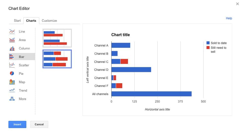
3) Charts
Charts are the best features that help you to quickly understand the data patterns and trends, especially when you are working with crucial metrics. Charts display complex tables and datasets in an easy-to-understand format. You can also use pivot tables as raw data.
To create a chart, click on Insert and select Chart. You can use the chart editor to the left to configure your chart. Select a chart type and your data range, tweak addition options, and customize the appearance.
4) Lookup Formulas
An essential technique for data projects in Google Sheets is to use lookup formulas. Some of the commonly utilized formulas are listed below:
VLOOKUP is a vertical lookup formula that finds a key-value (unique identifier) in the first column of a defined range and returns the value from another column in the same row.
HLOOKUP is like VLOOKUP, and the only difference is it’s a horizontal implementation of the VLOOKUP formula. HLOOKUP returns the value of a given cell in the column discovered after searching the first row of a range for a key.
INDEX & MATCH are superior to VLOOKUP, and their combination creates a powerful and flexible lookup solution. INDEX returns the content of a cell, specified by row and column offset. MATCH returns an item’s relative location in a range that matches a given value. They are more flexible and avoid VLOOKUP pitfalls.
Multi-Condition Lookup Formula: You can use this when you want to find a formula, based on two or more parameters. In such a scenario, the multi-condition lookup formula does the trick.
A multi-condition lookup formula looks like this:
={"Plans Overdue";ARRAYFORMULA(IF(T2:T="",,IF(S2:S+T2:T>U2:U,IF(U2:U="","Delayed","Complete - On Time"),IF(S2:S+T2:T<U2:U,IF(U2:U="","On Time","Complete - Late"),))))}5) Sparkline
This feature helps you to create dynamic graphs that represent the time-based progress of a metric. You just have to choose the data range as the function argument, and Sparkline will create a simple but gynamic graph. These graphs don’t have any axes and exist inside a cell. You can also enlarge these graphs by merging multiple cells. You don’t need a full-blown chart and complex parameters to represent the dataset’s timeline.
The syntax of the Sparkline function is:
=SPARKLINE(data, [options])You can also customize the appearance of Sparkline charts using optional parameters. For example, if you need to create a column graph instead of a line chart, use the following syntax:
=SPARKLINE(B10:B15, {“charttype”,”column”})6) Data Validation
Data validation helps add interactivity to your dashboard. It creates a drop-down menu where users can select a parameter that changes the data in charts automatically. It’s a powerful technique to protect Structured Data from people who need to edit specific sections of it.
7) Conditional Formatting
Applying Conditional Formatting can help you to see numbers greater than 0, equal to 0, or less than zero in a different format. When the data is continuously changing, this tool will help to bring attention to specific sections. It’s beneficial when a Project requires tracking minute percentage changes for various metrics.
All of these exceptional features can help you not only set up a dynamic dashboard in Google Sheets but also carry out insightful analysis in a matter of minutes!
You can explore little on Facebook Ads And Google Sheets.
Conclusion
These are a few things that you should know before creating a dynamic dashboard in Google Sheets. The final result will improve your team’s organization and efficiency. Cells and formulas in Google Sheets make it easy to arrange data.
Just like data on Google Sheets, most businesses today have an extremely high volume of data with a dynamic structure that is spread across numerous applications. If data integration is something that your business struggles with, Hevo Data can help achieve your goals in a hassle-free automated manner.
Creating a data pipeline from scratch for such data is a complex process since businesses will have to utilize a high amount of resources to develop it and then ensure that it can keep up with the increased data volume and schema variations. Businesses can instead use automated platforms like Hevo Data.
Want to take Hevo for a spin? Sign Up for a 14-day free trial and experience the feature-rich Hevo suite firsthand. You can also have a look at our unbeatable pricing that will help you choose the right plan for your business needs!
Share your experience of building a dynamic dashboard in Google Sheets! Let us know in the comments section below!
FAQs
1. Can you create dynamic charts in Google Sheets?
Yes, you can create dynamic charts in Google Sheets by linking charts to a data range that updates automatically, such as with formulas or data from another sheet.
2. Does Google Sheets have dynamic tables?
Yes, Google Sheets supports dynamic tables using pivot tables or formulas like QUERY, ARRAYFORMULA, and FILTER, which adjust automatically when data changes.
3. How do you make an interactive chart on Google Sheets?
Create an interactive chart using slicers, filters, or dropdown menus. Link these controls to your data, and the chart will update dynamically based on user inputs.
Share it with your connections.
-
 Share To LinkedIn
-
 Share To Facebook
-
 Share To X
-
 Copy Link


