


Power BI, part of Microsoft Fabric, is a unified business intelligence platform that combines AI-driven analytics, real-time dashboards, and deep integration with Microsoft 365. With rich visualizations that provide actionable insights, high-quality Power BI dashboards can aid better and faster decision-making across an organization.
In this article, we have curated a collection of the best Power BI dashboard examples that showcase design principles, creative visuals, and advanced techniques. These professionally designed dashboards span industries and business domains ranging from sales to marketing, finance, healthcare, and human resources.
Table of Contents
What makes a Great Power BI Dashboard?
- Audience-Specific: The dashboard is tailored to its target audience’s needs and goals. It considers the audience’s use case, key metrics, and cultural assumptions to ensure its effectiveness in providing insights.
- AI-Powered Insights: Use Copilot to auto-generate visuals, summaries, and Q&A from datasets.
- Simple and Decluttered: The dashboard should be easy to navigate and provide only the most important information without unnecessary clutter. This helps users quickly identify key metrics and make decisions.
- Grid Layout: Using a grid layout helps users follow a seamless journey and navigate the dashboard intuitively from left to right and top to bottom.
- Aesthetics Matter: The dashboard should have a visually appealing design, using a single font and creative colors to guide the audience through the consumption journey. This enhances adoption and engagement.
- Fast Load Times: The dashboard should load quickly to ensure users can easily access the information they need. This is achieved by minimizing clutter, storing data transformations in views, and balancing complex and simple visualizations. Use DirectLake and optimize DAX to reduce query load; leverage Fabric performance tuning features.
Say goodbye to endless reporting requests. Hevo Answers lets business teams get instant insights while they focus on strategic work.
🔹 Ask in Natural Language – No SQL required
🔹 AI-Powered Insights – Get accurate answers instantly
🔹 Seamless Data Integration – Connect to Salesforce, Shopify, Google Ads & more
🔹 Reduce Reporting Workload – Free up time for deep analytics
Industry-Specific Power BI dashboards Examples:
- Power BI Finance Dashboard
- Power BI Marketing Dashboard
- Power BI Sales Dashboard
- Power BI Retail Dashboard
- Power BI Human Resources Dashboard
- Additional Dashboards for Your Business
Power BI Finance Dashboard
1. Financial Analytics Dashboard
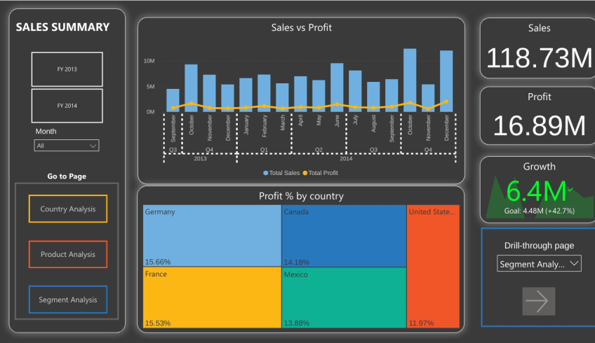
The Financial Analytics Dashboard can be visualized to track an organization’s financial performance. This dashboard lets one view revenue and profitability from different geographies, customers, and product segments. Analysts can go deep into these categories and analyze the Financial Performance Indicators. For those looking to build similar dashboards and enhance their skills, learning Power BI through a Microsoft Power BI course can be highly beneficial. Organizations seeking to upskill their teams can also benefit from Power BI corporate training, which provides hands-on experience in data visualization and analytics
Purpose of this dashboard:
The intuitive reporting tools help you identify what drives your business, from high-performing regions to profitable customer segments and successful product lines. The platform breaks down complex financial data into clear insights you can act on. With customizable features, it provides the finance management solution you need to make informed business decisions.
2. Quarterly Financial Performance Dashboard
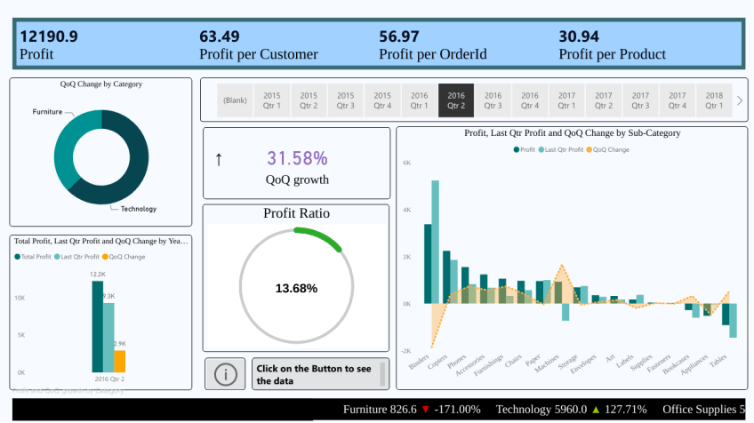
The Quarterly Financial Performance Dashboard helps track a company’s financial performance over a quarter. It can monitor progress towards financial goals and make decisions about business strategy accordingly.
Purpose of this dashboard:
The goals include tracking and assessing the company’s financial performance over quarters, evaluating patterns in profitability, segmenting the market, and pinpointing areas needing development. This dashboard aims to identify encouraging and worrisome profitable patterns to aid in strategic decision-making.
3. Power BI Budget Dashboard
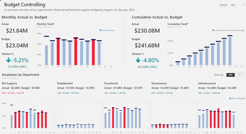
A Power BI budget dashboard is an interactive, intuitive, visual analytical tool that enables the tracking and management of budgets within any organization. These features combine all financial data to show critical metrics on budgets, spending, variances, and economic performance against budgetary goals.
Purpose of this Dashboard:
A Power BI budget dashboard is implemented to provide the most detailed view of finances and help budget managers exercise effective budgetary control. This allows stakeholders to track spending, identify issues in expenditure, analyze trends, and drive data-driven decisions toward financial discipline, optimizing resource allocation for a better, healthier financial status and strategic planning.
Power BI Marketing Dashboard
4. Customer Journey and Email Marketing Dashboard

Tired of disjointed marketing campaigns and scattered insights? Meet the Customer Journeys and Email Marketing Dashboard—a one-stop solution to analyze and optimize your email marketing efforts. This dashboard helps you consolidate performance metrics, track journey activities, and measure the impact of your campaigns with ease. Whether you’re assessing email open rates, clicks, or submissions, this dashboard gives you a real-time view of how your marketing efforts are driving customer engagement. Say goodbye to guesswork and hello to data-driven decision-making!
Purpose of this dashboard:
This dashboard is your go-to tool for email marketing success. It’s designed to provide a detailed view of customer journeys and email activity, empowering you to refine your campaigns for maximum impact. With insights into metrics like delivery rates, opens, clicks, and form submissions, you can identify what’s working and what needs improvement. It’s not just about numbers; it’s about understanding your audience and optimizing their experience. Think of it as your personal marketing advisor, guiding you to better engagement and higher ROI.
5. Social Media Analytics Dashboard
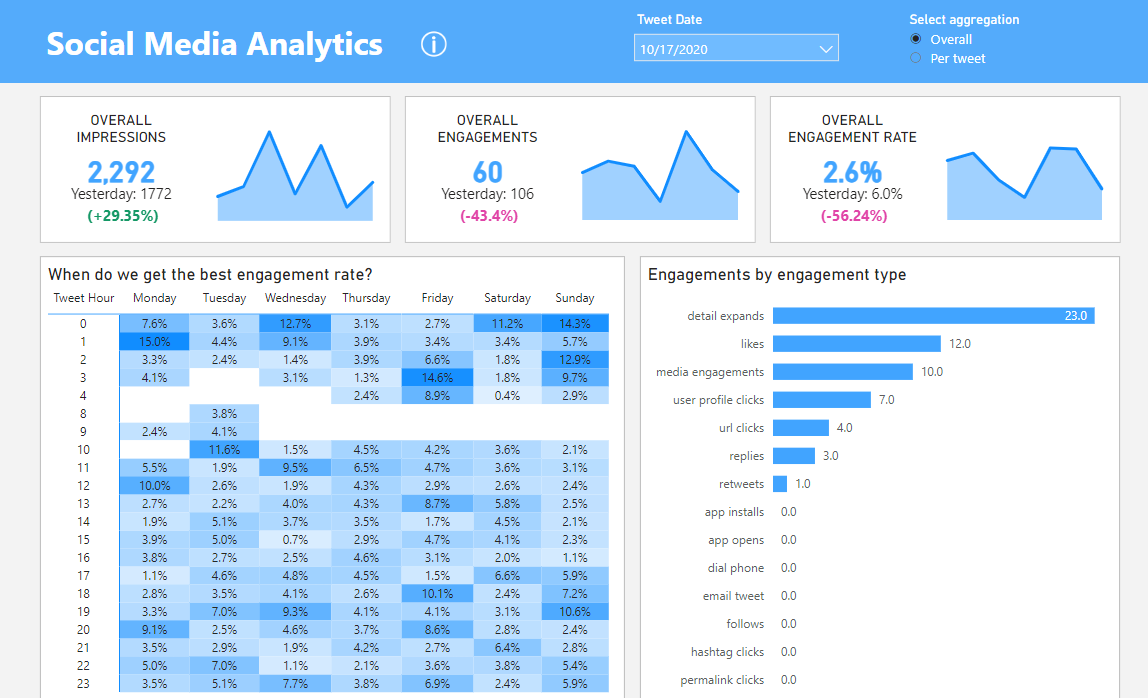
Social Media Analytics Dashboard can visualize key metrics and data across various social media platforms. It empowers real-time management, engagement, and demographic data regarding the audience and the effectiveness of the content. The tool condenses the data into clear charts and graphs for better analysis.
Purpose of this dashboard:
A Social Media Analytics Dashboard would provide insights into social media campaigns, keep abreast of brand reputation, and get a feel for the impact of social media efforts. With visibility into trends and areas for improvement, it helps make data-driven decisions, optimize content strategies, and lift overall social media performance.
6. Marketing Campaign Insights Dashboard
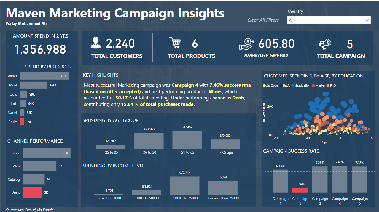
A Marketing Campaign Insight Dashboard is a single source of truth visualization that brings together key performance metrics and data related to marketing campaigns. It facilitates an all-inclusive view of campaign effectiveness with metrics such as conversion rates, return on investment, customer acquisition costs, and engagement rates.
Purpose of this Dashboard:
A Marketing Campaign Insight Dashboard would give marketers practical insights, supported by real-time data measurement of a campaign’s success rate, an approach commonly used in ad serving platforms like Epom. This would allow one to identify what works and how to further optimize marketing efforts, making informed decisions that will yield better business output with future campaigns.
Power BI Sales Dashboard
7. Customer Segmentation Dashboard
The customer segmentation Power BI dashboard helps users understand their customer base better. This dashboard allows users to categorize their customers into distinct groups based on their characteristics, behaviors, and purchase patterns.
Purpose of this dashboard:
A customer segmentation dashboard can briefly describe the breadth into which different marketing strategies, products, or services are implemented for various customer groups. It provides rich insights into customer segments and helps increase customer satisfaction by enabling personalized marketing and targeted business growth.
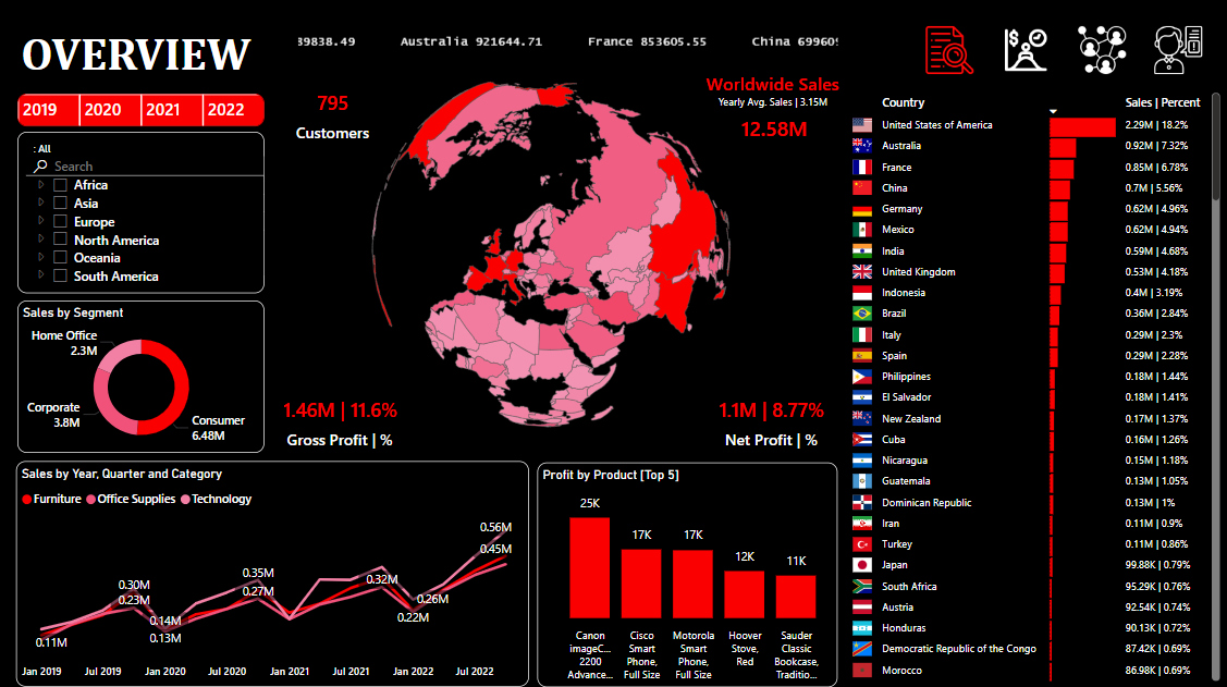
8. Sales Performance Dashboard
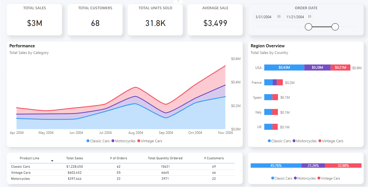
A Sales Performance Dashboard is the visualization of these critical metrics, which provides insight into sales activities and their outcomes. Most often, it includes information about the overview of sales performance through charts, graphs, and tables of trends in metrics such as revenues, growth of sales, lead conversion rates, and sales team performance.
Purpose of this dashboard:
This section focuses on how a Sales Performance Dashboard helps an organization monitor and analyze its sales operations by identifying trends, showing the effectiveness of sales strategies, and progress toward the set sales goals by making data-driven decisions toward better productivity in sales performance and revenue growth.
Power BI Retail Dashboard
9. Inventory Management Dashboard
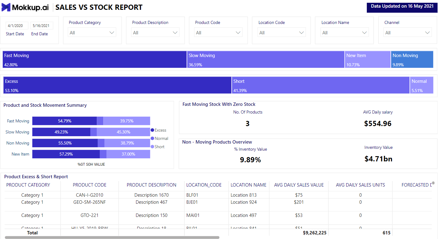
An Inventory Management Dashboard is a visual means of providing real-time data and insights on inventory levels, movements, and status. Its key metrics are stock levels, days of turnover, reorder points, and supply chain performance, which aid the effective control of inventories.
Purpose of this Dashboard:
An Inventory Management Dashboard aims to ensure proper inventory management by showing all stock availability and movement. It ensures that few overstockings and stockouts occur, maximizes order fulfillment, ensures supply chain efficiency, and controls the level of inventory against demand.
10. Customer Insights Dashboard
A customer insights dashboard is a visual representation that combines data on customers’ behaviors, preferences, and even activities across a business. It offers a single view of all the activities of the customers through various metrics, encompassing customer satisfaction, purchasing patterns, feedback, and level of engagement.
Purpose of this dashboard:
A Customer Insight dashboard helps a business understand the end-users better for a refined experience of customers, identify trends from detailed customer information, spot opportunities for personalized marketing, refine retention strategies, and make informed decisions that drive customer loyalty and satisfaction.
Power BI Human Resources Dashboard
11. Recruitment Dashboard
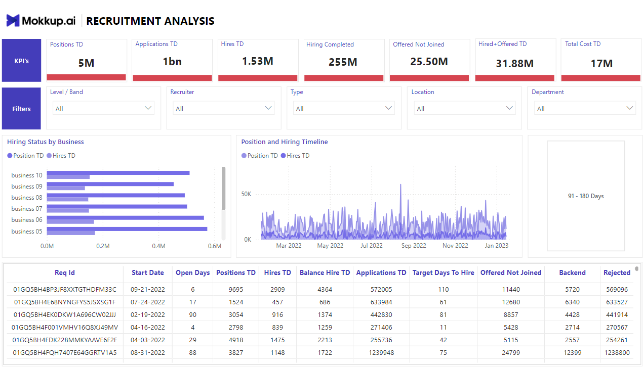
A Recruitment Dashboard is a single view of all data that has been compiled and represented on critical metrics regarding the hiring process. It provides insights into the recruitment process with metrics such as time-to-fill, cost-per-hire, sources of candidates, application conversion rates, and status of open positions.
Purpose of this Dashboard:
A Recruitment Dashboard simplifies and improves the entire recruitment cycle by delivering actionable insights and real-time data. It monitors and optimizes recruitment efforts, bottlenecks, candidate sourcing strategies, and hiring costs, and ensures that HR professionals can quickly and efficiently attract and retain the best talent.
Additional Dashboards for Your Business
12. Project Management
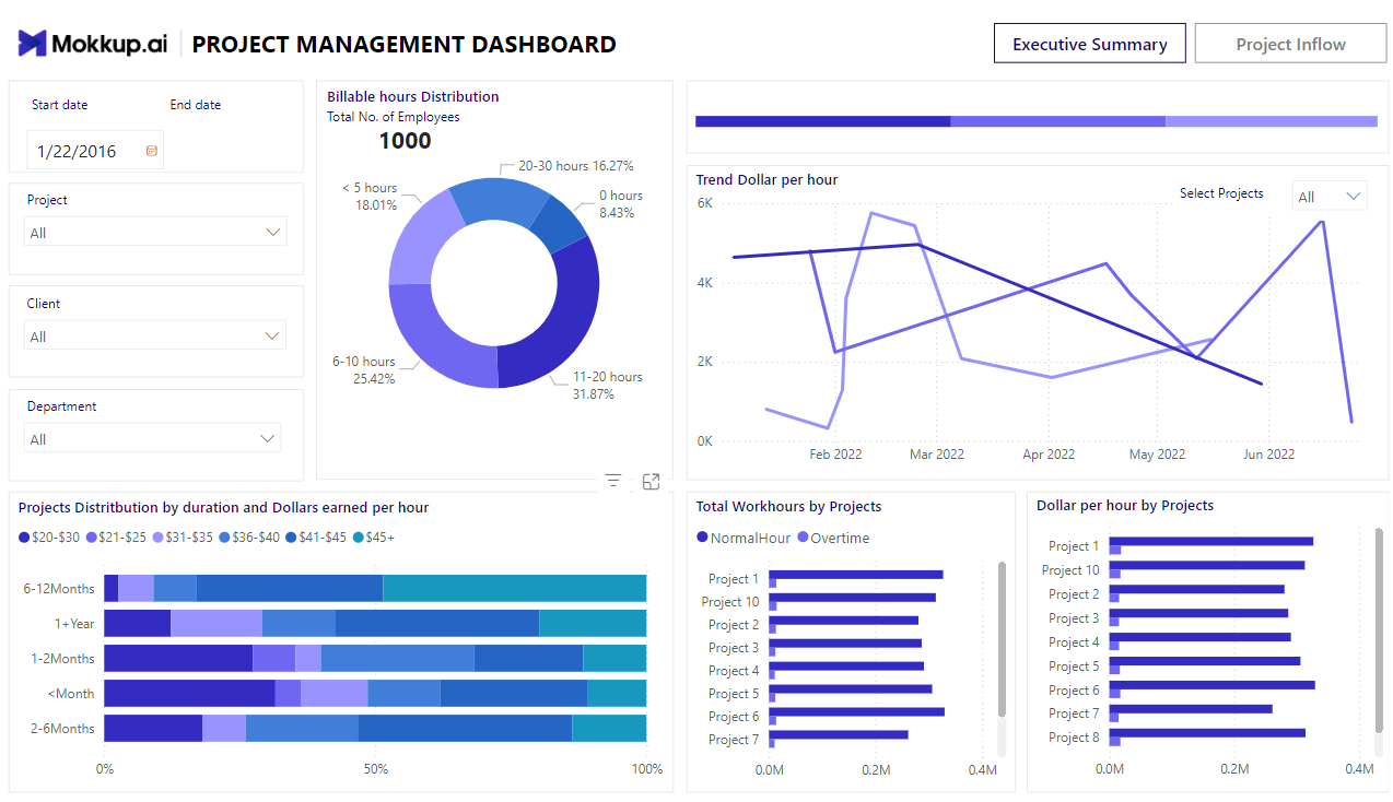
A project management dashboard is a single-source visualization with real-time indicators and project data. It provides an instantaneous overview of a project, showing metrics such as task status, achieved milestones, resource allocation, spent budget, and project timelines.
Purpose of this Dashboard:
The purpose of a Project Management Dashboard is to facilitate effective monitoring, communication, and consequent decision-making within the confines of a project. This is achieved through the project manager and other stakeholders keeping track of the project’s performance and thus detecting any possible risks and delays with the help of a visually interactive dashboard made using tools like Productiveteam, ClickUp, Jira, or Workstatus feed project data into Power BI in real time.
Dashboards like Workstatus, a powerful project management dashboard, are particularly helpful in this regard. They offer real-time insights into various project metrics such as task status and resource allocation. Their intuitive design ensures teams can monitor progress efficiently, mitigate risks, and stay on track to complete projects within budget and on time.
This ensures the project is completed with optimal use of resources and meets deadlines without unnecessary delays.
13. SEO Dashboard
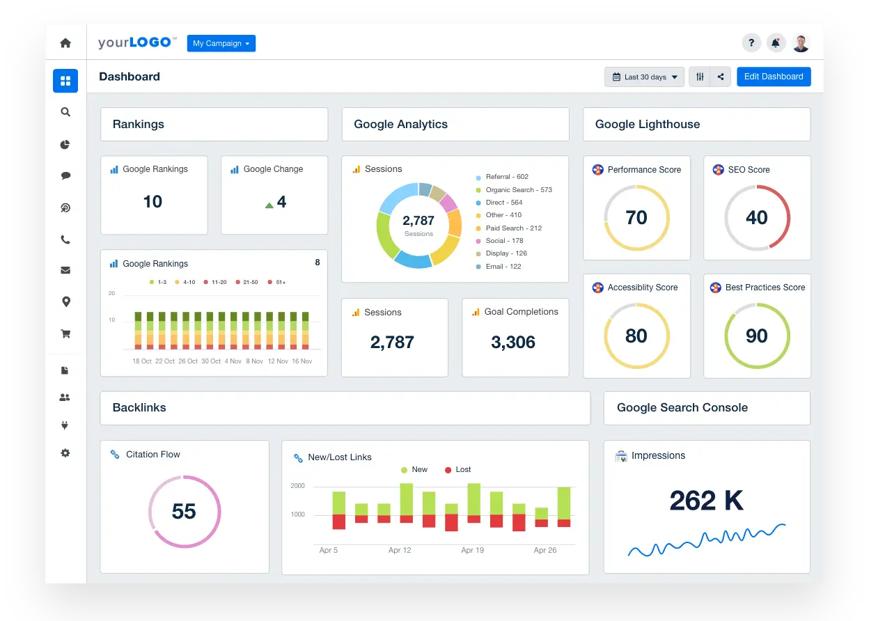
An SEO dashboard is a presentation tool that incorporates most metrics and data about search engine optimization efforts in a single view. It gives an approximate overview of various dimensions of SEO performance: keyword rankings, trends in organic traffic, backlink profiles, site health metrics like page load speed or mobile-friendliness, and conversion from organic search.
Purpose of this Dashboard:
An SEO dashboard will help the digital marketing and SEO professional, in general, to track, analyze, and optimize their SEO strategies. It aids them in tracing the impact of their SEO campaigns, finding opportunities for betterment, prioritizing optimization efforts, and making informed decisions that enhance search engine visibility, drive further organic traffic growth, and consequently improve website performance and conversions.
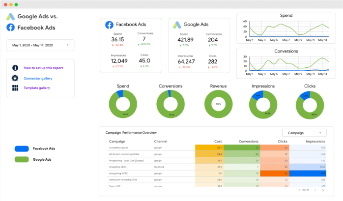
14. PPC Multi-Channel Dashboard
PPC Multi-Channel Dashboard by Coupler.io allows you to evaluate ad performance from various platforms in one place. It combines data from Google Ads, LinkedIn Ads, Facebook Ads, Bing Ads, and others. The dashboard is customizable and has filtering capabilities to conveniently overview the needed indicators. Verify platform API availability as Facebook and LinkedIn change API permissions regularly.
Purpose of this dashboard:
This PPC Multi-Channel Dashboard is a hub for monitoring ad performance overall and by each channel or campaign. It helps compare and analyze key ad metrics, track spending, conduct paid ad audits, and identify trends, which is essential for making decisions about campaign optimization.
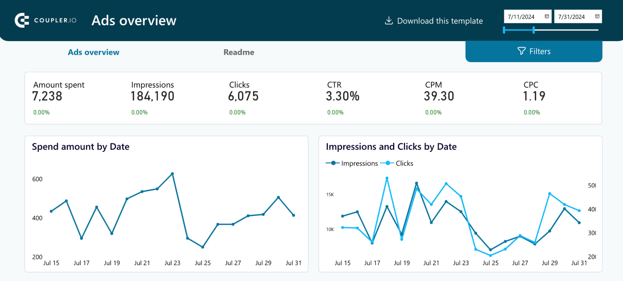
15. Google Ads Dashboard
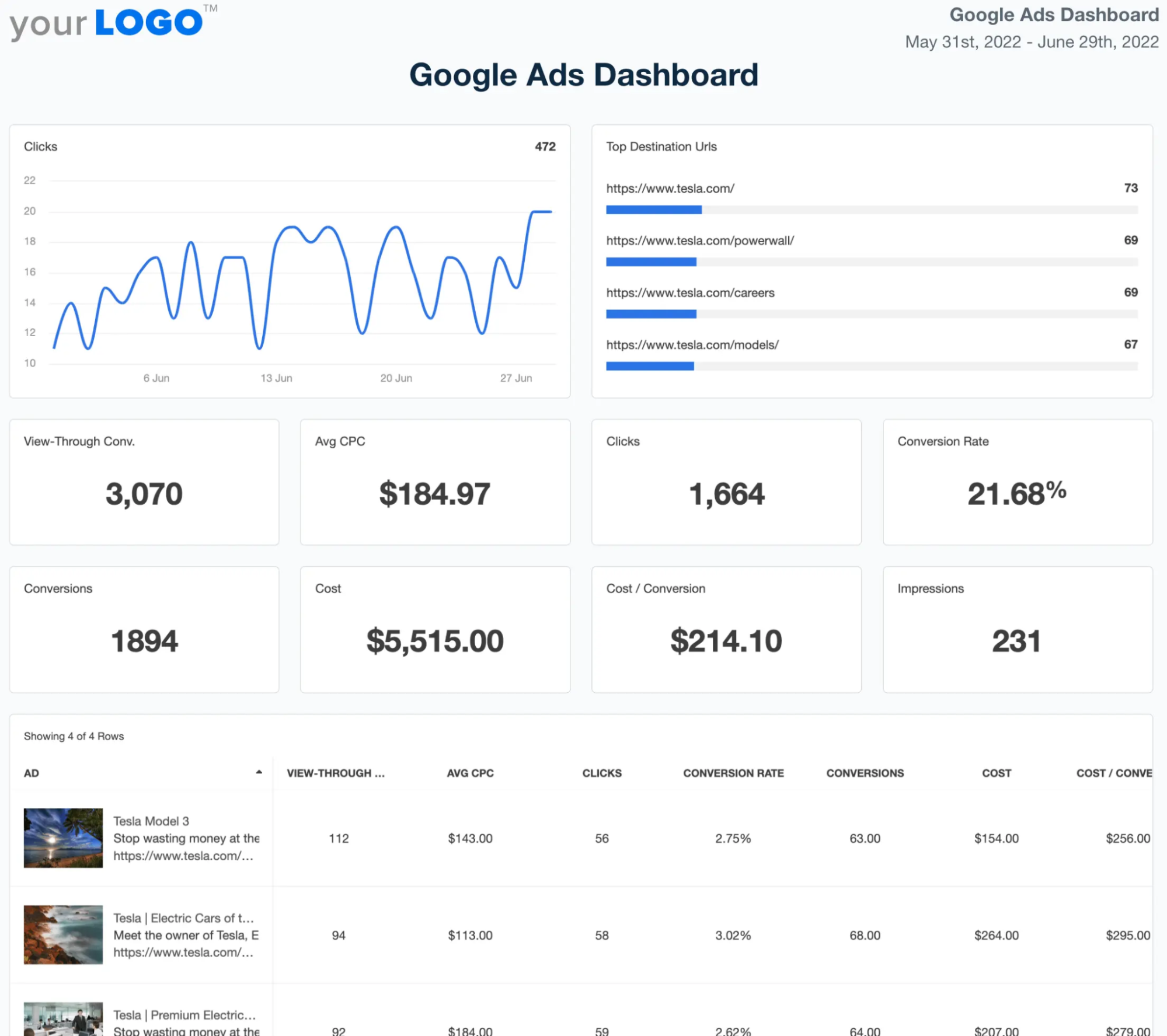
A Google Ads Dashboard is a visual information tool integrating and visualizing advertising campaign metrics and data in Google Ads. The key utility is in giving insights into the major parts of campaign activity, such as impressions, clicks, click-through rates, CPC, conversion rates, ad position, quality score, and campaign spending.
Purpose of this Dashboard:
A Google Ads Dashboard intends to help advertisers and digital marketers monitor and then optimize their Google Ads efforts efficiently. It helps in tracking the effectiveness of ad strategies, identifying improvements and opportunities, monitoring budgets, optimizing strategies effectively for matching keywords, bidding effectively, and making informed decisions to best maximize ROI on advertising and meet marketing objectives.
16. Facebook Ads Dashboard
A Facebook Ads Dashboard is a visual analytics tool that consolidates and displays critical metrics and data from Facebook advertising campaigns. It provides insights into campaign performance metrics such as impressions, clicks, click-through rates (CTR), cost-per-click (CPC), conversion rates, ad spend, audience demographics, and engagement metrics like likes, shares, and comments.
Purpose of this Dashboard:
The purpose of a Facebook Ads Dashboard is to help advertisers and marketers monitor and optimize their Facebook advertising campaigns effectively. It enables them to track campaign performance in real-time, analyze audience behavior and demographics, assess ad creative performance, optimize targeting and bidding strategies, manage budgets efficiently, and make data-driven decisions to maximize advertising ROI and achieve marketing goals.
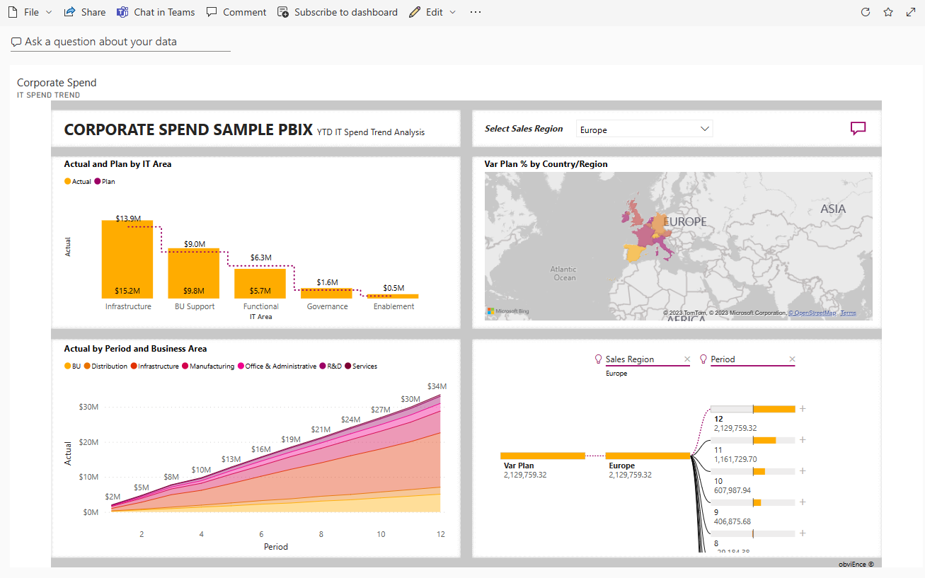
17. IT Spend Analysis / Corporate Spend Dashboard
An IT Spend Analysis Dashboard is a visual tool that compares planned IT budgets with actual expenses, offering insights into how well financial plans align with reality. It helps track spending trends across the fiscal year with quarterly updates and highlights areas with significant budget deviations.
Purpose of this Dashboard:
The IT Spend Analysis Dashboard aims to improve financial planning and control by showing how closely actual IT spending follows the original plan. It helps identify overspending, adjust forecasts, and make smarter budgeting decisions over time.
In case you are constrained by the data source availability for visualizing your data using Power BI, you can consider a cloud-based ETL tool like Hevo that can bring data from almost any data source to Power BI.
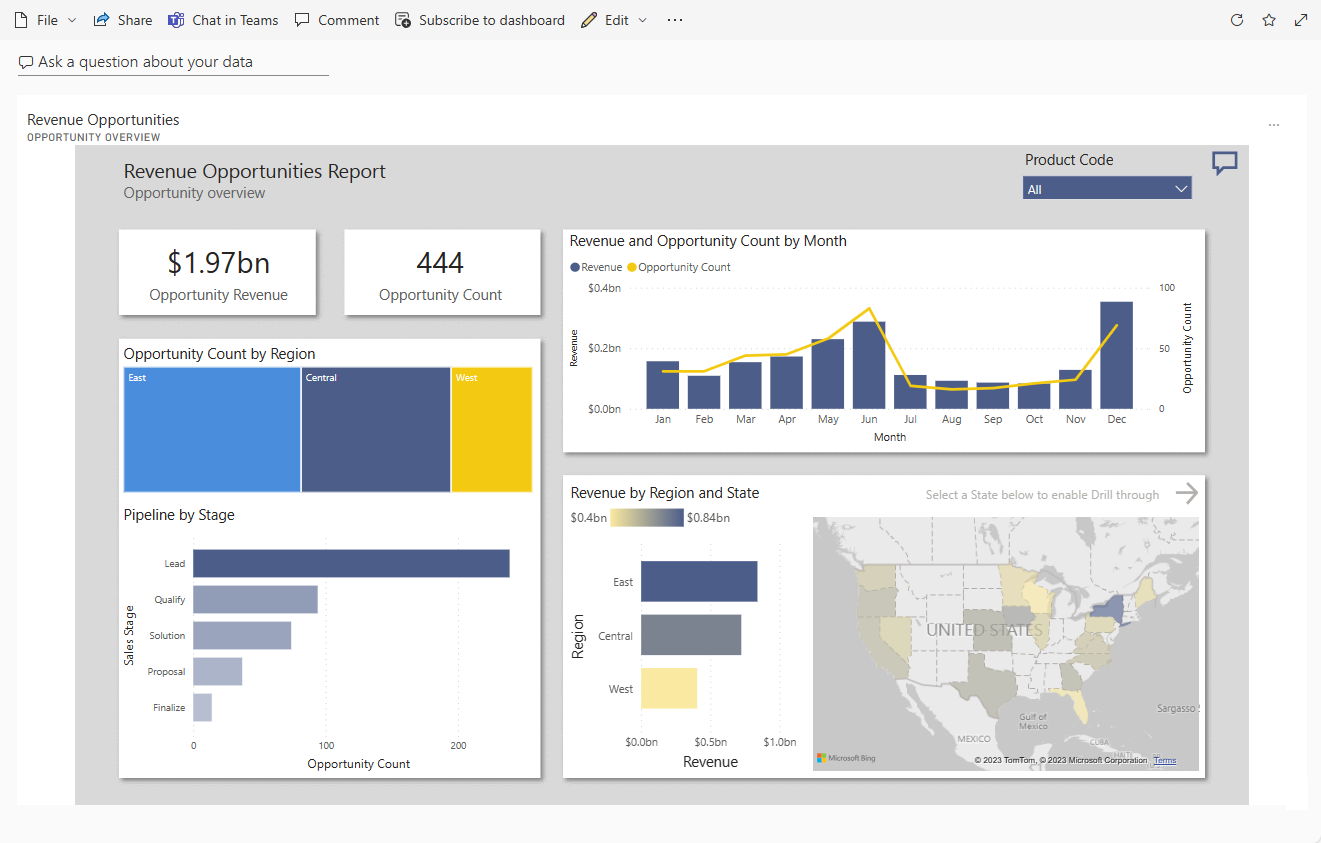
Get Started with Hevo for Free18. Opportunity Analysis / Revenue Opportunities Dashboard
A Revenue Opportunities Dashboard provides a clear view of a software company’s sales performance across direct and partner channels. It visualizes revenue trends by region, deal size, and channel, helping sales managers track opportunities and optimize strategies.
Purpose of this Dashboard:
The Revenue Opportunities Dashboard aims to support better sales decisions by showing where revenue is coming from and highlighting strong and weak areas. It helps sales teams uncover new opportunities and focus efforts where they matter most.
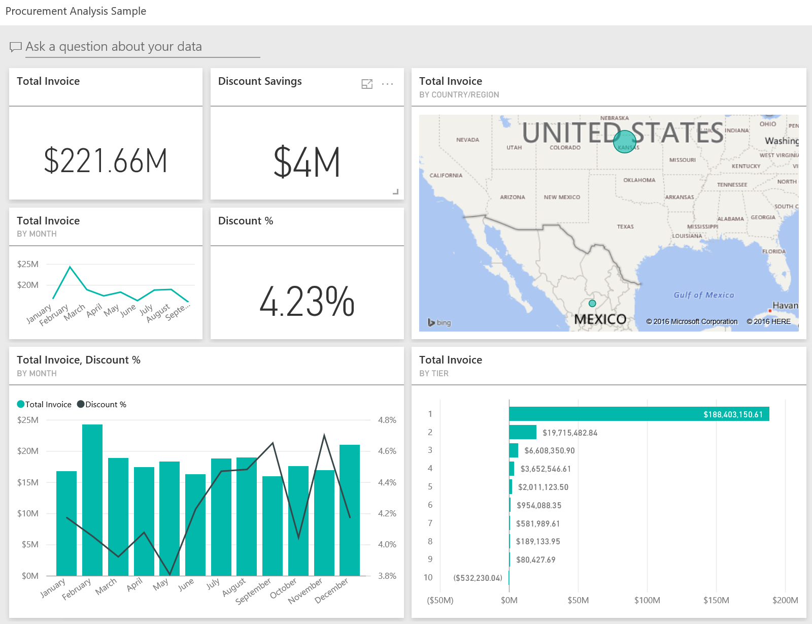
19. Procurement Analysis Dashboard
A Procurement Analysis Dashboard gives visibility into vendor-related spending for a manufacturing company. It breaks down expenses by category and location, identifies top vendors, and shows where the best cost savings are being achieved.
Purpose of this Dashboard:
The Procurement Analysis Dashboard is designed to help manage vendor spending efficiently by revealing major cost areas, supplier performance, and discount opportunities. It supports cost control and smarter procurement decisions.
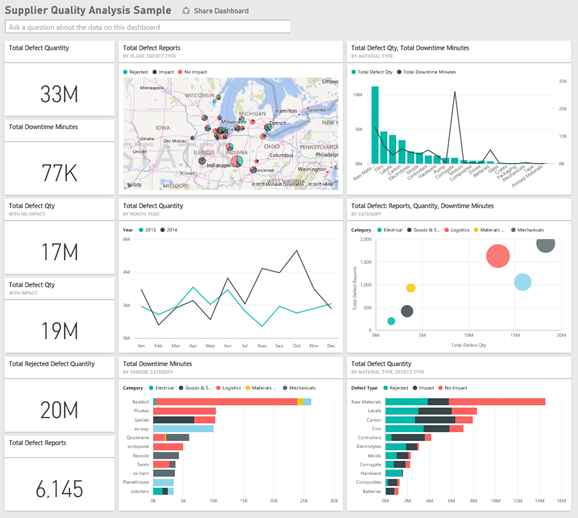
20. Supplier Quality Dashboard
A Supplier Quality Dashboard visually tracks supplier performance by measuring defect counts and downtime caused by those defects. It helps assess which suppliers consistently deliver quality and which ones may need improvement.
Purpose of this Dashboard:
The Supplier Quality Dashboard aims to improve supply chain reliability by identifying top-performing and underperforming suppliers. It also helps monitor plant-level quality control efforts to reduce delays and maintain smooth operations.
Step-by-Step Guide to Create a Power BI Dashboard
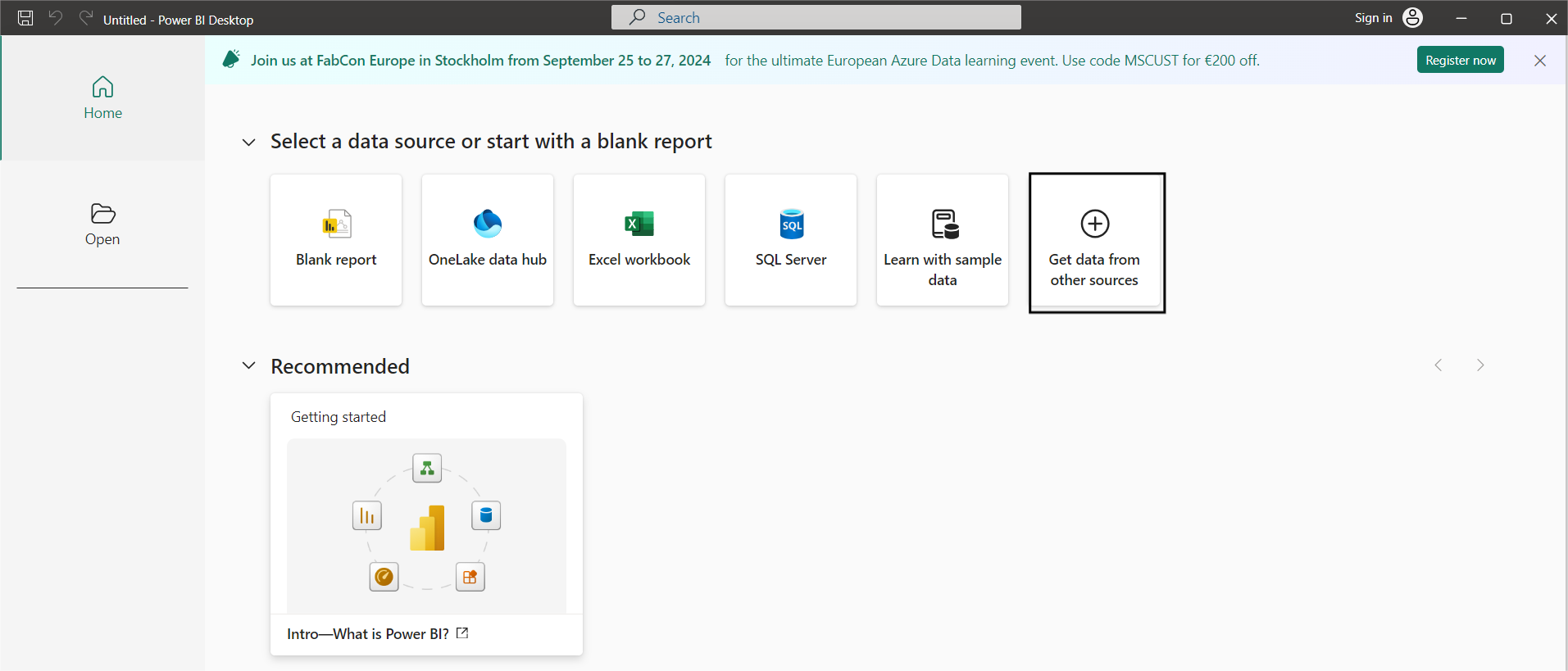
Step 1: Set Up Your Power BI Environment
Download and install the Power BI desktop app.
Step 2: Connect your source to Power BI
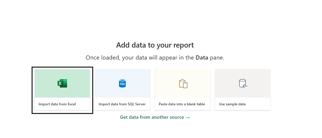
a. Open your Power BI desktop app to load your dataset. Go to Get Data from Other Sources
b. Click on Import data from Excel if you want to import an Excel file; otherwise, you can select any other source you want.
c. Select the table that you want to load and click on Load.
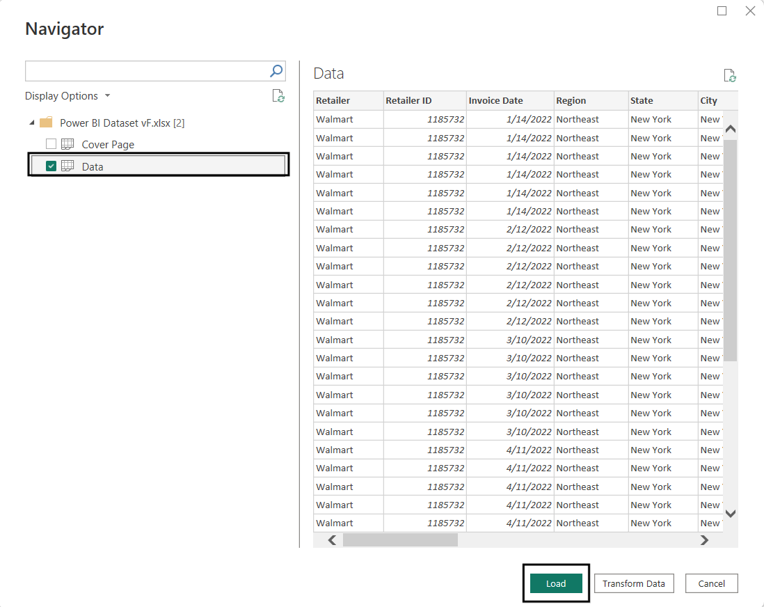
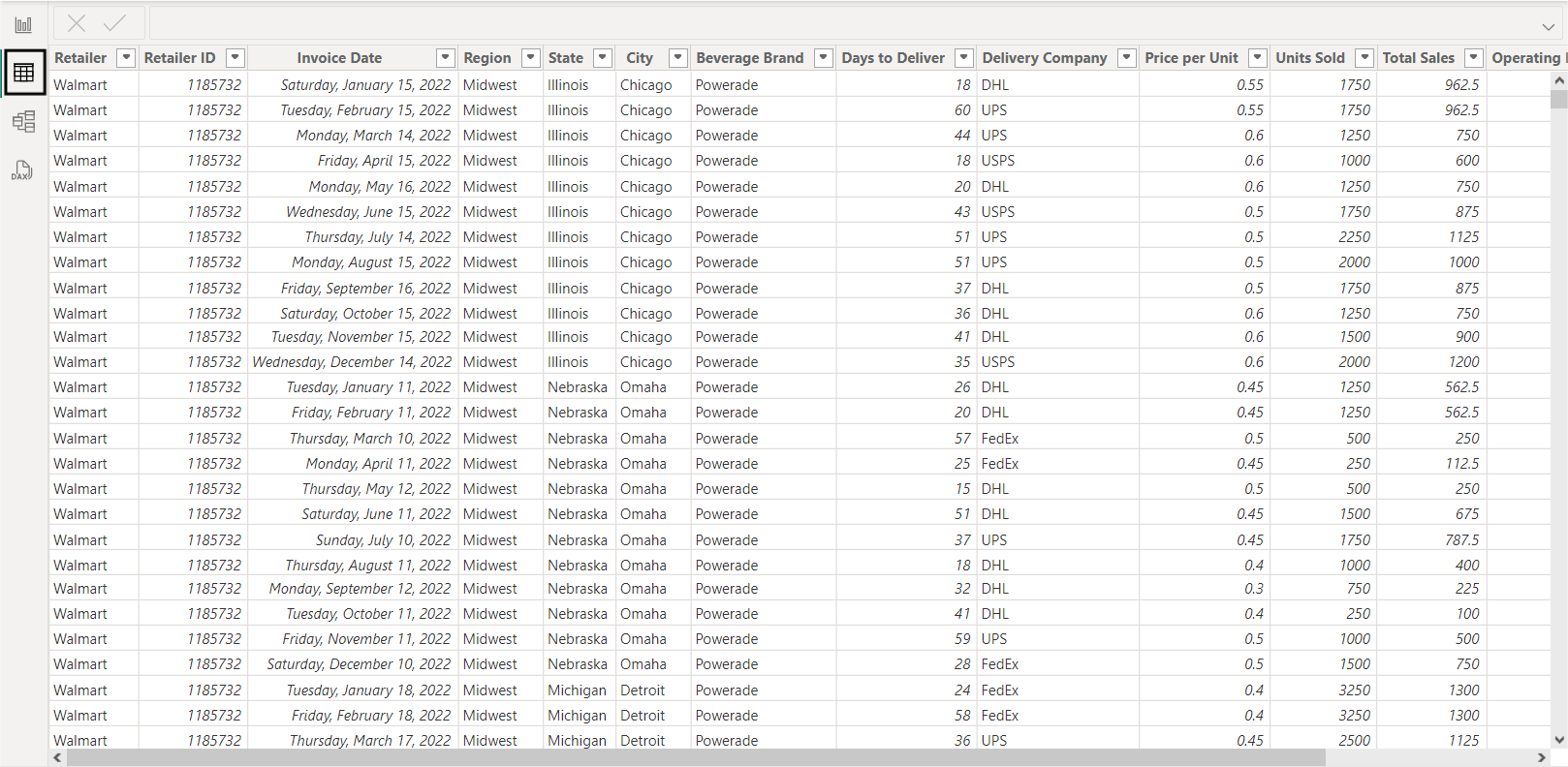
Note: You can click on the table button to preview your data:
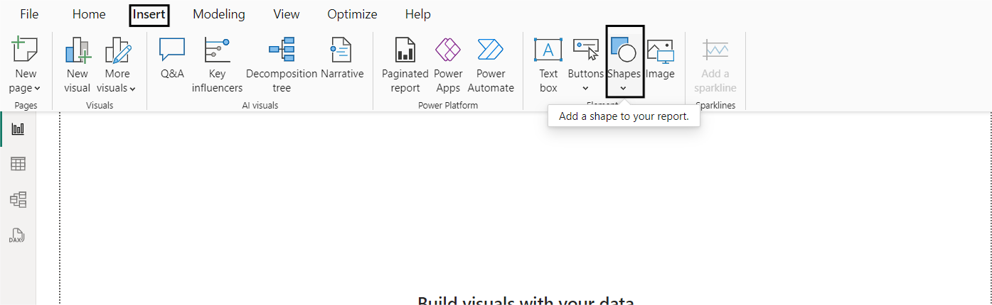
Step 3: Designing the Dashboard Layout
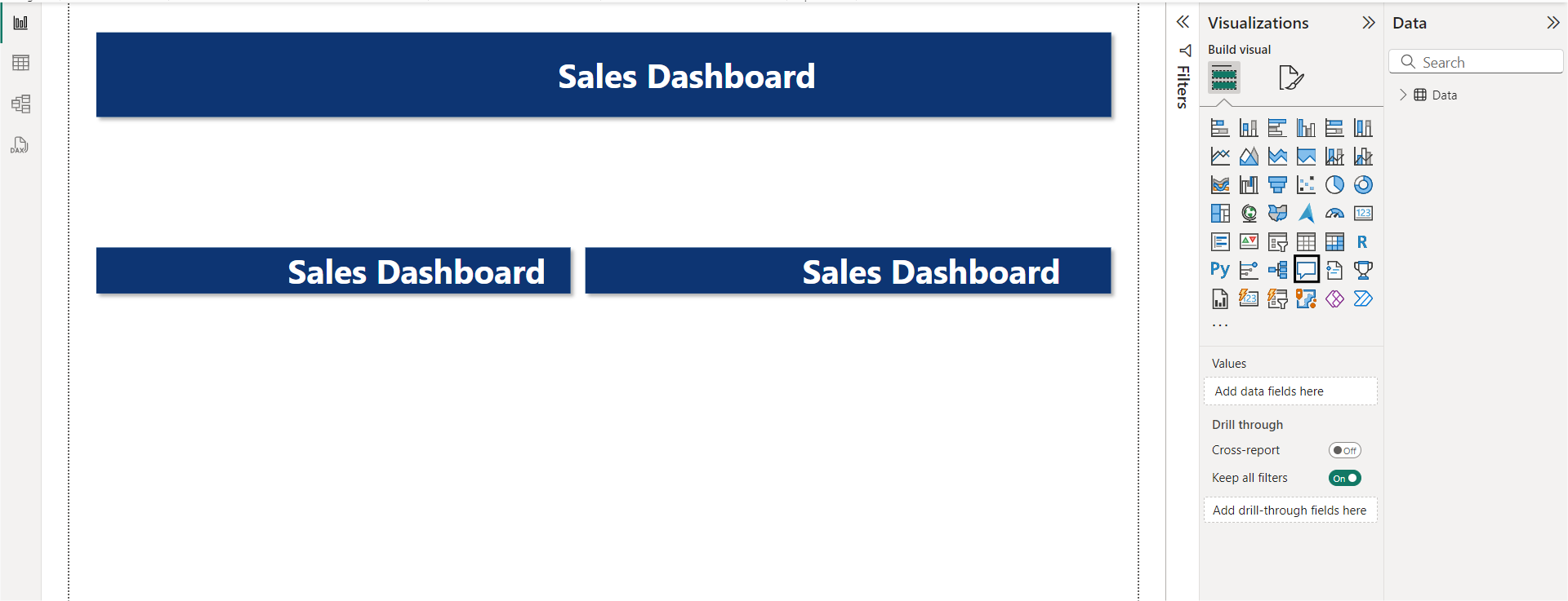
a. To Design a Dashboard Layout we need to first add headers to our dashboard. To add headers, go to the insert tab and click on Shapes. Now select a rectangle and start building your header, or you can follow my layout.
This is how our current layer looks:
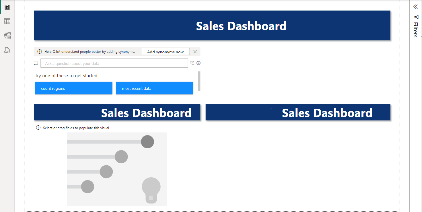
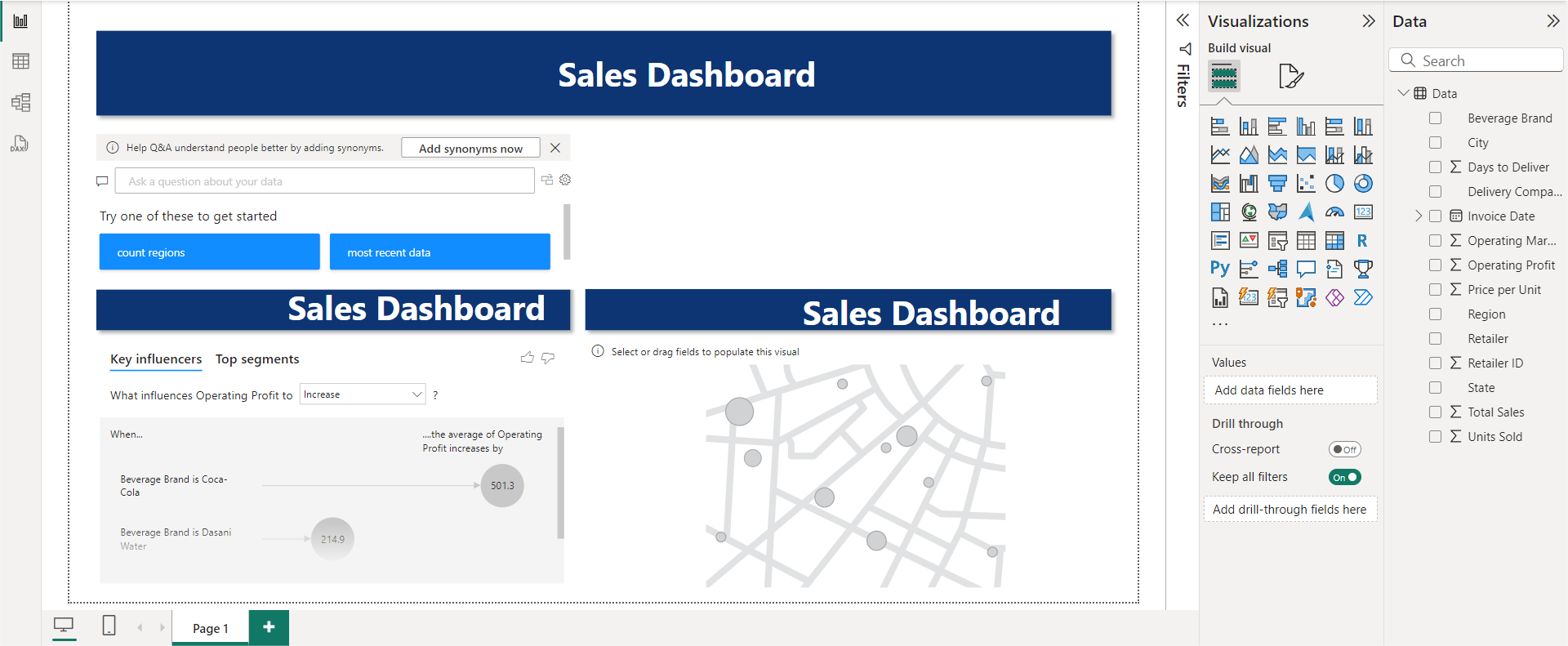
b. To make the dashboard interactive, we can add a Q&A section. To add a Q&A box, click on the chat icon, and then you can resize the section as per your requirements.
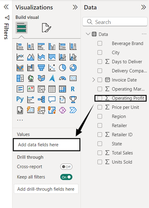
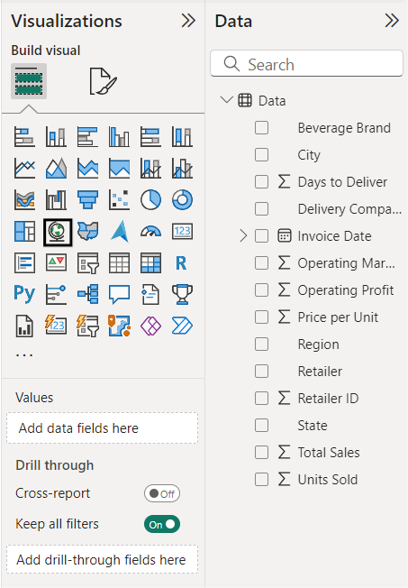
c. If we want to create a section for operating profits, we can use critical influencers’ visuals.
d. Drag and drop the operating profit column
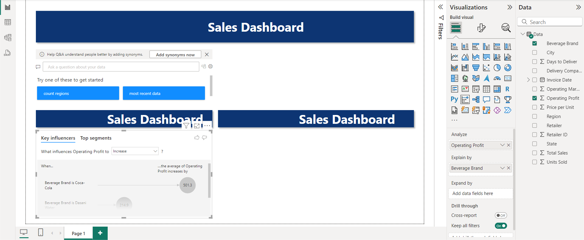
This will be your result after adding Operating Profits to your Dashboard:
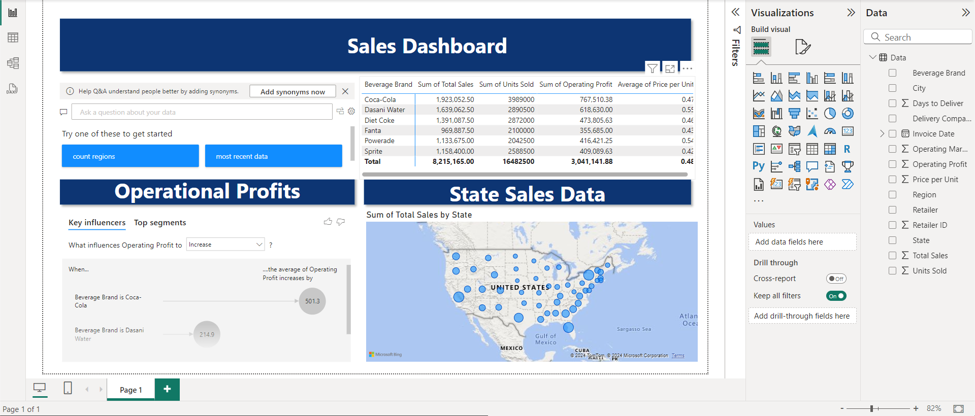
e. If you need to see the sales by state up next. You can include it by selecting the map icon.
Your Updated Dashboard should look something like this:
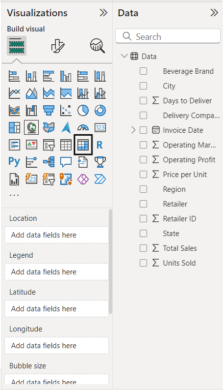
f. If you want to see more about finances, you can use a matrix
Your final dashboard should look like this.
Essentials of the Best Power BI Dashboards
A great Power BI dashboard is not only aesthetically colorful and decluttered but is also highly audience-specific and performance-efficient. Here are some characteristics of a great Power BI Dashboard:
- Faster Load Time: A fast-loading and user-responsive dashboard ensures a smooth and seamless visualization experience.
- Visual Appearance: The use of different colors, charts, and graphs for the representation of the data gives an appealing and professional look to the dashboard.
- Using a Grid Layout: A grid layout is super useful when constructing a dashboard as it increases the user’s productivity and ensures easy readability.
- Audience-specific: A good dashboard is always user-specific and monitors real-time data to minimize any latency.
To understand more in-depth about Power BI functionalities
- How to move from PostgreSQL to Power BI
- Explore Best Power BI Reports Examples
- Creating Power BI Gantt Charts: 3 Easy Steps
- All about the Power BI Calculate Function Simplified 101
- How to Change Date Format in Power BI: Display Time Right
Conclusion
This article gave a comprehensive list of the Top 10 Best Power BI Dashboard Examples. Overall, Power BI Dashboard Examples help companies better visualize their data to gain actionable insights from their customers. Discover the benefits of the RELATED function in Power BI for fetching related data from different tables to enrich your analysis. Find out more at RELATED Power BI.
To make the best use of these dashboards, organizations need relevant data, and there lies a big challenge. Even though Power BI supports most of the common databases, it does not handle cloud-based data sources outside the Microsoft ecosystem well.
For example, to make use of the Email Campaign Dashboard, you will need support for fetching data from Sources like Pardot or Hubspot. In case you are constrained by the data source support or Power BI, you can consider a cloud-based ETL tool like Hevo that can bring data from almost any data source to the destination of your choice.
Give Hevo a try by signing up for the 14-day free trial today. Also, check out our unbeatable pricing to choose the best plan for your organization.
FAQ on Power BI Dashboard
1. What is a Power BI dashboard?
A Power BI dashboard is a data visualization tool that allows users to create interactive and customized dashboards using data from various sources. It consolidates multiple reports and visualizations into a single view, providing insights into key metrics and trends within an organization.
2. Is the Power BI dashboard free?
Power BI offers both free and paid versions.
3. How do I create a Power BI desktop dashboard?
To create a Power BI desktop dashboard, follow these steps:
1. Prepare your data
2. Create visualizations
3. Design your dashboard
4. Add interactivity
5. Apply filters and slicers
6. Enhance with visuals and themes
7. Publish and share

Share it with your connections.
-
 Share To LinkedIn
-
 Share To Facebook
-
 Share To X
-
 Copy Link


