Table of Contents
Introduction to Google Data Studio Filter
You might have a lot of data in your dataset. You don’t necessarily want to put all of that in your report. You want to focus on the areas that really matter to the question at hand and draw your viewer’s attention to those areas. Filtering gives you control over your report. Using filtering, you can throw the spotlight on the subset you want your viewers to actually see.
So, filtering is basically like zooming into the right area of your data and presenting it. Like a good photographer, you will be able to capture the essence perfectly by learning the art of filtering.
Filtering is used to do two things. You can see what you want (what matches the conditions you have entered). You can avoid seeing what you don’t want. Applying filters does not affect the actual data. It only narrows down the amount of data you see on the report.
What you will cover in this blog is the following.
- Where can you Apply a Filter?
- How to Apply a Filter?
- Manage Filters
- Filter Controls
- Chart Filters
- Drill Down
- Metric Slider
- Conclusion
Where can you Apply a Filter?
There are several levels in a report. The highest level is ‘Report-level’. The next level is ‘Page-level’. The lowest level is ‘Chart-level’. You can apply your filter on any level you want as an editor.
If you apply a Google Data Studio filter on the highest level (the report level), that filter is inherited by all the pages and all the charts in those pages. This is known as ‘filter inheritance’.
When you apply the filter on a page level (which is the default when you apply a filter), that filter does not apply to the other pages in the report. It is specific to that page. That is, all the charts on that page are subjected to that filter.
Similarly, if you apply a chart level filter, only that chart is affected by it.
You can turn off inheritance by using the ‘Filter’ section of the DATA panel for a chart. When you do that, the selected chart won’t be inheriting Page level filters. You can also right-click on a Report level component and change it to Page-level.
Hevo offers a faster way to move data from databases or SaaS applications into your data warehouse to be visualized in a BI tool. Hevo is fully automated and hence does not require you to code. In fact, even the maintenance required is minimal. Check out what makes Hevo amazing:
- Easy Integration: Connect and migrate data without any coding.
- Auto-Schema Mapping: Automatically map schemas to ensure smooth data transfer.
- In-Built Transformations: Transform your data on the fly with Hevo’s powerful transformation capabilities.
- Load Events in Batches: Events can be loaded in batches in certain data warehouses.
How do you Apply a Google Data Studio Filter?
Whenever you add a component to a page in your report, it is by default Page level. What this means is that the component can be seen on that page. It will not appear on the next page.
If you want a component to appear on every page of your report (such as a heading), you should right-click on it and make it Report level.
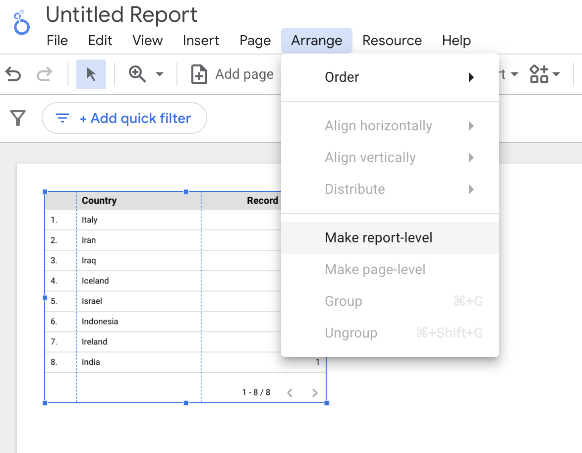
You can change it back to page-level if you want.
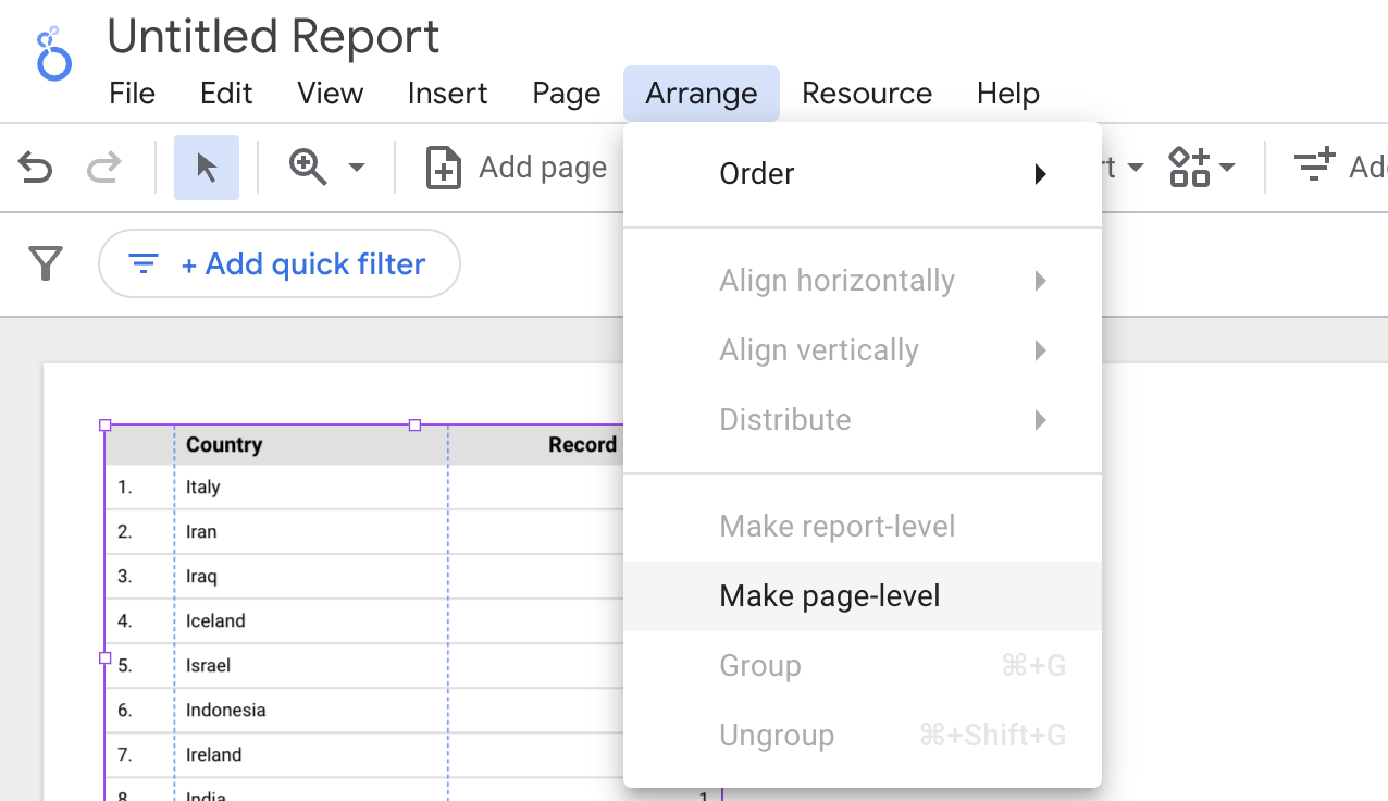
So, we have covered the Report level and Page level. There is the chart level filter that comes next. A chart level filter works slightly differently.
- You need to click on a chart and get into the DATA panel on the right.
- Click on ‘ADD A FILTER’ and you can select the right combination that you want to show on your chart.
Let us do this through an example.
Example
In the following example, a Chart level filter has been applied to a table. There is also a map chart on the page shown. But since the filter is being applied to the ‘table’ chart alone, the ‘map’ chart should not be affected. Let us see if that works.
The conditions I have applied in the Table are these:
- I want to show the viewers only the countries whose names start with ‘I’.
- Out of these, I want to exclude those countries whose population is less than 10 million.
Here is how I define those conditions. I am using an AND clause because I want both of the above conditions to be satisfied. If you want to satisfy at least one of those conditions, you can use an OR clause.

Looking at the result, we only have countries whose names start with ‘I’ with populations above 10 million in the table. Notice that nothing has changed in the map chart. You can still see all the countries. So a chart level filter only affects that particular chart.
You can go back to the DATA panel and edit your existing filter by clicking on the ‘Edit’ symbol on the filter.
Manage Filters
In the top menu, under Resource, you will find an option – Manage filters. You can create filters there and apply those filters to any charts you need.
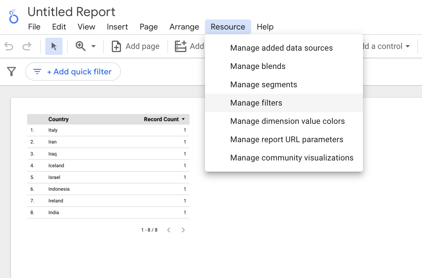
I have created a filter called ‘another filter’ which shows the countries with the percentage of internet users greater than 50%. It has been applied to zero charts at the moment.

Once created, this filter can be applied to any chart in the report using the ADD FILTER option in the DATA panel.
Filter Controls – Giving Viewers the Ability to Filter
The above filters are editor controlled. This means the viewers cannot filter out what they want to see. But if you want your viewers to have control over what they see, then you can use the filter control option in the Top menu.
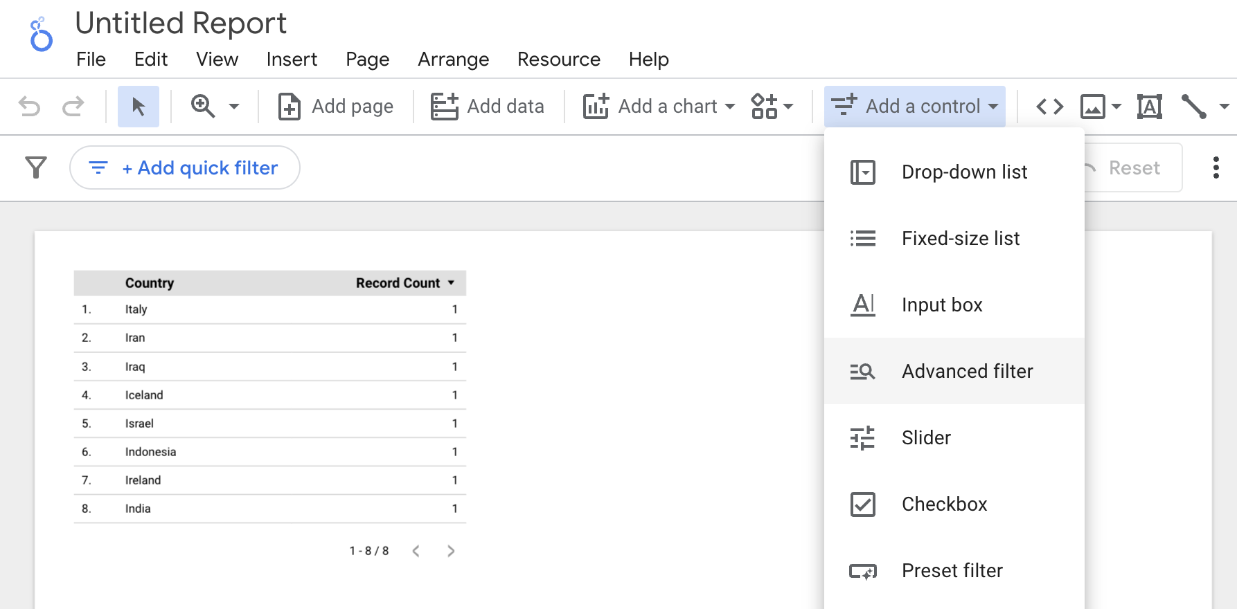
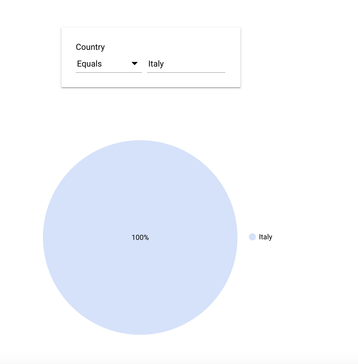
Here, the filter is on the dimension – ‘Country’. So the viewers will be able to select which countries they want to focus on in the report. You can select which dimension you want your viewers to play with when you create the filter using the DATA panel. This is how it looks on the ‘View’ side.
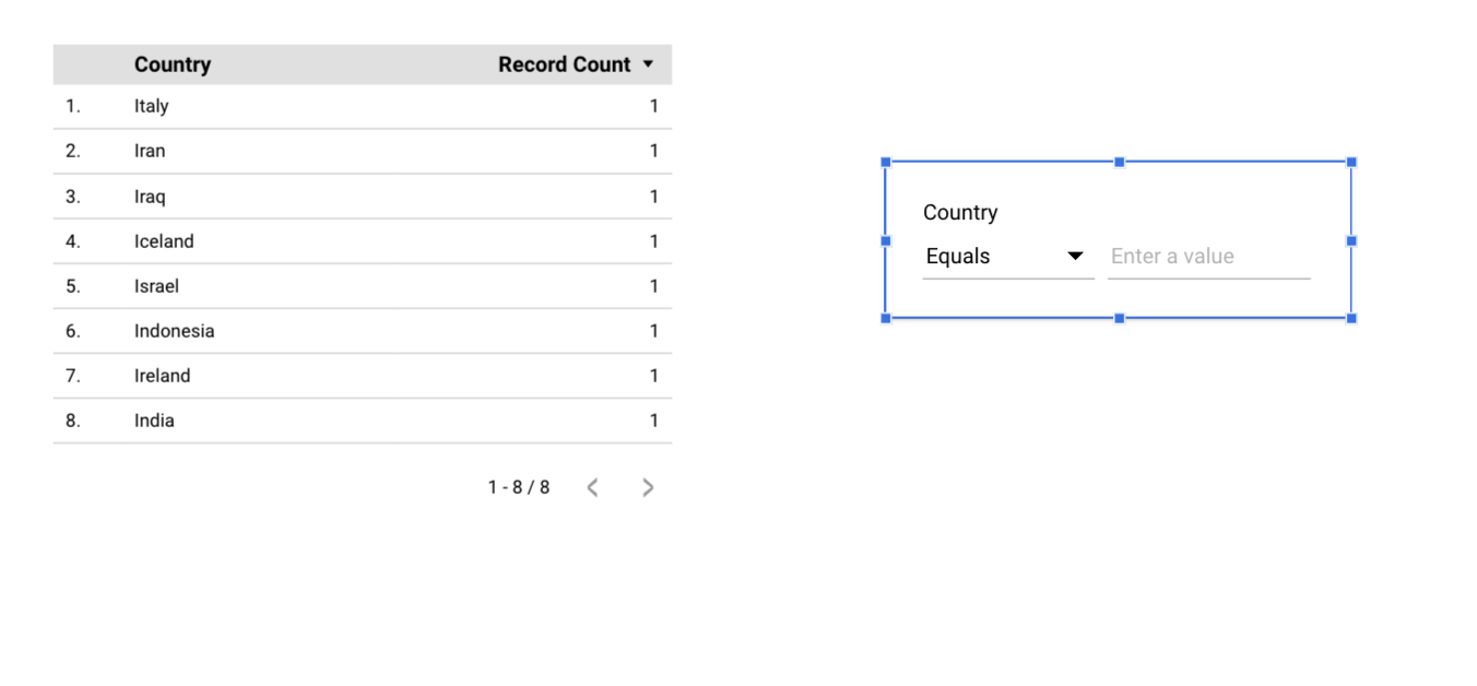
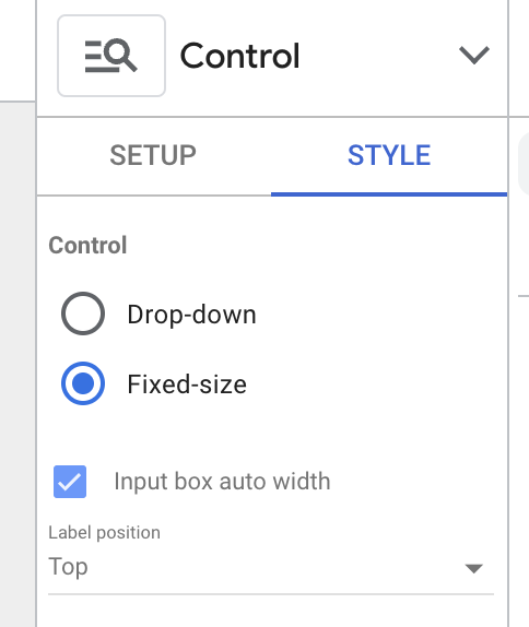
You can change the style of the filter control by clicking on the filter control box and modifying it in the STYLE panel. For example, you have seen how a list appears when you apply filter control. But you can also use a different format, where the viewer can search for the value. You can do this by clicking on the Search symbol.
This is how your viewers can filter on the report.
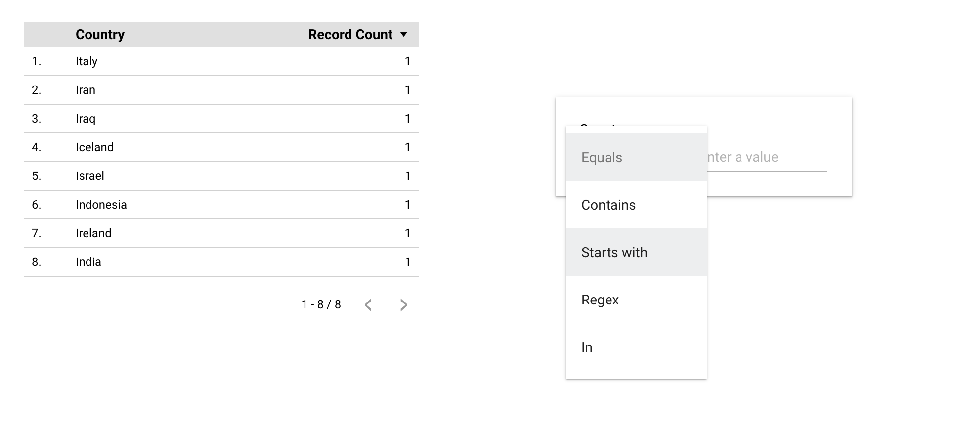
They can even select a group of values using the IN match type.
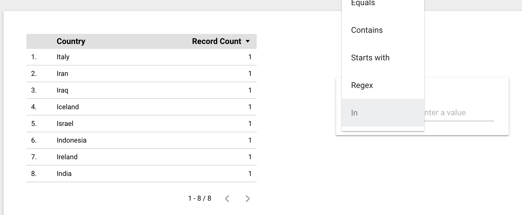
A lot more can be done with the match type- Regular Expressions, which is a separate subject on its own. You can find more about it from the official documentation.
Chart Filters
This one is my favorite! Rather than selecting or searching, you can let your viewers directly interact with your charts in the report.
Create all the charts you need from your data. Now click on the chart you want your viewers to be able to interact with to filter. Look for ‘Interactions’ at the bottom of the DATA panel and select ‘Apply filter’. Do this to all the charts you want your users to be able to use as filters.
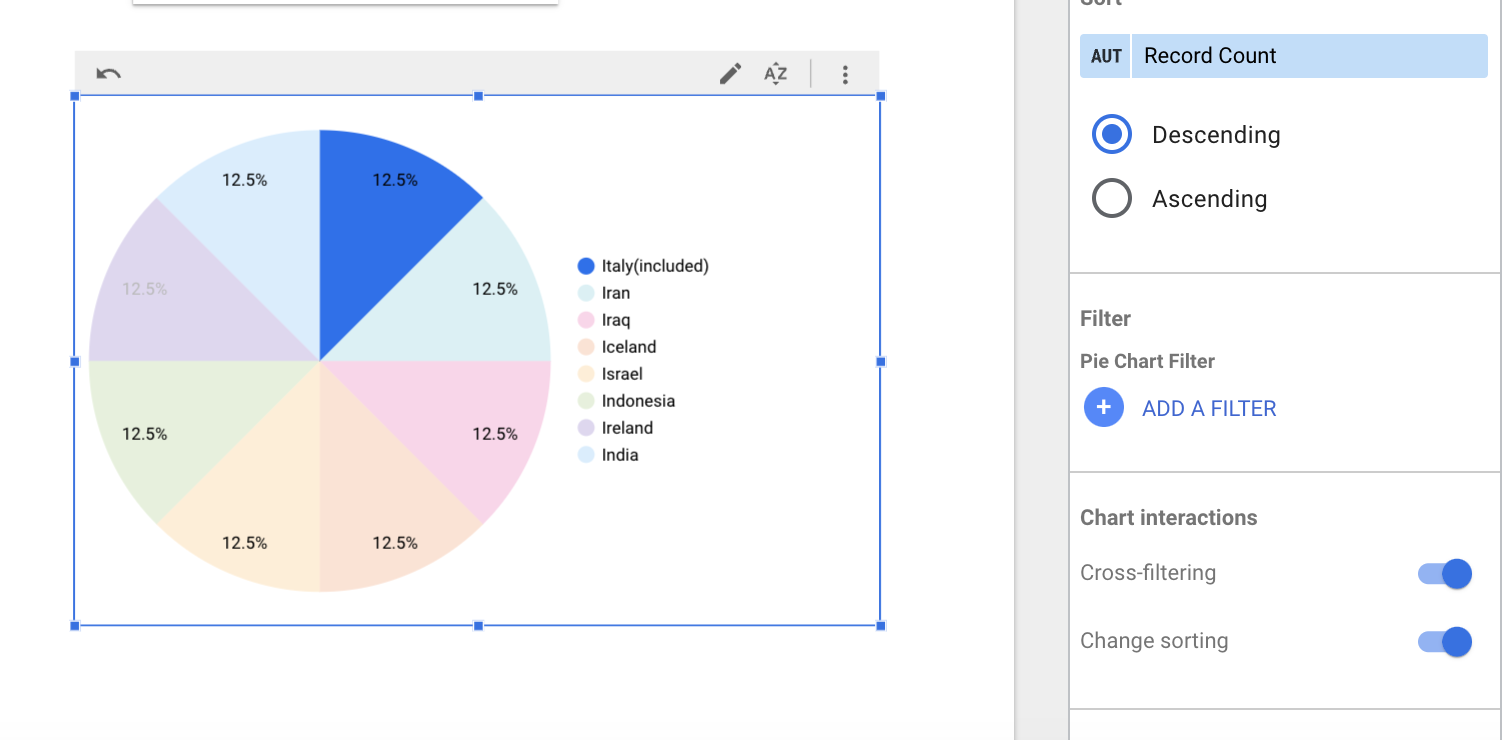
Check out what happens on the ‘View’ side of things.
You can select a country and all three of the charts modify their contents filtering down to just that country. (That is, the three charts interact with each other.)
You can next also click on the age group that you are interested in to filter it down to a specific age group.
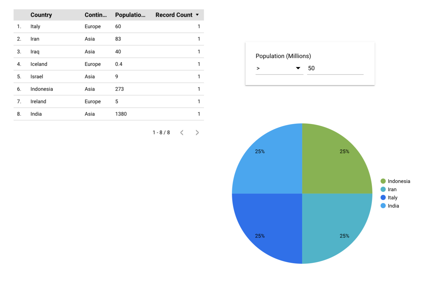
You can apply the filters on multiple charts at once or on only one chart.
Drill Down
Another way of letting the viewer control the charts directly is the ‘Drill down’ in the DATA panel.
Click on any chart and turn on the Drill down toggle in the DATA panel.
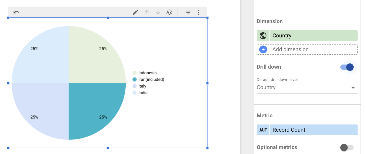
Go on view and check the results. In this case, I have enabled Drill down on the map chart. You can apply it to any chart.
By clicking on the Up or Down symbols on the map, I can move up or down in the level of details on the chart. For example, in a GeoMap, the city/country would be the lowest level. Next comes the subcontinent and then finally the continent. You can adjust the hierarchy in the DATA panel in the Drill down section.
Note that this depends entirely on the chart you select and the data you have. For example, if you are dealing with Date, you will probably have Day, Month, and Year. If it is a product that you are looking at in your sales report, it might be SKU, Category, Department, etc.
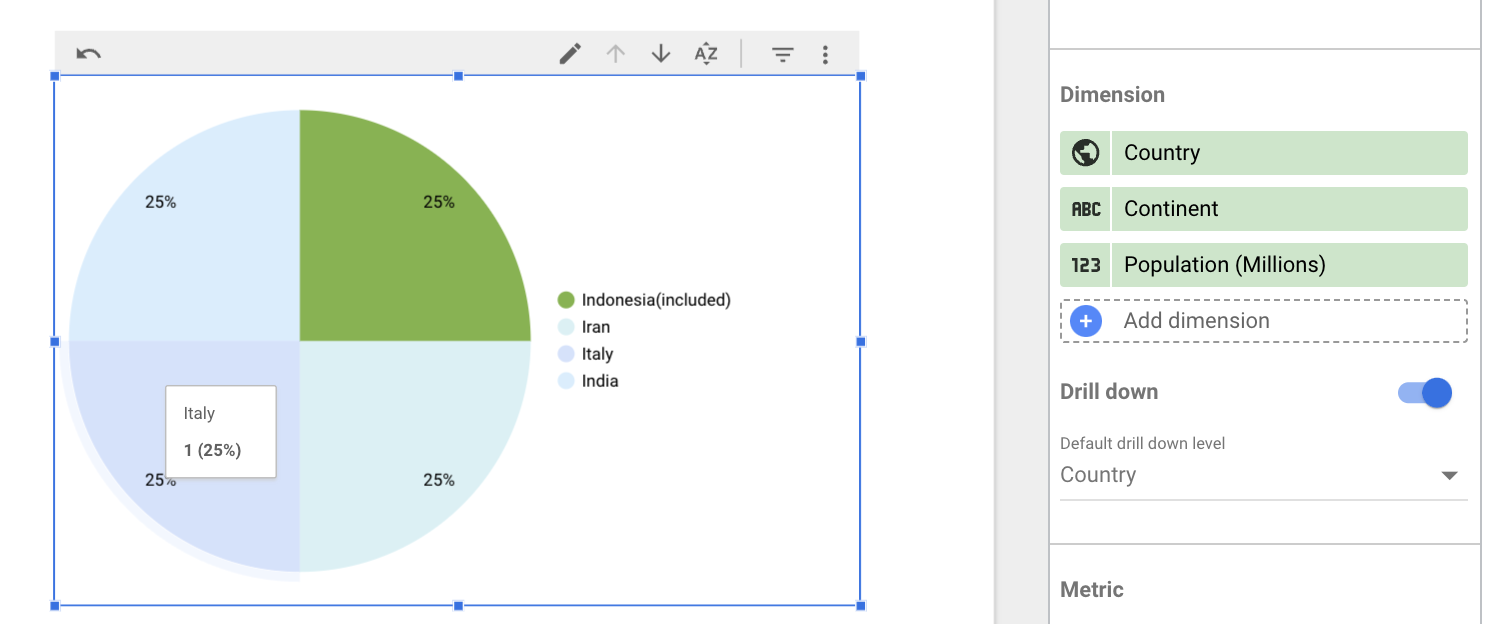
Check out what happens as you start from a lower level to a higher level by clicking on the Up arrow in the GeoMap.
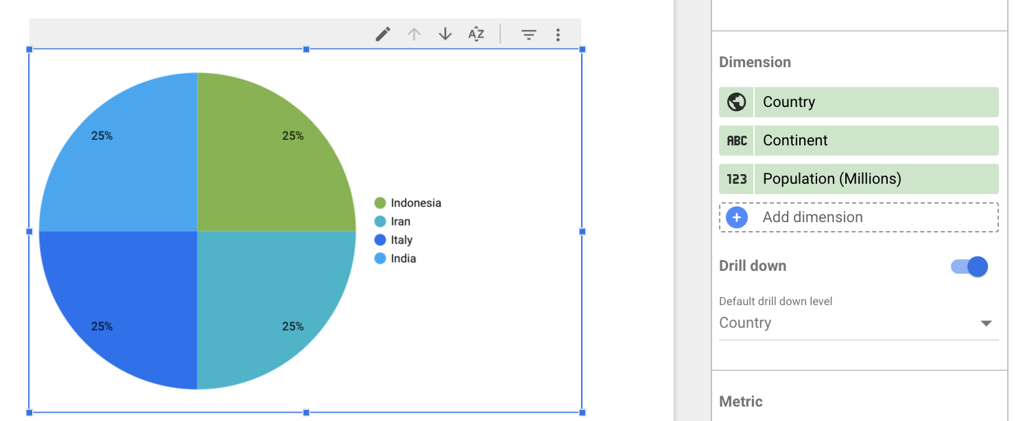
Click on the Up button at the top-right of the map and click on some region on the map.
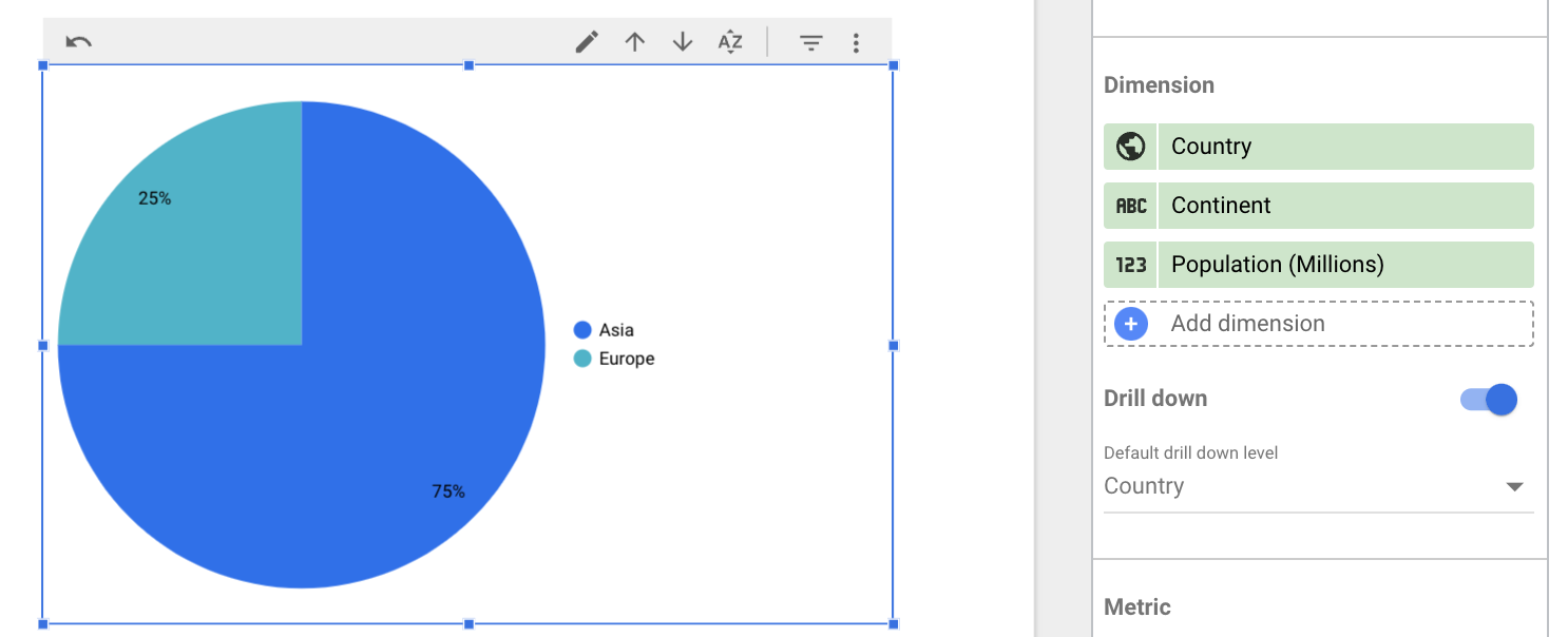
Go another level up and try clicking on a region.
Metric Slider
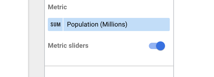
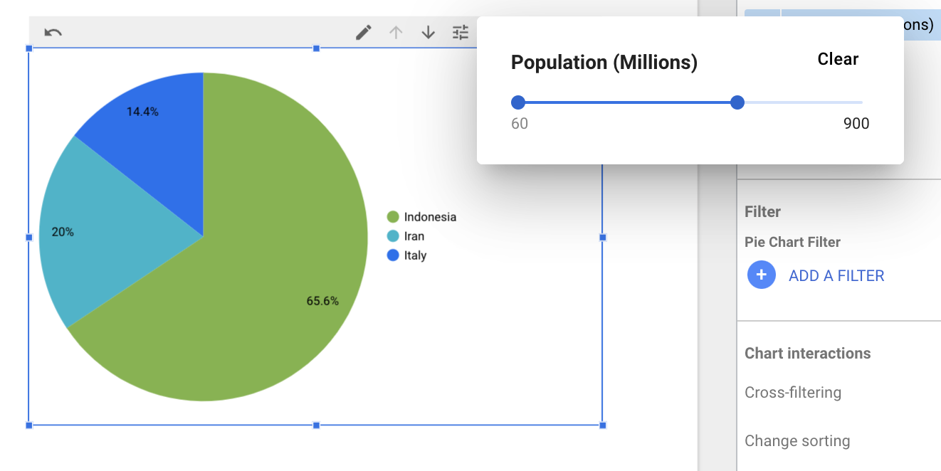
Another way to control what you view in the chart is through ‘Metric slider’. Enable metric slider on a chart and you can use the slider to view values in the selected range.
Benefits of Using Google Data Studio Filters
- Customized Reports: Filters allow you to display only the data that is relevant to your audience, making reports more focused and easier to understand.
- Improved User Experience: With filters, users can interact with reports and dashboards, selecting their preferred data views without altering the original dataset.
- Data Segmentation: Filters help you analyze specific subsets of data, such as by region, time period, or product category, allowing for deeper insights.
- Faster Decision Making: Filters make it easy to drill down into key metrics, enabling quicker decision-making based on specific, tailored data views.
- Cleaner Reports: By using filters, you can avoid cluttering reports with unnecessary data, keeping them clean and digestible.
- Interactive Dashboards: Filters create more dynamic dashboards where users can select different criteria, enhancing engagement and the overall reporting experience.
Conclusion
You have seen that filtering is the ability to see what you want and remove what you don’t want from the View in the report. You have learned that filtering doesn’t affect the actual data itself, just like how zooming in when taking a photograph doesn’t affect the actual object you are capturing in your camera. You have seen how you, as an editor, can make some filters only apply for a given chart, some filters apply to a whole page and some to the whole report.
You also saw how you can let viewers directly apply filters by clicking on the charts using the Interactions section. Finally, you saw the function of Drill down and Metric slider in narrowing down on what viewers see.
This is an introduction to filtering and you can learn a lot by experimenting with Google Data Studio.
If you are working with multiple sources of data, ranging from databases to SaaS applications, you might find it difficult to integrate all the disparate data. Hevo is a top-notch data integration tool that lets you move data from several such sources to any destination in real-time so that you can perform analytics seamlessly. If you want to see how it works first hand, you can sign-up for a 14-day free trial. You will love it! Check out the pricing details to understand which plan fulfills all your business needs.
Frequently Asked Questions
1. How do you add a filter in Google Data Studio?
To add a filter in Google Data Studio, click on the “Add a Filter” option in the report editor. Then, choose the field you want to filter, set the filter condition, and apply it to the relevant charts or tables.
2. How do I add a filter to a table in Looker Studio?
To add a filter to a table in Looker Studio, select the table, click on the “Add a Filter” option in the properties panel, and set the filter criteria you want to apply to the data displayed in the table.
3. What are filters in Looker Studio?
Filters in Looker Studio allow you to control the data displayed in your reports by specifying criteria. They help focus on specific data, segment results, and provide interactive controls for users to explore data more efficiently.


