Getting insights from MongoDB can be challenging without the right visualization and analytics tools. In this post, we cut through the noise and provide the must-know list of the top MongoDB visualization tools for 2026.
Whether you need real-time monitoring, data discovery, or rich visualizations to inform better decision making, these tools can help you transform your MongoDB data into valuable business insights.
Read on for an overview of key capabilities, integrations, and use cases to determine which solution is the best fit to maximize the value of your MongoDB deployment this year and beyond.
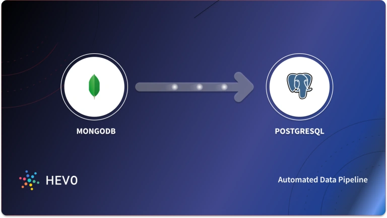
Effortlessly manage and migrate your MongoDB data with Hevo. Hevo supports MongoDB as one of its 150+ data sources, ensuring seamless data integration and real-time synchronization.
- No-Code Solution: Easily connect and manage your MongoDB data without writing a single line of code.
- Flexible Transformations: Use drag-and-drop tools or custom scripts for data transformation.
- Real-Time Sync: Keep your destination data warehouse updated in real time.
- Auto-Schema Mapping: Automatically handle schema mapping for a smooth data transfer.
Join over 2000 satisfied customers, including companies like Voiceflow and Playtomic, who trust Hevo for their data integration needs. Check out why Hevo is rated 4.7 stars on Capterra.
Get Started with Hevo for FreeTable of Contents
MongoDB Visualization Tools — Quick Comparison
| Tool | Best Use Case | Limitation |
| Tableau | Enterprise-grade dashboards and rich visualizations across multiple data sources | Expensive and requires learning time for non-technical users |
| Power BI | Organizations using the Microsoft ecosystem that want affordable BI | Requires extra setup for MongoDB + learning curve for modeling |
| MongoDB Charts | Fast, native dashboarding directly inside MongoDB Atlas | Limited customization and analytics compared to full BI platforms |
| MicroStrategy | Large enterprises needing governed BI and advanced reporting | Overkill and costly for teams focused only on MongoDB |
| SAP Analytics Cloud | SAP-centric companies wanting unified BI + planning + forecasting | Not ideal for teams without SAP stack / requires connectors |
| Qlik Sense | Real-time analytics on large and complex datasets | Can be expensive + needs time to master associative engine |
| TIBCO Spotfire | Power users and data scientists needing predictive & exploratory analytics | Pricing and complexity higher than typical BI tools |
| MongoDB Data Explorer | Quick schema exploration + simple visual queries inside Atlas | Basic dashboards only; not a full BI visualization tool |
| MongoDB Compass | Developers/DBAs needing visual schema view + query debugging | Not suited for executive dashboards or team collaboration |
| Studio 3T | Developer-friendly IDE with visual aggregation pipelines and schema insights | Advanced features require paid tier |
| Looker | Embedded analytics and dashboards inside SaaS products | Setup complexity and cost can be high for small teams |
| Knowi | Unified analytics across MongoDB + multiple NoSQL/SQL sources without ELT | Smaller ecosystem + pricing only available on request |
What are MongoDB Visualization Tools?
MongoDB visualization tools are software platforms that convert raw MongoDB documents into charts, dashboards, and interactive reports. Instead of manually querying JSON documents or running aggregation pipelines, these tools provide a visual interface to explore data, spot trends, and evaluate performance in real time.
In practical terms, MongoDB visualization tools allow you to:
- Connect directly to a MongoDB database or a downstream warehouse
- Run queries, aggregations, and filtering without writing code
- Build dashboards to monitor KPIs, customer behavior, and system metrics
- Share insights with engineering, product, and business teams
These tools range from MongoDB-native interfaces (like MongoDB Charts and Compass) to enterprise BI platforms (such as Tableau, Power BI, and Qlik) that blend MongoDB data with other sources for richer analytics.
Best MongoDB Visualization Tools
Seeing that data visualization has rapidly grown in popularity, there has come a plethora of different platforms that let you analyze your MongoDB datasets without ever having to learn a programming language.
The way they get around this is by using data visualization to complete the analysis.
To come up with this list, the following criteria are used to pick the best MongoDB Visualization Tools:
- Deployment options (on-prem and cloud).
- Ease of learning/using.
- Quality of visualizations.
- Performance on large datasets.
- Ability to combine data from different sources.
The Best MongoDB Visualization Tools include:
1. Tableau
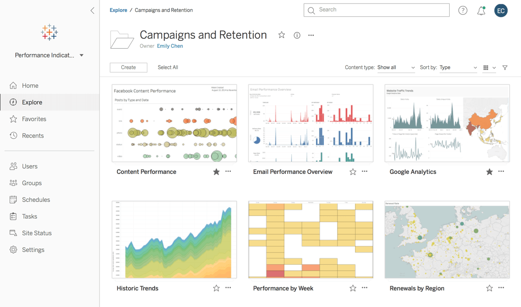
Tableau is mainly known for its world-class visualizations. But to create those visuals, it also includes functionality to create metrics, join data from multiple sources, and even create a data model. Models can be for planning purposes or analytics.
Within a model, Tableau allows you to enrich the data to support time-based charts, Geo maps, assign responsibilities for organization units to specific users, and apply model security.
Pros
- Easy to use for both technical and non-technical users.
- Quick and insightful exploration of MongoDB data.
- Abundant resources and pre-built dashboards.
- Interactive dashboards for deeper analysis and communication.
- Combines data from various sources.
Cons
- Paid subscription required.
- Advanced features require deeper understanding.
- Less seamless than dedicated MongoDB tools.
- Delays real-time analysis and raises security concerns.
Pricing Details
- Tableau has a free version and a free trial is also offered.
- Tableau Creator: Starts at $70/user, per month, billed annually.
- Tableau Explorer: Stars at $35/user, per month, billed annually.
- Tableau Viewer: Starts at $12/user, per month, billed annually. A minimum of 100 Viewers is required.
2. Power BI
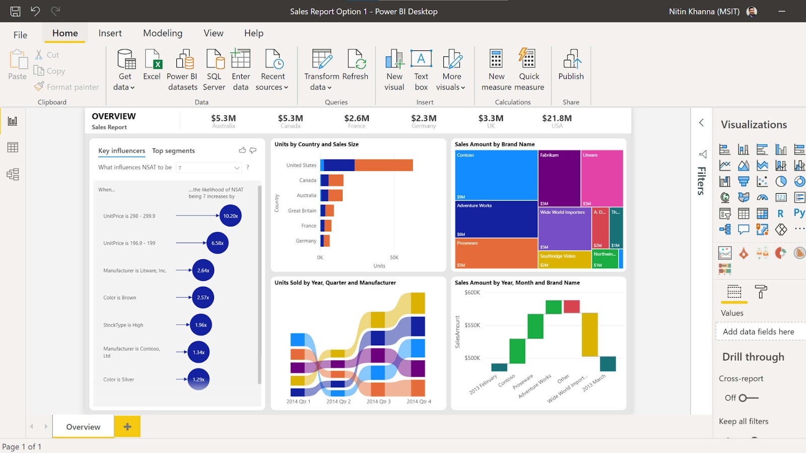
Power BI is one of the most widely used analysis and visualization tools on the market. In Power BI, you’re either creating reports, working with data, or consuming reports to make business decisions based on that data. It might not have the same level of visuals as Tableau, but it lacks analytical power for the average user.
Again with Power BI, you can create data models, metrics, and interactive dashboards. Power BI can easily handle massive amounts of NoSQL data, and it uses a formula language called DAX, which will be very familiar to Excel users.
Using Power Query, you can clean and shape your data to get it in the right format as you pull it in Power BI.
Pros
- Seamless for users of other Microsoft products.
- Combines and shapes data from various sources.
- Update automatically with data changes.
- Access reports and dashboards on the go (free tier limitations apply).
- Available for individual users or small projects.
Cons
- Data modeling and visualization features require more learning.
- Requires additional configuration steps for MongoDB.
- Adds complexity for on-premises data.
Pricing Details
- Microsoft Power BI has a free version and offers a free trial.
- Microsoft Power BI paid version starts at US$9.99/user, per month.
3. MongoDB Charts
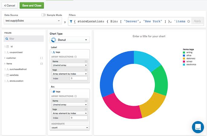
MongoDB Charts provides an intuitive way to build charts and dashboards off data sitting in MongoDB Atlas. It’s fully interactive; a user can drag and drop fields, zoom in, pan, etc. It also includes a Chart builder that you can use to customize how charts appear. It provides many different types of charts for visualizing your data such as gauge charts, bar charts, column charts, line charts, geospatial charts, heatmaps, and more.
Pros
- Seamless, real-time visualization within MongoDB Atlas.
- Pre-built charts, accessible for all technical levels.
- Charts update automatically with data changes.
- Included in MongoDB Atlas subscription.
- Share and collaborate on charts within Atlas.
Cons
- Fewer customization options than full-featured BI tools.
- Lacks complex data modeling and drill-down capabilities.
- Only available within MongoDB Atlas interface.
Pricing Details
- Free and open-source.
4. MicroStrategy
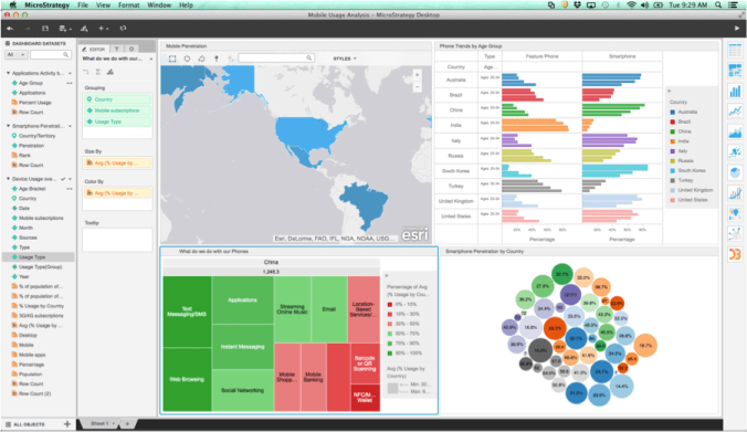
MicroStrategy is an enterprise data analytics platform that can deliver BI to your MongoDB datasets. They have a suite of BI apps that can connect your teams to any data source in one click and help you create pixel-perfect visualizations with a drag-and-drop canvas that renders beautifully on any device so that you can run your business with reports organized into pages and chapters and consolidated in a personalized library. You can deploy it on-premises or in the cloud.
While MicroStrategy is a powerful business intelligence (BI) tool, it is not specifically designed for visualizing data directly from MongoDB. Its primary focus lies in connecting to various data warehouses and relational databases. However, there are workaround methods to connect MicroStrategy to MongoDB
Potential Pros
- Extensive functionality beyond visualization (data mining, analytics, reporting)
- Strong security and governance features
- Scalability for large datasets
Significant Cons
- Requires custom development or specialized connectors (increased cost and time)
- Not designed for MongoDB, hinders real-time visualization
- Higher licensing fees compared to dedicated MongoDB visualization tools
Pricing Details
- MicroStrategy does not offer a free version. However, there is a 30-day free trial available.
- MicroStrategy paid version starts at $600.00 paid one-time.
5. SAP Analytics Cloud
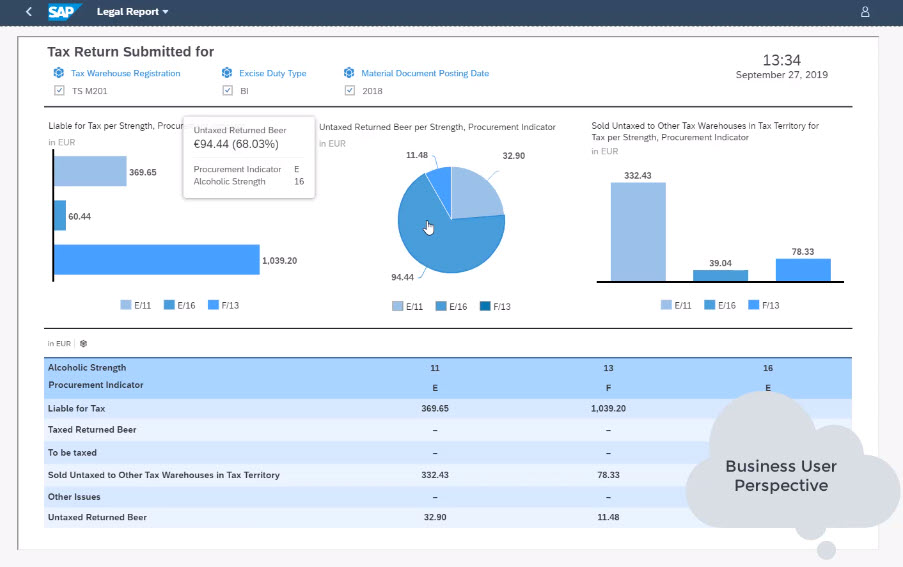
The SAP Analytics Cloud is SAP’s BI module that can be used for reporting data from your MongoDB data sources. SAP BI can give value to the unprocessed data in your MongoDB database by organizing, cleaning, and storing it using business logic for downstream analytics that will eventually inform business decisions. It’s mainly used for data exploration, visualization, analysis, financial planning, and predictive forecasting. By importing data from your MongoDB instance, you can create a model in SAP Analytics Cloud that can be shared with many other users with data access customized to each user’s level of authorization.
Pros
- Cloud-based: Easy deployment and maintenance.
- Security and governance: Strong data protection and compliance.
- SAP integration: Unified view of enterprise data.
Cons
- Limited native support: Requires third-party connectors (complexity, compatibility issues).
- Expensive: Costly for small organizations or solely for MongoDB visualization.
- Limited MongoDB community: Fewer resources and support specific to MongoDB.
Pricing Details
- No free version.
- 30-day free trial.
- Starts at $25.00/user, per month.
6. Qlik Sense
Qlik Sense is a modern cloud analytics platform designed to help create a data-literate workforce and transform your business. Qlik has various modules that work harmoniously to help you manage and clean your data, share information, and create visualizations and reports. It combines the power of AI with the creativity of human intuition.
Unlike black-box AI systems, the Qlik cognitive engine uses its unique associative technology to generate context toward insights. While some solutions in this list limit you to rigid, linear exploration and partial views of data, Qlik’s unique associative engine indexes all the relationships in your data so you can search and explore in any direction in a similar way to how your mind works.
Pros
- Qlik Sense excels at associative data exploration, allowing users to navigate and discover insights through interactive visualizations and data relationships.
- Qlik Sense empowers users with self-service capabilities, enabling them to build and explore visualizations without relying heavily on IT professionals.
Cons
- Additional configuration might be needed.
- Can be costly for smaller organizations or solely for MongoDB visualization.
- Requires understanding of associative exploration and scripting.
- Fewer resources and support specific to MongoDB.
Pricing Details
- Qlik Sense: A free version with basic features to get you started.
- Qlik Sense Business: $30/user per month, billed annually.
7. TIPCO Spotfire
Whether you are a business user with little or no data expertise, or a data scientist working with analytical applications at scale, Spotfire has all the horsepower and self-service features you need to discover brilliant insights and communicate them effectively. Spotfire can take the data you use every day like sales or customer service information, wrangle it into shape and then visualize it to identify trends and patterns so you can delve deeper to find the proof you need to take transformative action. Spotfire’s intuitive shareable dashboards let you bring intelligence to all stakeholders in your organization. With predictive analytics, you can even anticipate what’s coming next to get ahead of the game.
Pros
- Explore data freely, uncover hidden patterns.
- Access real-time MongoDB data, no pre-processing needed.
- Create interactive dashboards and applications for effective communication.
- Explore different data segments, identify trends within subsets.
Cons
- Commercial software with tiered pricing plans.
- Requires some learning investment to master full capabilities.
- Less flexibility compared to open-source alternatives.
- Primarily cloud-based, some features may have limited functionality offline.
Pricing Details
- No free version.
- 30-day FREE Trial is available.
- TIBCO Spotfire Desktop: $650 per year.
- TIBCO Spotfire Cloud: $200 per month or $2000 per year.
8. MongoDB Data Explorer

It is a powerful feature of MongoDB Atlas. It is a MongoDB data visualization tool that includes full CRUD functionality. You can query and take action on your MongoDB Atlas cluster data in your web browser itself. It allows you to create and drop databases, edit documents, and run aggregation pipelines for data processing.
Pros
- Seamless access and visualization within the cloud-based MongoDB Atlas platform.
- Drag-and-drop interface for building queries without requiring knowledge of MongoDB Query Language (MQL). This simplifies data exploration especially for non-technical users.
- View and analyze real-time data changes as they occur in your MongoDB database.
- Export data in JSON or CSV format for further analysis or sharing.
Cons
- Offers basic visualization capabilities like tables and charts. Lacks the advanced data storytelling features found in dedicated BI tools.
- While offering basic filtering and sorting functionalities, it may not be sufficient for complex data exploration needs.
- Relies on the MongoDB Atlas platform, limiting its use outside of that specific ecosystem.
Pricing
- Free trial available
- For shared instance: $9/month
- For dedicated instance: $60/month
9. MongoDB Compass

A go-to tool of MongoDB, Compass is a stand-alone application. You can analyze the contents of your data in the MongoDB database without the knowledge of MongoDB query syntax. It is a MongoDB dashboard open source tool and can also be used for optimized querying, and document validation. The structure of your collections can be displayed using the built-in schema visualization of Compass. You can also visualize geospatial data using it.
Pros
- Offers a visual representation of your data structure, revealing data types and relationships within collections, making it easier to understand complex schemas.
- Ensures data integrity by comparing documents against predefined schema rules, catching potential errors and maintaining data consistency.
Cons
- Lacks the advanced data storytelling features found in dedicated BI tools.
- While it handles moderate datasets well, performance can become sluggish when dealing with very large collections.
- Primarily intended for individual users, offering limited options for sharing data or collaborating with others on visualizations.
Pricing
- Free full version available
10. Studio 3T
It is a GUI tool for MongoDB that you can use to view and manage your data collections. It has a Schema Explorer feature that visualizes data distribution and helps you find missing fields. It also enables finding duplicated records, and other anomalies. Your analysis results can be exported to frame documentation of your schema.
Pros
- Seamless migration of data and queries from various SQL databases (e.g., Oracle, MySQL) to MongoDB, simplifying the transition for teams familiar with SQL.
- Visually construct and edit complex aggregation pipelines with a drag-and-drop interface, offering a user-friendly approach for advanced data manipulation.
- Compare and merge data between different collections or versions, facilitating data reconciliation and version control workflows.
- Supports user authentication, role-based access control, and encryption for securing access to sensitive data within MongoDB.
Cons
- While offering a free tier with basic functionalities, unlocking advanced visualization features requires a paid subscription.
- Compared to some competitors, Studio 3T can be resource-intensive, potentially impacting performance on older or less powerful machines.
Pricing
- Basic Version: $ 16.59/month
- Pro Version: $33.25/ month
- Ultimate Version: $58.25/month
11. Looker
Looker is a browser-based software using which you can customize, and create a variety of interactive visualizations. Built for SQL-based data sources, Looker uses a data modeling layer. Looker platform consists of LookML, which is a data modeling syntax. It also consists of pre-built pieces of code called Blocks. Using these two, you can customize visualization. This enables you to use the work of others instead of starting from scratch.
Pros
- Transform and calculate data with LookML for complex visualizations.
- Integrate visualizations seamlessly into applications and websites.
- Control access with RBAC and RLS, ensuring data privacy.
- Share dashboards, workspaces, and collaborate on analysis.
Cons
- Tiered pricing based on data and users, can be expensive for smaller companies.
- May require additional setup compared to other data sources.
Pricing
- It is a self-service version that is free while for a project subscription, it is $9 per user per month for a project.
12. Knowi
It is a business intelligence tool that also supports unstructured data. It integrates with several NoSQL databases such as MongoDB, MongoDB Atlas, Couchbase, etc. It connects with several data sources without the need to move or transform data.
Knowi HUB, Knowi ELEVATE, and KNowi EMBED are three products that help in real-time data analysis.
Pros
- Seamless connection to MongoDB without data movement or driver installation.
- Combines data from various NoSQL and SQL databases, overcoming limitations of single-source analysis and providing a holistic view.
Cons
- Compared to some established BI tools, Knowi is a relatively newer offering, and its user base and community resources might be smaller.
- Primarily functions online, with potential limitations in offline data exploration or visualization creation.
Pricing
- Free trial available
- Quotation-based pricing options
Why are Data Visualization Tools Important?
- Data visualization tool allow businesses to understand how customers engage with a particular product. Reporting tools deliver business intelligence and reporting functionalities to end-users in an intuitive self-service format.
- Using their no-code drag and drop functionalities, business analysts with minimal technical skills can create visually rich reports on a view basis.
- Your BI team can use these tools to perform regression analysis, time-series analysis, as well as Cluster analysis to help you get to the core of your data and unveil patterns that cannot be easily grasped by looking at a table.
Learn more about : MongoDB Schema Designer.


Conclusion
The MongoDB visualization tools in this list allow for anyone in your organization despite their level of technical expertise to create analytics by simply dragging and dropping visualizations to visualize data in a governed self-service environment.
Some even feature open APIs that let you build anything you can imagine—from purpose-built extensions to embedded analytics within your enterprise applications, down to custom analytics applications that can run anywhere.
FAQs
How to visualize data from MongoDB?
You can visualize MongoDB data using tools like MongoDB Charts, Tableau, Power BI, or D3.js. These tools connect to MongoDB, allowing you to create interactive dashboards and visualizations.
Is there a GUI for MongoDB?
Yes, MongoDB offers MongoDB Compass, a GUI tool for querying, visualizing, and analyzing your database. Other third-party tools like Robo 3T and Studio 3T also provide GUI interfaces for MongoDB.
Does MongoDB have a graph database?
MongoDB is not inherently a graph database, but it can model graph-like relationships using document embedding and referencing. Alternatively, MongoDB provides integrations with graph tools like Neo4j or TinkerPop.
Share it with your connections.
-
 Share To LinkedIn
-
 Share To Facebook
-
 Share To X
-
 Copy Link